Home » Posts tagged 'jQuery Mobile'
Tag Archives: jQuery Mobile
The cloud experience vision of .NET by Microsoft 12 years ago and its delivery now with Windows Azure, Windows 8/RT, Windows Phone, iOS and Android among others
Take also a Food for thought: Cloud experience development: the new essence [this same ‘Experiencing the Cloud’ blog, Sept 7, 2012]
Update as of Sept 11, 2013: finally recognized by the top business media, unfortunately as an Epic Fail: Microsoft’s Internet Vision From 2000 [Bloomberg YouTube channel, Sept 11, 2013]
Had they recognized the famous at that time “Steve Masters video’ their ‘Epic Fail’ retrospective would had been even more devastating: Steve Masters [Microsoft, March 24, 2009, but originally July 25, 2000]
Update as of Sept 20, 2012: Take note as well that CVP Jason Zander, who was up to now responsible for the delivery of Visual Studio 2012 described here, finally took his new role as CVP of development for Windows Azure. With this Azure has a triad structure with program management under CVP Scott Guthrie, and test and engineering systems under CVP Bharat Shah, all directly under the head of Server and Tools Business (STB), Satya Nadella. This is a structure quite similar to Steven Sinofsky’s Windows Business. It is also remarkable that Windows Embedded is also in the STB (since 2010), although not as directly as Azure. All this was first reported by ZDNet in August. The Windows Embedded position in STB you can grasp from an earlier post of mine: The future of Windows Embedded: from standalone devices to intelligent systems [March 9-28, 2012]. You can also find a “Who is Jason Zander?” update in the “Visual Studio 2012 Launch …” section of this very long post.
END OF UPDATES
Made public on June 22, 2000 and becoming essentially dead on August 9, 2000, so having just 49 days of public lifetime, there was an inherent fate in the original .NET vision as it was a true cloud experience vision. Microsoft, however, wasn’t able to deliver that in terms of intended customer and consumer values widely advertised, “only” in terms of essential foundation technologies (but even that had been a tremendous achievement). So a non-cloud version of .NET had been delivered during not less than 8 years because of that. Even since 2008—with the evolving versions of Windows Azure cloud solution—the cloud experience had been so limited in .NET terms that we could not see any real, massive deliveries of the original .NET version. Not anymore!
How this happened? A conclusive summary put ahead: For me the morale of this, My .NET Services (alias Hailstorm) story is that without an extremely strong and capable, general constructor type leader, responsible for the delivery of the whole .NET vision (all along), a vision like the original .NET cannot succeed, if at all. With Ballmer’s August 9, 2000 decision not only the responsibilities were spread over all of Microsoft, but even the leadership was quite divided and diverse: Steve Ballmer, Bob Muglia, Eric Rudder, Sanjay Parthasarathy (who was initially under Rudder but essentially independent), … and—most importantly—Bill Gates himself, who as the CEO just months before had tremendous influence and respect throughout the organization, but was “clever enough” not to take any formal leadership responsibility by occupying a quite undefined “chief software architect” position.
With the Windows Azure cloud now in the Satya Nadella’s hands, the upcoming Windows 8 PC clients in Steven Sinofsky’s (including the ARM based Windows 8 tablets), the Silverlight 4 derived Windows Phone 7.5 transitioning to the Windows Phone 8 having the same core as in Windows 8, and finally the Xbox now enhanced to a full entertainment hub in the living room, with all that Microsoft finally is in the position to introduce a complete Post-PC offering as had been envisaged by Ray Ozzie. Wait no more than October 26, 2012, when the first and probably most important wave of that, Windows 8 is coming to the market. End of the conclusive summary.
For a well researched, more general analysis the best answer is in the Microsoft’s Lost Decade [Vanity Fair, Aug 15, 2012] which appeared in the August 2012 magazine issue as “How Microsoft Lost Its Mojo: Steve Ballmer and Corporate America’s Most Spectacular Decline”. A highly recommended read as an addition to this story!
Here is the evidence of the original .NET vision as well as a brief retrospect of what happened behind the scene, then follows a section on more .NET background, as well as another section about the current Microsoft .NET as it is, then two sections for the new development platform which made possible the delivery of the original .NET vision:
-
The original .NET vision and its failed delivery with final correction started with Ray Ozzie
-
More .NET background
-
The current Microsoft .NET as it is
-
Visual Studio 2012 Launch for Connected devices & Continuous services
-
Windows Azure Mobile Services (Preview) for the “reborn” June 2012 release of Windows Azure
Note put forward from the end: you will see that the originial .NET vision is now completely delivered as illustrated by the following illustration from very end:


also: .NET is now a core part of several Microsoft platforms, and each has focused on specific subset of APIs.
![6204.image_09BDDF73[1]](https://lazure2.wordpress.com/wp-content/uploads/2012/09/6204-image_09bddf731.png?w=960)
Figure 1: .NET Framework profiles in context

Figure 2: Feature areas supported by .NET for Metro style apps
| .NET for Metro style apps | Windows Phone 7.1 | .NET Framework 4.5 | |
| Namespace | 72 | 95 | 447 |
| Type | 1,246 | 1,788 | 14,936 |
| Member | 15,674 | 20,291 | 217,166 |
Table: API surface counts, by .NET Profile
The original .NET vision and its failed delivery with final correction started with Ray Ozzie
Microsoft .NET vision – Consumer.mpg [Microsoft, July 25, 2000]
Microsoft .NET vision – Healthcare.mpg [Microsoft, July 25, 2000]
Microsoft exposes .NET vision [David Beynon in Computerworld Australia, July 3, 2000]
To fully exploit the Internet as it’s going to look over the next few years (ie, Internet: the next generation), organisations must ‘expose themselves programmatically’ online, says Paul Maritz, the Microsoft group vice president of the platforms strategy and developer group.
With the help of a slick video featuring an accident-prone Steve Masters apparently of Seinfeld sitcom fame, Maritz last week argued the case for transforming the Internet into a services-rich platform. Such a platform, built on the back of Microsoft’s XML-based .NET (dot-net) environment, would let individuals use personalised services provided, or arranged, more or less instantly via online wireless devices. In Maritz’s scenario, it would be transparent to the individual if the personalised service required interaction with one or many organisations behind the scenes.
“We want to develop Web services that expose the functionality, the business logic, the value that you add across the Internet – expose it programmatically,” Maritz said. “When we really start to use the Internet as an information bus [it will] allow people to pull together the information they want and have more satisfying experiences.”
While the video showed Masters more as an efficient idiot rather than a satisfied customer, it did demonstrate the potential of an ‘information bus’ type Internet.
The plot went roughly like this: Masters is away from his home town when he is run down by a bicycle courier, and while lying on the footpath he uses his ‘smart phone’ to call his regular doctor’s office; the receptionist quizzes him about his injury (ankle); a GIS functionality within his smart phone signals his location and the receptionist identifies two appropriate orthopaedic specialists within limping distance. The receptionist’s system tells her that Masters’ health insurance cover is only 80 per cent at the nearest specialist while he’s 100 per cent covered for the slightly more distant doctor. She relays this to Masters and he chooses the closest doctor; the same receptionist checks the specialist’s schedule, finds she’s available and makes an appointment; the receptionist asks Masters if he wants his medical records (text and image) available online to the specialist; Masters says yes and the specialist is authorised for this access (voice or bio recognition possibly working in the backgound); the ins-urance payment pro-cess is initiated; he hobbles around the corner for treatment.
This all happened within a five-minute phone call. On crutches, Masters leaves the specialist’s office. He is run down by another bicycle courier. End video.
Imagine the systems integration hassles that would lie behind delivering the service as described above. Maritz claims that .Net products and services delivered by Microsoft and partners would ultimately make such work relatively easy (but remember .NET will take several years to roll out).
“His medical records information [could be] stored in a future .NET storage service and he controls access to that information. It’s an example of storing personal state, personal preferences, important information, out on the Internet, and then retaining control of it.”
“More importantly, what we saw was a number of Web service-enabled businesses, cooperating together programmatically across the Internet,” Maritz added. “There were the Web services that the receptionist was invoking and all of those were coming together in what to her looked like a single experience.”
According to Maritz, to enable such scenarios Microsoft is working on a ‘common programming model’ for the Next Generation Internet that is based on accepted, open, Internet standards, in particular the XML standard. This would let Microsoft and developers build to this model and call on the services it offers (see .NET white paper extract starting page 10 [not available anymore, therefore see the whole whitepaper text included below in the beginning of “More .NET background” section that is right in the middle of this post]). Other key technologies include the Simple Object Access Protocol (SOAP) protocol (which Maritz described as “essentially the protocol that lets XML travel over the Internet”) which Microsoft submitted, jointly with IBM, to the World Wide Web Consortium.
“We believe that with this common programming model, and the set of standards laid down, we can start to build some very exciting and useful solutions,” he added.
Third-party .NET services are crucial to Microsoft’s strategy. To help ‘bootstrap’ the industry towards its vision, Microsoft will invest $US2 billion over the next three years to enable industry partners, independent developers and corporate IT developers to build Microsoft .NET services.
Early offerings to the development community include Visual Studio 7, or VisualStudio.NET, a prerelease version of which will be given to developers this month at Microsoft’s Professional Developers’ Conference in Orlando, Florida. The full Visual Studio.Net development suite won’t be available until 2002 or later. A version of Visual Studio 7 to be introduced next year will include some of the capabilities that developers need to build applications for the .Net platform, including support for the SOAP and enhanced XML support.
Visual Studio.Net falls under the Microsoft.Net services push, where developers build building blocks. The goals of the building blocks are to make applications easy to develop and integrate as well as to give developers the ability to project information to users when and where they need it, via whatever types of devices they require. Visual Studio is currently in a limited beta-testing phase.
New features in Visual Studio.Net include Drag-and-Drop Web Services development and a Web Form Designer. Drag-and-Drop Web Services enable developers to drag a task, such as calendaring, directly into a project so developers do not have to write reams of code for every program. The Web Form Designer is a graphical designer in which code or Web Services components can be dragged and dropped right into a project.
Microsoft also demonstrated a new aspect of BizTalk Server at Forum 2000, the BizTalk Application Designer. Built on top of Visio 2000, this feature enables developers to add business actions into Web services. The biggest benefit, according to BizTalk group manager Amit Mital, is that it enables business analysts to change the business processes without involving the developer.
Also new is a programming language dubbed C# (C Sharp). This is a language derived from C and C++ that provides a way for developers to build applications and components for the .Net platform, according to Tony Goodhew, Microsoft’s Visual C++ product manager.
Bob Trott contributed to this report. David Beynon was a guest of Microsoft at the Forum 2000 event, held in Redmond, Washington on June 22.
Microsoft Delivers First .NET Platform Developer Tools for Building Web Services [press release, July 11, 2000]
PDC Attendees Receive Technology Preview of .NET Framework and Visual Studio.NET
In his keynote address at the eighth Microsoft Professional Developers Conference (PDC) 2000, Paul Maritz, group vice president of the Platforms Group at Microsoft Corp., today announced the initial developer availability to PDC attendees of the Microsoft® .NET Framework and Visual Studio.NET for building, integrating and running next-generation, XML-based Web services. Visual Studio.NET, the latest version of the world’s most widely used development tools, provides native support for drag and drop development of Web services. Together, these two products provide developers with a high productivity, multilanguage environment to rapidly build, deliver and integrate Web services on the Microsoft .NET Platform.
“Delivering this software to developers today is an important milestone in helping developers build next-generation Internet software and services,” Maritz said. “By creating a unified platform where devices and services cooperate with each other, Microsoft is unleashing a new wave of developer opportunity and creativity that will help developers reach a new level of power and simplicity.”
At the heart of the .NET Platform is the .NET Framework, a high-productivity, multilanguage development and execution environment for building and running Web services with important features such as cross-language inheritance and debugging. The .NET Framework simplifies the creation of Web services by automatically handling many common programming tasks, regardless of programming language, reducing the amount of code developers must write and eliminating common sources of programming errors. The .NET Framework is the industry’s first development environment to natively support Simple Object Access Protocol (SOAP). The .NET Framework incorporates advances to two key Microsoft development technologies: the Component Object Model, the most popular reusable software model in the world, and Active Server Pages, used by nearly 1 million Web developers.
Separately, Microsoft announced that 17 third-party programming languages, such as Perl and Python from ActiveState, will support the .NET Framework. The result is a new model of service-based development that offers faster time to market and more reliable, scalable software.
Microsoft also announced the .NET Compact Framework, which allows any device to emit or consume XML-based Web services. The .NET Compact Framework is a small footprint, CPU-independent implementation of the .NET Framework. Microsoft will provide a version for Windows® CE and other embedded operating systems, as well as for devices that do not require an operating system.
Visual Studio.NET is the most productive tool set for developers building Web services on the .NET Platform. Visual Studio.NET, which includes updates to the Visual Basic® and Visual C++® development systems, the Visual FoxPro® database development system, and a new language, C#, the recently announced dialect of C++, helps developers extend today’s development skills to tomorrow’s Web applications and Web services. Visual Studio.NET provides an easy-to-use, extensible integrated development environment (IDE) for the .NET Framework. Together, the new technologies introduced in the .NET Framework and Visual Studio.NET will enable millions of developers worldwide to quickly build and consume scalable, reliable and manageable Web services.
“We’re really excited about Visual Studio.NET,” said Bill Shea, software development manager for Merrill Lynch & Co. Inc. “Enabling our software developers to rapidly build applications that integrate with the systems we have today, and that use Internet standards to communicate with any client system or device, will help us further enhance our service offerings and maintain our position as one of the world’s leading financial management and advisory companies.”
About Microsoft .NET
The Microsoft .NET Platform, announced June 22 at Forum 2000, is Microsoft’s initiative for creating the next generation of software, which melds computing and communications in a revolutionary way. This vision offers developers, businesses and consumers the ability to harness technology on their terms and with the tools they need to create truly distributed Web Services making information available any time, any place and on any device.
About Microsoft
Founded in 1975, Microsoft (Nasdaq “MSFT” ) is the worldwide leader in software, services and Internet technologies for personal and business computing. The company offers a wide range of products and services designed to empower people through great software — any time, any place and on any device.
Microsoft, Visual Studio, Windows, Visual Basic, Visual C++ and Visual FoxPro are either registered trademarks or trademarks of Microsoft Corp. in the United States and/or other countries.
The names of actual companies and products mentioned herein may be the trademarks of their respective owners.
Unfortunately Paul Maritz didn’t get the expected full responsibility job for delivering on the vision, in fact remained in a non-effective position of just overseeing the delivery:
Ballmer Outlines Changes to Advance Microsoft’s .NET Strategy [press release, Aug 9, 2000]
Microsoft Moves to Deliver on its Vision for the Next Generation Internet While Continuing Strong Focus on Core Businesses
…
Alignment for the Future — Building on Today’s Core Business
Creating one set of building blocks that every .NET application can use is paramount to delivering the .NET infrastructure. To lead this effort, Bob Muglia will take on a new role as group vice president of the .NET Services Group.
Muglia’s primary responsibility will be to develop the software technologies, subscription services and new user interface that will help consumers, businesses and software developers realize the full potential of the Internet.
“Microsoft is investing significant resources in the .NET initiative while continuing to stay very focused on our core businesses,” said Muglia. “We think this is a winning strategy for consumers, businesses, software developers and Microsoft.”
The following Microsoft executives will lead the .NET efforts under Muglia:
David Cole , senior vice president, will lead the Personal Services Platform Division. This division will be responsible for building the back-end services that form the infrastructure for both the MSN® network of Internet services and .NET.
Brian MacDonald , who is being promoted to senior vice president, will lead the Subscription Service Division. MacDonald will be responsible for the development of a subscription service that will offer users a cutting edge Internet experience.
Kai-Fu Lee , who is being promoted to vice president of the User Interface Technologies Division, will focus on the development of a next generation user interface that incorporates natural language and speech technologies and provides users with greater control over personal information and preferences.
The .NET Services Group will become part of the newly established Personal Services and Devices Group (PSDG), which will be led by Group Vice President Rick Belluzzo . In addition, PSDG will include MSN, Microsoft’s TV Service and Platform Division, the Home and Retail Division and the Mobility group.
…
The Platforms Strategy and Developer Group, under the leadership of Paul Maritz , group vice president, will continue to oversee business development, overall platform product strategy and planning, and Visual Studio® .NET. Microsoft’s Visual Studio.NET, with the .NET Framework, provides a single, rapid application development environment that enables an XML-based programming model to create and tie together highly distributed programmable web services, including the building block services built by the .NET Services Group and other groups at Microsoft.
So soon it was announced that Paul Maritz to Retire After 14 Years at Microsoft [Microsoft press release, Sept 13, 2000] with all his units spread over elsewhere:
…
Microsoft Vice President Sanjay Parthasarathy, who formerly reported to Maritz, has been appointed to a new developer evangelism and business development role, and will report directly to Ballmer.
“Microsoft’s developer relations efforts, which have always been a top priority for the company, will continue,” said Ballmer, “and will in fact be expanded, with Sanjay Parthasarathy responsible for driving business and technology relationships with a few key ISVs, dot-coms and venture capitalists. Sanjay also will play a coordinating role with the existing developer evangelism teams within Microsoft’s business divisions.”
…
In addition to Sanjay Parthasarathy’s new role, Yuval Neeman will continue as vice president of the Developer Division, reporting to Group Vice President Jim Allchin. Mike Nash, vice president of the Content Development and Delivery Group, which includes the MSDN® developer program, also will report to Allchin. Chris Atkinson, vice president for .NET Developer Solutions, will report to Senior Vice President Paul Flessner. Charles Stevens, vice president of the Business Solutions Group, will continue to oversee Microsoft’s relationships with ISVs.
Among them Sanjay Parthasarathy had been able to influence most the delivery on the original vision (as the founder and a longtime leader of the so called DPE), but he left Microsoft in middle of 2009, returned to India and now he is describing himself as:
I’m working on a startup called Indix [as CEO].
I was at Microsoft for 19 years. My last role was as corporate VP of the Startup Business Accelerator, a new division I created to focus on building startups for Microsoft.
I was corporate VP of the Developer & Platform Evangelism Group [DPE or D&PE] from 2000 to 2007. I built the D&PE division from 0 to over 1,500 people worldwide and grew Microsoft’s developer tools business from $500 million to $1 billion.
…
Under Parthasarathy’s DPE successor, Walid Abu-Hadba (who came first a GM, and after half a year got his corporate VP title) .NET went into oblivion as his assignment had no mention of .NET at all, as evidenced by the announcement of his VP appointment [press release, Feb 8, 2008]:
… to focus on platform strategy and evangelism of the Microsoft platform to developers, IT professionals and partners worldwide.
Abu-Hadba in fact was a insignificant leader even in that role as he almost exclusively exposed himself in the students evangelism only for the last 4+ years, with statements like [June 10, 2010]:
“The future of computing is developed by students and young entrepreneurs working in dorm rooms, garages and coffee shops,” Abu-Hadba says. “Microsoft is enabling the next generation of software developers by providing the tools and opportunities they need to learn, develop skills, and turn their ideas into realties. We are committed to doing everything we can to help spur those game-changing advancements through programs like Imagine Cup, DreamSpark, and BizSpark.”
As a clear sign of transfer of responsibility for .NET another new executive appointment had been made at the same time, as quoting from the same release:
Scott Guthrie, corporate vice president, .NET Developer Platform. Previously general manager, Guthrie will continue to oversee several development teams responsible for delivering Microsoft Visual Studio developer tools and Microsoft .NET Framework technologies for building client and Web applications.
With it even the fate of remaining .NET Framework and Visual Studio.NET parts of the original .NET vision had already been decided: something different should take up their position even in the developer platform space. Although Guthrie got a mandate to try to revitalize the .NET development platform with the already promising universal web browser plug-in effort, Microsoft Silverlight (see also the Microsoft Silverlight History), that effort ended with insufficient result (not Guthrie’s and his team fault, but the failure of the whole plug-in concept in 2010/11). That fate had been finalized by his next executive move to being (quoting from his July 15, 2011 exec bio):
… responsible for delivering the development platform for Windows Azure, as well as the .NET Framework and Visual Studio technologies used in building Web and server applications.
A founding member of the .NET project, Guthrie has played a key role in the Microsoft developer space since 1998. Today, Guthrie manages the development teams that build the developer platform for Windows Azure, Windows AppFabric Server, BizTalk Server, IIS, ASP.NET, WCF, WF and the Web, and Web Service and Workflow features of Visual Studio.
For the future of the .NET development platform this meant more precisely (as quoted from an internal May 2, 2011 Developer Division memo by ZDNet):
Sharpening our Focus around Azure and Cloud Computing. Azure and the cloud are incredibly important initiatives that will play a huge role in the future success of STB [Server and Tools Business] and the company. Given the strategic importance of Cloud Computing for STB and Microsoft, we need a strong leader to help drive the development of our Cloud Application Platform and help us win developers for Azure. We’ve asked Scott Guthrie to take on this challenge and lead the Azure Application Platform team that will report to Ted Kummert in BPD [Business Platform Division inside the Server and Tools Business lead by Satya Nadella] … This team will combine the Web Platform & Tools team led by Bill Staples, the Application Server Group led by Abhay Parasnis and the Portal and Lightweight Role teams from the Windows Azure team. Scott’s transition is bittersweet for me. I personally will miss him very much, but I’m confident that Scott will bring tremendous value to our application platform. With Scott’s current organization finishing up important milestones, the timing is right for Scott to take on this role.
With Scott’s transition, the Client Platform team led by Kevin Gallo will report directly to me and will continue its focus on the awesome work that the team is doing for the different Microsoft platforms. The .NET Core Platform team led by Ian Carmichael will report to Jason Zander which will bring the managed languages and runtime work closer together. Patrick Dussud will report to Ian Carmichael and will continue being the technical leader for .NET.
For more information see also: Microsoft’s New Leader of Server and Tools: ‘Our Mission Is to Cloud-Optimize Every Business’ [Microsoft feature story, June 22, 2011]
Satya Nadella’s appointment [Feb 9, 2011] was actually made as Bob Muglia, previously president of the Server and Tools Business, decided to leave Microsoft because of Steve Ballmer’s decision “that now is the time to put new leadership in place for STB” [internal e-mail from Ballmer made public, Jan 10, 2011]. While Ballmer mentioned Muglia’s successes in hie e-mail he didn’t mention on crucial failure for which Ballmer himself was in fact responsible. Returning again to that August 9, 2000 decision:
Ballmer Outlines Changes to Advance Microsoft’s .NET Strategy [press release, Aug 9, 2000]
Microsoft Moves to Deliver on its Vision for the Next Generation Internet While Continuing Strong Focus on Core Businesses
…
Alignment for the Future — Building on Today’s Core Business
Creating one set of building blocks that every .NET application can use is paramount to delivering the .NET infrastructure. To lead this effort, Bob Muglia will take on a new role as group vice president of the .NET Services Group.
Muglia’s primary responsibility will be to develop the software technologies, subscription services and new user interface that will help consumers, businesses and software developers realize the full potential of the Internet.
“Microsoft is investing significant resources in the .NET initiative while continuing to stay very focused on our core businesses,” said Muglia. “We think this is a winning strategy for consumers, businesses, software developers and Microsoft.”
The following Microsoft executives will lead the .NET efforts under Muglia:
David Cole , senior vice president, will lead the Personal Services Platform Division. This division will be responsible for building the back-end services that form the infrastructure for both the MSN® network of Internet services and .NET.
Brian MacDonald , who is being promoted to senior vice president, will lead the Subscription Service Division. MacDonald will be responsible for the development of a subscription service that will offer users a cutting edge Internet experience.
Kai-Fu Lee , who is being promoted to vice president of the User Interface Technologies Division, will focus on the development of a next generation user interface that incorporates natural language and speech technologies and provides users with greater control over personal information and preferences.
The .NET Services Group will become part of the newly established Personal Services and Devices Group (PSDG), which will be led by Group Vice President Rick Belluzzo . In addition, PSDG will include MSN, Microsoft’s TV Service and Platform Division, the Home and Retail Division and the Mobility group.
Bob Muglia, however, failed tremendously on this assigment and quite quickly. His last public exposure in that assigned capacity was in the time of the first developers release of .NET My Services (formerly codenamed “HailStorm”) and the .NET Compact Framework, which brings .NET to a variety of “smart” devices [Oct 23, 2001]. In an adjacent Q&A: For Developers, Microsoft Group VP Muglia Says Microsoft is Delivering on .NET Now [Microsoft feature story, Oct 23, 2001] he is answering questions about .NET My Services. Let’s quote the most relevant ones from the point of view of the original .NET vision:
PressPass: What will the advent of the .NET My Services mean to developers and business customers? To consumers?
Muglia: For developers, it means a powerful platform for building Web services that offer real value to customers. The value comes from providing users with the ability to log on to Web sites easily, and receive timely and relevant notifications that they’ve consented to receive. By doing this, we think that businesses will see more demand for their products. At the same time, consumers will benefit from the new breed of applications that result — applications that deliver more convenience and value than ever before.
For example, eBay has deployed the .NET Alerts service on their Website to make sure that their customers are notified when they are outbid. That way, customers can act on that information quickly and easily, and avoid losing an auction item they really want.
PressPass : How does .NET My Services fit into Microsofts overall .NET strategy?
Muglia: The creation of user-centric services are central to our .NET strategy. . NET My Services takes advantage of the. NETbased technologies and architecture that make it possible for applications, devices, and services to work together. These services make user consent the basis for who can access user information, what they can do with it, and how long they have permission to do so.
PressPass: Can you give us examples of the kinds of things that developers will be able to do with the .NET My Services platform?
Muglia: Starbucks is one early adopter of .NET My Services. They’re enabling some really forward-looking, cutting-edge wireless applications that may make standing in line inside a store a thing of the past. They are working with Ontain on new services that will enable people to have their coffee preferences preset with Starbucks. Then they can place their order via their mobile phone, and when they arrive in the store, their drink is already made and paid for.
The whole .NET infrastructure envisaged in the August 6, 2000 decision by Microsoft was described in the Speech Transcript – Eric Rudder, Tech-Ed – 2002 [Microsoft transcript, April 10, 2002] by Eric Rudder, Chief Technology Officer and Senior Vice President, D&PE:
…
Having a strong infrastructure on the back end for millions of people to use Web services is key, and here we build upon the strength of the Windows Server family and the .NET Enterprise Servers as well.
We’ve offered a set of foundation building block services, which we call .NET My Services, centered around Passport and alerts, to enable developers to focus more on their business logic and the business problem that theyre trying to solve rather than re-implement that plumbing again and again and again, and Ill talk some more about that.
…
The first key thing is authentication. This is led by our Passport service, which we launched in 1999. There are over 200 million accounts today. We handle over 3.5 billion authentications per month, which is truly staggering when you think about it, when you think about the scalability of the .NET platform.
We support federation, so corporations can have their own version of authentication, have their own databases, have their own information about their employees and their customers, while still providing a single programming model and single toolset, all covered by the .NET framework.
And, of course, weve announced services for notification as well to deliver anytime, anywhere, on any device alerts. This is our .NET Alert Service. Again, its user-controlled: I subscribe to the events that Im interested in. I route them to the devices that I want at the time I want with the priority that I want.
So I think Web services are pretty compelling today. If you think about what we announced at the PDC, the foundation for our Web services vision and the foundations for our Global XML Web Services Architecture, which we codenamed GXA, you can get quite a lot done with XML Web services today.
…
For servers clearly the biggest thing on the horizon for us is the shipment of Windows .NET Server later in the year. Again, we redefine the category of what it means to be a Web service application server.
For smart clients Stinger is our key smart phone device coming out. I showed you Pocket PC phone edition. Tablet PC will also ship later in the year. I think thats an incredibly exciting device.
Well have the key tools as well, the smart device extensions. If you know Visual Studio you know how to write a Pocket PC application. The .NET Compact Framework, which again is supportable across not just CE but other operating systems as well.
And our services roadmap will start with Passports and alerts and well move up to .NET My Services going forward in the future.
…
Then came the problems from the very starting point, Passport:
Q&A: Microsoft’s Agreement with the Federal Trade Commission on Passport [Microsoft feature story, Aug 8, 2002]
PressPass: What exactly is the agreement with the FTC?
Smith: Last August the FTC approached us about how we described some of our privacy and security measures in Passport. And for the last year we have worked to provide the FTC with information about our policies and security measures and to answer their questions. At the end of the process they had four specific concerns. This agreement addresses their concerns and puts specific processes in place to assure our customers that we are meeting a high bar for security and privacy protection. It also governs the way we communicate with consumers about our service going forward.
…
PressPass: Let’s go through the four concerns of the FTC point by point. First, the FTC said that you failed to implement and document procedures to prevent, detect, monitor or document unauthorized access.
Smith: We have always believed that the security measures deployed at Passport have been reasonable and appropriate relative to industry standards and norms. But we recognize that security needs have evolved, and a level that we considered reasonable when we launched the service in 1999 is no longer reasonable today. We have continued to advance and improve the service’s security and privacy. In some cases, this has meant introducing new technologies, and in other cases it has meant creating new processes and procedures. The FTC’s complaint asserts that some of these technologies and procedures should have been in place and fully documented from Passport’s inception. We understand this concern, and we are confident that we are on a path to meet the current high bar for security and that this will be confirmed when the third-party audit we agreed to conduct is completed.
PressPass: Second, the FTC asserts that you were incorrect in your statement that purchases using a Passport Wallet are safer or more secure than purchases made without a Wallet.
Smith: What we were intending to convey was that using Passport Wallet at a Passport Wallet site is often “safer” and “more secure” than making a credit card purchase at another site that did not utilize the same encryption technologies to protect user credit card data. Passport Wallet sites are required to employ encryption technologies that clearly are safer than providing credit card information in the clear. The FTC’s complaint asserts that some people may have thought we were comparing a Passport Wallet purchase and a non-Wallet purchase made at the same site, and that at most sites encryption is used whether you use a Wallet or not. While it is worth noting that many Passport Wallet merchants did not adopt these encryption technologies until they were added as support for the Passport Wallet, we have recognized the FTC’s point and have already changed the language in our advertising.
PressPass: The FTC also claims that you collected some information that was not mentioned in your privacy policy.
Smith: The FTC made a very thorough review of our Passport privacy statement, as well as our related policies and procedures. After this review, the FTC Complaint asserts that only one thing was not adequately described. That is a temporary log that we keep and use to permit our customer service representatives to support Passport users who have contacted our support team. It’s important to note that no personal information has been shared with anyone else or misused in any manner as a result of these temporary logs. The FTC Complaint itself recognizes that the log is only “linked to a user’s name in order to respond to a user’s request for service.” We have already changed our Privacy Statement to clearly describe this temporary log and its limited use. We believe that our privacy commitment to consumers has always been strong, and we are heartened by the fact that that this one readily correctable omission was the only issue identified over the course of this in-depth review by the FTC.
PressPass: The Complaint says that Kid’s Passport claimed to provide parents with certain controls that it does not provide.
Smith: The FTC’s Complaint asserts that our original Web materials relating to Kids Passport were not as clear as they should have been in describing the capabilities and the limitations of the Kids Passport service, particularly in that it only permits users to control information provided to sites that are Kids Passport sites. It also asserts that it has been possible for some children to get around some of the parental controls that Kids Passport does provide. While we believed at the time that we were making a fair representation of the features and limitations of our service, we understand the FTC’s concerns. We have taken steps to make the parental controls provided by Kids Passport more “kid-proof,” and we have revised the description of Kids Passport in our Web materials and privacy statement to clarify the points raised by the FTC. In fact, Kids Passport recently received certification from TRUSTe, an independent non-profit initiative whose mission it is to build trust and confidence in the Internet.
…
But this didn’t help as the Passport history has ended as Microsoft account [current Wikipedia article as of Sept 9, 2012]
Microsoft account (previously Microsoft Wallet,[1] Microsoft Passport,[2] .NET Passport, Microsoft Passport Network, and most recently Windows Live ID) is a single sign-on web service developed and provided by Microsoft that allows users to log in to many websites using one account.
…
Support for OpenID
On October 27, 2008, Microsoft announced that it was publicly committed to supporting the OpenID framework, with Windows Live ID becoming an OpenID provider.[6] This would allow users to use their Windows Live ID to sign-in to any website that supports OpenID authentication. There has been no update on Microsoft’s planned implementation of OpenID since August 2009.[7]
…
<as the history after the FCC agreement>
In 2003, Faisal Danka,[20] a British IT Security expert, revealed a serious flaw in Microsoft Passport, through which any account linked to Microsoft Passport or Hotmail could easily be cracked by using any common browser.
Microsoft had pushed for non-Microsoft entities to create an Internet-wide unified-login system.[citation needed] Examples of sites that used Microsoft Passport were eBay and Monster.com, but in 2004 those agreements were cancelled.[21] In August 2009, Expedia sent notice out stating they no longer support Microsoft Passport / Windows Live ID.[citation needed]
In 2012, Windows Live ID changed its name to Microsoft account.[22][23]
For me the morale of this, My .NET Services (alias Hailstorm) story is that without an extremely strong and capable, general constructor type leader, responsible for the delivery of the whole .NET vision (all along), a vision like the original .NET cannot succeed, if at all. With Ballmer’s August 9, 2000 decision not only the responsibilities were spread over all of Microsoft, but even the leadership was quite divided and diverse: Steve Ballmer, Bob Muglia, Eric Rudder, Sanjay Parthasarathy (who was under Rudder initially but essentially independent), … and—most importantly—Bill Gates himself, who as the CEO just months before had tremendous influence and respect throughout the organization, but was “clever enough” not to take any formal leadership responsibility by occupying a quite undefined “chief software architect” position.
Muglia was removed from his central position in summer of 2002 and put into a kind of quarantine as head of the Enterprise Storage Division till summer 2005 when he became head of the Server and Tools Business (taking over BTW from nobody else as Eric Rudder who failed as the initial leader of the Server and Tools Business).
Then came Ray Ozzie to the rescue who put the foundation for the original .NET vision into order: Ray Ozzie: Churchill Club [transcript of remarks by Ray Ozzie, chief software architect for Microsoft, speaking at the Churchill Club, San Jose, Calif., June 5, 2009]
Our program this evening is called The Potential of Cloud Computing. We are honored to have with us Ray Ozzie, Chief Software Architect of Microsoft, and Steven Levy, Senior Writer with Wired magazine
…
STEVEN LEVY: So you get to Microsoft, and was Microsoft sufficiently cloudy for you? Did you feel you had to block the sun?
RAY OZZIE: The hailstorm [obvious reference to .NET My Services which were code named Hailstorm] had passed. (Laughter.) When I got to, as you said, I had the opportunity in ’97 when I left IBM to kind of return to zero. When you’re fortunate, and you’ve had a successful product you get caught up in everything that it takes to make it successful. Ultimately you end up doing a lot of customer work. And then I decided that I needed to get back to technology. I returned to zero and Groove was built in ’97 for about eight years until we were acquired. And it was born to be Internet. And it took a contrarian approach, as opposed to using Web servers as the core infrastructure for how it was built. It was a purely peer-to-peer system, ultimately augmented with cloud servers, and enterprise integration servers, and management servers, and things like that. But, the great thing about it was I did have a chance to kind of get into the ethos of what is the net, and ultimately what is the Web.
By the time I got to Microsoft [in 2005, but he assumed the CSA (chief software architect) role in June 2006, when chairman/CSA Bill Gates announced his intent to relinquish the role on the transition from Microsoft to working full-time at his foundation], respectfully, they were very busy working on things that would ultimately become Vista, and Office 2007, a large part of the company. But, I felt as though it was kind of like back to the future in many ways. There was a lot of PC thinking, the PC was still the center of most of – of how most people thought about things, and it was a little scary, because by that time I had a perspective that there is this transformation happening. I still think the PC is amazingly relevant, but it’s the connected PC, it’s the PC connected to the cloud, connected to other PCs, PC connected to phones, TVs, and so on. So, I worked with Steve and Bill on a plan to change management, basically.
…
STEVEN LEVY: And Azure is going to let people build their own Hotmail, is that right?
RAY OZZIE: That’s right. In essence, the nature of Windows Azure, at one extreme not talking ahead of what’s shipping today, but the nature of what we’re building will enable people to wrap existing workloads, existing Windows Server workloads in a way that with as little change as possible they can move those workloads up into a cloud environment, and that could be a private cloud or a public cloud environment. And even they need some work, because configuration-wise, in terms of networking, there’s different latencies between operating things in the cloud and on premises, but with as minimal change as possible to bring existing workloads up.
But, more ideally laying out programming design patterns, and building an infrastructure so that you could say, this is what an ideal cloud program looks like, this is the way you factor the roles, the front-end roles, the mid-tier roles, this is what database looks like in the cloud. This is how you build a program with no single point of failure from day one, with elastic ability to scale form day one, and so on. And so that’s, in essence, what Azure is.
STEVEN LEVY: And Microsoft, of course, is going to eventually have all its own cloud applications on –
RAY OZZIE: That’s right. When I got there, if you look at Hotmail, Messenger, and so on, each one grew up, whether because of acquisition, or because of the state of the art at the time, grew up as a stovepipe. Each one had its own management systems, each one had its own storage, cheap storage system. Each had its own ops group. In some cases they had their own data centers. And we, in essence, said, what is the right way of re-conceptualizing this so that they could all go into a common infrastructure.
Another thing is that, and we could probably talk for a long, long time, because we started basically at a much lower level. We started with the notion of, what would a data center look like from a physical perspective moving forward. And at that point we were – we had just transitioned from what we refer to as a generation one to a generation two data center, where generation one is essentially you have screw drivers and people who install OSes, and buy PCs, at the tens of PCs. Gen two is you’re buying more standardized racks, but it’s still fairly manual.
Gen three is essentially what we’re in deployment on right now, with containerized data centers, where you build the – you build the building, you spent $300, $400, $500 million building a building, and power and cooling, and big stalls. And then as you need capacity, semi trailers roll in with thousands of PCs at a time, and they kind of plug the – but even in that environment you still have to pre-invest in the land, you have to pre-invest in the power and cooling infrastructure to build the shell for that thing.
The next generation that we’re in testing now in a few places in the world are, in essence, free-standing, completely modular data centers, where every component of the data center from the UPSs, the cooling power, whatever conditioning you need, are all free-standing with no roots. So, all we do is prepare the property, build a security wall around it, bring the networking and power in, and negotiate the contracts for that. And then, truly, we don’t have to deal with a lot of pre-investment in inventory.
…
STEVEN LEVY: So … when is all this becoming available?
RAY OZZIE: The low levels are available in a kind of a beta, we call it community technology preview form. We’ll be going commercial soon on those low levels. But what excites me, frankly, more, is what’s happening at the high level in these services that we call online. They have changed services. The whole investment is tremendous. A year, year-and-a-half ago when we started talking about this with customers, with integrators and partners, you know, they didn’t really understand why they wanted to do this. Now, these integrators are building practices around this. You have partners out there, and our own sales force knocking on people’s doors saying, how can we save you money? Here is a way that we can save you money. We’ll make money. You’ll – it will cost you less, and it’s good all around.
STEVEN LEVY: So, the second part of this, the mesh.
RAY OZZIE: Yes.
STEVEN LEVY: Explain that.
RAY OZZIE: Well, everything that we’ve been talking about really is more or less the back end side of what cloud computing looks like. What really turns me on, just because I’m kind of genetically, even though I did systems early in my career, I really want to ship a mass-market app, it’s kind of addictive. We like it. And, the thing that excites me is the transformation that’s happening at the user experience level, and how we consume devices. I mean, we’re moving to a world where we have so many different types of devices, and number of devices in our lives.
And stated kind of abstractly, but probably most coherently, if you were designing an OS today for the experiences that need to be delivered today, you would design it differently. You would have the cloud at the center, everything is all connecting to the cloud, and you would use those devices in rich ways that were appropriate to that device, but leverage that connection to the cloud and to the other devices. So, it would be very easy to buy a six-pack of netbooks at the holiday season, and give them to the kids, because you know that all you have to do is drop them on your desk, or on the table, login, and all the apps are cached, all the data is synced. There’s no reason why code that comes to the client, any kind of code, whether it’s assembly language wrapped up in an exe, or whatever, it should all be cached like JavaScript is cached. It should all be sandboxed like the browser sandbox. Data should be synchronized. The Web isn’t there yet on that, but in terms of technology to enhance the Web and bring us in that direction, you know, that’s the opportunity.
…
STEVEN LEVY: One more question, to what degree do the productivity apps become totally cloud-based?
RAY OZZIE: I don’t think it’s – they’ll be totally cloud-based in the realm, in the – let me back up. There’s kind of a – in order to get things going across the company you need meetings, you need to say things, say them again, and say them again. So we say three screens and a cloud, three screens and a cloud, three screens and a cloud, throughout the company. And what that means is everything we deliver, from a user experience perspective, will be – will have some aspect of its value delivered across the PC class of device, the phone class of device, and the TV class of device. Every one of them will have something, and all will be connected to the cloud. That will bring them all together.
The Office experience, it’s not software for a PC. It’s productivity. People are paying for productivity. So every person when they buy Office will be doing editing, and looking at big stuff, and big desktop screens, because that’s what it’s good for. The PC, nothing will ever be the PC in terms of hitting page down, or the down arrow on a big spreadsheet, and scrolling around. It’s just so compelling. And so that’s how it should be delivered.
Yes, it has to be cached, it should be delivered from the cloud, but its native code for the PC is great. But, people, most of the world’s people don’t come together on the PC, they come together on the Web. And we do a lot of sharing. You don’t create documents for yourself very often. You create them as part of larger things. So the sharing scenarios, the collaboration scenarios are homed, rooted on the Web. And then there are phone scenarios. Everything that we do, you go to meetings, and productivity, you don’t always take your laptop, but you probably always carry your phone with you. The phone has your location. The phone has a recorder. The phone has a little thing that you can take a picture of what’s on the whiteboard. The phone is an amazing companion to the Office scenario. So 100 percent of Office will be cloud, 100 percent will be mobile, 100 percent will be PC.
…
The proposed solution is described in Windows Azure and the Azure Services Platform: Making Microsoft’s Software-plus-Services Vision a Reality [Microsoft feature story, Oct 27, 2008] and Microsoft (Ray Ozzie, Steve Ballmer) on the cloud clients [this same ‘Experiencing the Clog’ blog, Oct 9, 2010]. Please also read his The Internet Services Disruption [Ray Ozzie, Oct 28, 2005] memo written to the executive staff and direct reports, as well as the Dawn of a New Day [Ray Ozzie, Oct 28, 2010] memo sent to the same audience before leaving (as the delivery was totally overtaken by different units and there was no possibility for him to influence this in any significant way).
His The Internet Services Disruption [Ray Ozzie, Oct 28, 2005] memo refers to .NET as it had been delivered (not the original vision) which is still true, only more advanced than that time:
In 2000, in the waning days of the dot com bubble, we yet again reflected on our strategy and refined our direction. After taking a more deliberative look at the internet and its implications for software, we came to the conclusion that the internet would go beyond browsing and should support programmability on a global scale. We observed that certain aspects of our most fundamental platform – the tools and services that developers use when building their software – would not likely satisfy the emerging security and interoperability requirements of the internet. So we embarked upon .NET, a transformative new generation of the platform and tools built around managed code, the XML format and web services programming model. At the time, it was a risky bet to build natively around XML, but this bet paid off handsomely and .NET has become the most popular development environment in the world.
…
Our products have embraced the internet in many amazing ways. We’ve transformed the desktop into a rich platform for interactive internet browsing, media and communications-centric applications. We’ve transformed Windows into best-of-breed infrastructure for internet applications and services. We’ve created, in .NET, the most popular development platform in the world. We’ve got amazing products in Office and our other IW offerings, having fully embraced standards such as XML, HTML, RSS and SIP. Our MSN team has demonstrated great innovation and has held its own in a highly competitive and rapidly changing environment – particularly with Spaces and in growing a base of 180M active Messenger users worldwide. The Xbox team has also built a huge user community and has demonstrated that internet-based “Live” interaction is a high-value, strong differentiator.
With the Windows Azure cloud now in the Satya Nadella’s hands, the upcoming Windows 8 PC clients in Steven Sinofsky’s (including the ARM based Windows 8 tablets), the Silverlight 4 derived Windows Phone 7.5 transitioning to the Windows Phone 8 having the same core as in Windows 8, and finally the Xbox now enhanced to a full entertainment hub in the living room, with all that Microsoft finally is in the position to introduce a complete Post-PC offering as had been envisaged by Ray Ozzie. Wait no more than October 26, 2012, when the first and probably most important wave of that, Windows 8 is coming to the market.
And finally Microsoft .NET vision – Knowledge_sb.mpg [Microsoft, July 25, 2000]
More .NET background
Microsoft .NET: Realizing the Next Generation Internet [Microsoft White Paper, June 22, 2000], since not available on the Microsoft site anymore, the below text is reconstructed from source1 and source2:
Overview: A Revolutionary Business
Revolutions are a way of life in the computer industry. Only 20 years ago, the world was still in the mainframe era. Few people had access to computers, and then it was only via the nearest IT department. The PC and the graphical user interface changed all that, democratizing computing for tens of millions of people and transforming the computer into a truly mass-market product. Corporations realized that networks of PCs and PC-based servers could change the way they did business, while for consumers the PC quickly established itself as a new medium for home entertainment. Then the Internet came along. It revolutionized the way we communicate, created a rich new source of information and entertainment, and added an “e” to commerce. Today, close to 300 million people worldwide use the Web. According to International Data Corp., more than a quarter of a trillion dollars’ worth of business will be transacted over the Internet this year.
Yet for all these wonders, there is still plenty of room for improvement. Today’s Internet largely mirrors the old mainframe model. Despite bountiful bandwidth, information is still locked up in centralized databases, with “gatekeepers” controlling access. Users must rely on the Web server to perform every operation, just like the old timesharing model. Web sites are isolated islands and cannot communicate with each other on a user’s behalf in any meaningful way. Today’s Web does little more than simply serve up individual pages to individual users — pages that mostly present HTML “pictures” of data, but not the data itself (at present, making both available is too technically demanding for most Web sites). And the browser is in many respects a glorified read-only dumb terminal — you can easily browse information, but it is difficult to edit, analyze or manipulate (i.e., all the things knowledge workers actually need to do with it). Personalization consists of redundantly entering and giving up control of your personal information to every site you visit. You have to adapt to the technology, instead of the technology adapting to you.
These problems are multiplied if you use more than one PC or mobile device. To access your online information, e-mail, offline files and other data, you have to struggle with multiple (and often incompatible) interfaces, varying levels of data access, and only intermittent synchronization of all the information you need (i.e., when you physically link your device with your PC). Online data is presented in an incomplete and predefined format, greatly limiting its usefulness. The concept of a customized “personal information space” that adapts to your needs is still a dream.
For the Web developer, the tools to build, test and deploy engaging Web sites are hopelessly inadequate. Many focus more on building attractive rather than useful Web sites. None of them address the entire software lifecycle, from design to development to deployment to maintenance, in a way that is consistent and efficient. No system today lets developers write code for the PC and deploy it to a variety of devices.
Corporate users face additional challenges. While the advent of farms of smaller servers has made the overall computing experience more reliable by eliminating single points of failure, it has made system management more complex. Performance measurement, capacity planning and operations management are challenging in today’s multi-tier, multi-function Web sites. New e-commerce systems rarely map well or interoperate with legacy business systems. And building systems that securely span the firewall, so customers and partners can intelligently engage with your business, is so difficult that many businesses resort to costly duplicate systems.
Is all this really as good as it gets? Everyone believes the Web will evolve, but for that evolution to be truly empowering for developers, businesses and consumers, a radical new vision is needed. Microsoft’s goal is to provide that vision and the technology to make it a reality.
Microsoft .NET: Beyond Browsing, Beyond the Dotcom
Microsoft is creating an advanced new generation of software that melds computing and communications in a revolutionary new way, offering every developer the tools they need to transform the Web and every other aspect of the computing experience. We call this initiative Microsoftò .NET, and for the first time it enables developers, businesses and consumers to harness technology on their terms. Microsoft .NET will allow the creation of truly distributed Web Services that will integrate and collaborate with a range of complementary services to serve customers in ways that today’s dotcoms can only dream of. Microsoft .NET will drive the Next Generation Internet. It really will make information available any time, any place and on any device.
The fundamental idea behind Microsoft .NET is that the focus is shifting from individual Web sites or devices connected to the Internet, to constellations of computers, devices and services that work together to deliver broader, richer solutions. People will have control over how, when and what information is delivered to them. Computers, devices and services will be able to collaborate with each other to provide rich services, instead of being isolated islands where the user provides the only integration. Businesses will be able to offer their products and services in a way that lets customers seamlessly embed them in their own electronic fabric. It is a vision that extends the personal empowerment first offered by the PC in the 1980s.
Microsoft .NET will help drive a transformation in the Internet that will see HTML-based presentation augmented by programmable XML-based information. XML is a widely supported industry standard defined by the World Wide Web Consortium, the same organization that created the standards for the Web browser. It was developed with extensive input from Microsoft Corp. but is not a proprietary Microsoft technology. XML provides a means of separating actual data from the presentational view of that data. It is a key to the Next Generation Internet, offering a way to unlock information so that it can be organized, programmed and edited; a way to distribute data in more useful ways to a variety of digital devices; and allowing Web sites to collaborate and provide a constellation of Web Services that will be able to interact with each another.
Microsoft .NET comprises the following:
Microsoft .NET platform — Includes .NET infrastructure and tools to build and operate a new generation of services; .NET User Experience to enable rich clients; .NET building block services, a new generation of highly distributed megaservices; and .NET device software to enable a new breed of smart Internet devices.
Microsoft .NET products and services — Includes Windows.NET, with a core integrated set of building block services; MSN.NET; personal subscription services; Office.NET; Visual Studio.NET; and bCentral for .NET.
Third-party .NET services — A vast range of partners and developers will have the opportunity to produce corporate and vertical services built on the .NET platform.
Microsoft .NET will take computing and communications far beyond the one-way Web to a rich, collaborative, interactive environment. Powered by advanced new software, Microsoft .NET will harness a constellation of applications, services and devices to create a personalized digital experience — one that constantly and automatically adapts itself to your needs and those of your family, home and business. It means a whole new generation of software that will work as an integrated service to help you manage your life and work in the Internet Age.
For consumers, that means the simplicity of integrated services; unified browsing, editing and authoring; access to all your files, work and media online and off; a holistic experience across devices; personalization everywhere; and zero management. It means, for example, that any change to your information — whether input via your PC or handheld or smart credit card — will instantly and automatically be available everywhere that information is needed.
For knowledge workers and businesses, it means unified browsing, editing and authoring; rich coordinated communication; a seamless mobile experience; and powerful information-management and e-commerce tools that will transparently move between internal and Internet-based services, and support a new era of dynamic trading relationships.
For independent software developers, it means the opportunity to create advanced new services for the Internet Age — services that are able to automatically access and leverage information either locally or remotely, working with any device or language, without having to rewrite code for each environment. Everything on the Internet becomes a potential building block for this new generation of services, while every application can be exposed as a service on the Internet.
The Microsoft .NET vision means empowerment for consumers, businesses, software developers and the entire industry. It means unleashing the full potential of the Internet. And it means the Web the way you want it.
The Microsoft .NET Platform: Building the Next Generation Internet
Built on the standard integration fabric of XML and Internet protocols, the Microsoft .NET platform is a revolutionary model for developing an advanced new generation of software. Previously, programming models have focused on a single system, even attempting to mask interactions with other systems to look like local interactions. Microsoft .NET is explicitly designed to allow the integration or orchestration of any group of resources on the Internet into a single solution. Today, this type of integration is extremely complex and costly. Microsoft .NET will make it intrinsic to all software development.
The loosely coupled XML-based Microsoft .NET programming model introduces the concept of creating XML-based Web Services. Whereas today’s Web sites are hand-crafted and don’t work with other sites without significant additional development, the Microsoft .NET programming model provides an intrinsic mechanism to build any Web site or service so that it will federate and collaborate seamlessly with any others. Just as the introduction of interchangeable components accelerated the Industrial Revolution, Microsoft .NET promises to hasten the development of the Next Generation Internet.
None of this will be possible without many partners and the millions of independent and corporate developers who have helped build today’s computer industry. As Alexander Graham Bell put it, “Great discoveries and improvements invariably involve the cooperation of many minds.” When DOS became popular on the PC, it created opportunities for a new generation of independent developers to build businesses around DOS-based applications. Windows took those opportunities to an even higher level. The opportunities for every developer afforded by Microsoft .NET will be greater still. In the next three years, Microsoft will invest $2 billion to enable industry partners, independent developers and corporate IT developers to build Microsoft .NET services.
For developers, Microsoft is creating an entirely new set of Microsoft .NET development tools, designed from the ground up for the Web, and spanning client, server and services. These tools will enable developers to transform the Web from today’s static presentation of information into a Web of rich interactive services. Microsoft’s breakthrough next-generation Visual Studio tool suite automates development of Web Services via the drag-and-drop rapid-application development paradigm pioneered by the Visual Basic development system — services that can be consumed on any platform that understands XML. Visual Studio even automatically generates XML code. Microsoft is also announcing a new set of BizTalk Orchestration tools that allow visual programming of business processes by composition of services, enabling business analysts to develop solutions the same way developers do.
The Microsoft .NET programming model gives independent developers the opportunity to focus fewer resources on where or how an application runs and more on what it does — on where they can add real value. Microsoft .NET addresses some of the biggest challenges facing developers, who today are wrestling with the tradeoff between functionality and manageability. It takes ASPs and application hosting to a new level, enabling the integration of hosted applications with other applications, whether hosted or not; the customization of those applications; the ability to program against those applications; and the option to run the applications offline.
In addition, developers will be able to leverage and customize a range of core Microsoft .NET building block services in their own applications and services, reducing the effort required to create compelling products. These core Microsoft .NET building block services correspond to areas of functionality where Microsoft has deep expertise and can provide value to a broad set of developers. In many cases, Microsoft is unifying developer building blocks in the Windows operating system with similar capabilities that are Internet-based today, to enable the easy delivery of highly distributed, programmable services that run across standalone machines, in corporate data centers and across the Internet.
With the option of subscribing to these core Microsoft .NET services off the shelf, developers can make a “buy or build” decision as to where they want to spend their development resources. Some may elect to build basic service capabilities themselves, but many will likely opt for a well-packaged solution with strong development tools support, just as many developers choose not to write their own printer drivers or windowing system with Windows and instead focus their resources on differentiating their own higher-level products.
The core Microsoft .NET building block services that will be offered include:
Identity — Building on Microsoft Passport and Windows authentication technology, provides levels of authentication ranging from passwords and wallets to smart cards and biometric devices. Enables developers to build services that provide personalization and privacy for their customers, who in turn can enjoy new levels of safe and secure access to their services, no matter where they are or on what device. Supported in the first major release of Windows.NET, code-named “Whistler.”
Notification and Messaging — Integrates instant messaging, e-mail, fax, voice mail and other forms of notification and messaging into a unified experience, delivered to any PC or smart device. Builds on the Hotmail Web-based e-mail service, Exchange and Instant Messenger.
Personalization — Puts you in control by enabling you to create rules and preferences that implicitly and explicitly define how notifications and messages should be handled, how requests to share your data should be treated, and how your multiple devices should be coordinated (e.g., always synchronize my laptop computer with the full contents of my Microsoft .NET storage service). It will also make moving your data to a new PC a snap.
XML Store — Uses a universal language (XML) and protocol (SOAP) to describe what data means, enabling data to maintain its integrity when transmitted and handled by multiple Web sites and users. The result is that Web sites become flexible services that can interact, and exchange and leverage each other’s data. Microsoft .NET also offers a secure, addressable place to store data on the Web. Each of your devices can access this, optimally replicating data for efficiency and offline use. Other services can access your store with your consent. Brings together elements of NTFS, SQL Server, Exchange and MSN Communities.
Calendar — A crucial dimension of user control is time: When is it permissible to interrupt me, and when should I be left alone? This becomes especially important as people use more devices more of the time, and as users and services interact more richly. Microsoft .NET provides the basis for securely and privately integrating your work, social, and home calendars so that they are accessible to all of your devices and, with your consent, other services and individuals. Builds on the Outlookò messaging and collaboration client and the Hotmail Calendar.
Directory and Search — Microsoft .NET makes it possible to find services and people with which to interact. Microsoft .NET directories are more than search engines or “yellow pages.” They can interact programmatically with services to answer specific schema-based questions about the capabilities of those services. They can also be aggregated and customized by other services and combined with them.
Dynamic Delivery — Enables Microsoft and developers to dynamically offer incremental levels of functionality and reliable automatic upgrades on demand, without user installation or configuration. Microsoft .NET proactively adapts to what you want to do, on any of your devices. This inversion of the traditional installation-dependent application model is a necessity in a world where users will enjoy the benefits of services on multiple devices.
Microsoft .NET’s distributed services will be available both online and off. A service can be invoked on a standalone machine not connected to the Internet, provided by a local server running inside a company, or accessed via the Internet cloud. Different instances can cooperate and exchange information through a process called federation, which allows organizations to decide whether to run their own infrastructure or host it externally without compromising their control or access to services across the Internet, or when not connected to the Internet. So, for example, a corporate directory service can federate with a service in the Internet cloud. This sets services based on Microsoft .NET far apart from today’s Internet-based offerings.
Microsoft .NET building block services can be consumed on any platform that supports XML. Windows will offer the best environment to create and deliver Web Services, while Windows-based clients will be optimized to distribute Web Services to every kind of device. And Microsoft Windows DNA 2000 already provides the first comprehensive XML-enabled infrastructure for building and operating Web Services.
The Microsoft .NET User Experience: Intelligent Interactivity
Today, computing revolves around two separate worlds — the world of applications on PCs and devices, and the world of Web sites. Microsoft .NET enables these two worlds to collaborate seamlessly, combining rich functionality with the Internet’s infinite ocean of information. It will transform today’s Web into the truly “intercreative space” that Tim Berners-Lee has envisioned.
Today, working across online and offline environments — even when using only a single PC — is a frustrating and inefficient experience. It is more disintegrated than integrated: Web browsing (read-only), creativity (authoring and editing), communications (e-mail, instant messaging), calendar and contacts (offline, device-dependent) each require separate applications that have widely varying functionality and compatibility. Most people would prefer a single, unified environment that adapts to whichever environment they are working in, moves transparently between local and remote services and applications, and is largely device-independent — a kind of universal canvas for the Internet Age. To make this a reality, Microsoft .NET offers users the following:
Natural Interface – A collection of technologies that enable the next generation of interactions between humans and computers — including speech, vision, handwriting and natural-language input via a new “type-in” box. Technologies can be combined for multi-model user interface. The Natural Interface provides the right User Experience for every device or environment.
Universal Canvas — An XML compound information architecture that integrates browsing, communications and document authoring in a single, unified environment, enabling users to synthesize and interact with information in a unified way. The universal canvas builds upon XML schema to transform the Internet from a read-only environment into a read/write platform, enabling users to interactively create, browse, edit, annotate and analyze information. Because the underlying information is XML, the universal canvas can bring together multiple sources of information from anywhere in the world to enable seamless data access, synthesis and use.
Information Agent — Manages your identity and persona over the Internet and provides greater control of how Web sites and services interact with you. Maintains your history, context and preferences — your past, present and future on the Internet. Supports privacy-enabling technologies such as P3P. Unlike today’s Internet, your personal information remains under your control and you decide who can access it. Enables you to create your personal preferences just once, which you can then permit any Web site or service to use.
SmartTags — Extends IntelliSenseò technology to Web content, enabling your PC and devices to be smart about handling information from the Internet. Extensible architecture allows anyone to create adaptive user experience and data handlers. Intrinsic knowledge of XML schemas.
Working with a new breed of smart devices, Microsoft .NET will also be the Web where you want it. Next Generation Internet devices will be designed to use hosted services and offer rich local processing capabilities. They will use the network intelligently, exploiting broadband links but being economical with wireless bandwidth, and will come in a range of new form factors, such as the tablet PC. Programmable and customizable, with automatic updates and zero administration, these smart devices will see explosive growth during the next five years, and they will partner with the ultimate smart Internet device: the PC.
Microsoft .NET: The Next Generation of Products and Services
In the long term, all applications software will likely be provided as a service, subscribed to over the Internet. This will allow Microsoft and other software service providers to provide better customer service, transparent installation and backup, and a positive feedback loop into the product-development process. Software delivered as a service would also allow Microsoft and independent developers to respond more swiftly with backups and antivirus protection.
We envision the majority of our software applications evolving into subscription services over time, while we continue to offer our existing platforms and applications. From the outset, however, Microsoft will offer a range of .NET products and experiences including the following:
Windows.NET — The next generation of the Windows desktop platform, Windows.NET supports productivity, creativity, management, entertainment and much more, and is designed to put users in control of their digital lives. Tightly integrated with a core set of .NET building block services, it provides integrated support for digital media and collaboration, and can be personalized. It can also be programmed by .NET services, including MSN.NET, bCentral for .NET, and Office.NET. Windows.NET will provide a rich platform for developers wanting to write .NET applications and services. Microsoft will also continue to offer and support versions of the Windows platform without .NET services.
MSN.NET — By combining the leading content and services of MSN with the new .NET platform, MSN.NET will enable consumers to create a single digital personality and leverage smart services to ensure consistent, seamless and safe access to the information, entertainment and people they care about any time, any place and on any device. MSN.NET will build on a new integrated client, currently in beta.
Personal Subscription Services — In addition to MSN.NET, Microsoft will build a set of premium consumer-oriented services on the .NET platform that will build on existing Microsoft entertainment, gaming, education and productivity products. These services will give people the power of traditional desktop applications with the flexibility, integration and roaming support of the new .NET family of User Experiences.
Office.NET — Advanced communications and productivity tools, including universal canvas technology that combines communication, browsing and document authoring into a single environment, enabling users to synthesize and interact with information in a unified way. Universal collaboration services will enable anyone to collaborate with people inside and outside their companies. A new architecture, based on smart clients and services, will provide rich functionality, performance and automatic deployments on any device. Microsoft will also continue to offer and support versions of Office without .NET services.
Visual Studio.NET — XML-based programming model and tools, fully supported by MSDN and Windows DNA 2000 servers. Enables the easy delivery of highly distributed, programmable services that run across standalone machines, in corporate data centers and across the Internet.
bCentral for .NET — Cutting-edge range of subscription-based services and tools for small and growing businesses. Includes hosted messaging and e-mail, enhanced commerce services, and a new customer relationship management (CRM) service built on the .NET platform. The enhanced commerce and customer management services will enable small businesses to better serve their customers online. Functionality will include support for rich hosted catalogs and the ability to track interactions with customers to enable personalized service.
Conclusion: The .NET Revolution
Ten years ago Microsoft set out a vision of a world with Information at Your Fingertips. Back then, information was anything but: modems were connected at 4800 baud, most messages were sent by fax rather than e-mail, and few people had even heard of the Internet. Although we envisioned a world in which people could connect with the information they wanted, when they wanted it, from whatever device they wanted, we had no idea what technologies would help make that a reality. Today, we do.
The Microsoft .NET platform will revolutionize computing and communications in the first decade of the 21st century by being the first platform that takes full advantage of both.
Microsoft .NET will make computing and communicating simpler and easier than ever. It will spawn a new generation of Internet services, and enable tens of thousands of software developers to create revolutionary new kinds of online services and businesses. It will put you back in control, and enable greater control of your privacy, digital identity and data. And software is what makes it all possible.
Microsoft .NET will only succeed if others share broadly in its success. Microsoft’s business philosophy has always been to produce low-cost, high-volume, high-performance software that empowers individual and business users, and creates opportunities for our customers, partners and every independent developer. That philosophy is what sets Microsoft apart from its competitors — and Microsoft .NET takes it to a new level.
#########
Microsoft, MSN, Visual Studio, bCentral, Windows, Visual Basic, BizTalk, Outlook, Hotmail, IntelliSense and MSDN are either registered trademarks or trademarks of Microsoft Corp. in the United States and/or other countries.
The names of actual companies and products mentioned herein may be the trademarks of their respective owners.
Note: the original materials were as represented by Microsoft’s Vision: Building the Future with .NET [Microsoft Malaysia, last updated Dec 14, 2004]
The Microsoft® .NET platform will fundamentally change the way companies interact with their customers and partners over the Internet.
What Microsoft’s .NET Vision Means for Businesses
Microsoft is creating an advanced new generation of software that will drive the Next Generation Internet. Microsoft calls this initiative .NET, and its purpose is to make information available any time, any place, on any device. Read what .NET will do for businesses.Microsoft .NET: Realizing the Next Generation Internet
Microsoft .NET will allow the creation of truly distributed Web Services that will integrate and collaborate with a range of complementary services to drive the Next Generation Internet. It really will make information available any time, any place and on any device.Bill Gates’ .NET Keynote
See a transcript of remarks made by Bill Gates, Microsoft chairman and chief software architect, introducing the .NET platform.Steve Ballmer on the .NET Platform
See a transcript of remarks made by Steve Ballmer, Microsoft president and chief executive officer, on how the .NET platform will affect Microsoft’s business offerings.Bob Muglia on the New Business User Experience
See a transcript of remarks made by Bob Muglia, group vice president of Microsoft’s Business and Productivity Group, on how the .NET platform will change the way people work in business, and ulimately change business itself.
What is still available on the Microsoft site:
Microsoft Unveils Vision for Next Generation Internet [press release, June 22, 2000]
Company Introduces .NET Generation of Software
Signaling a new era of personal empowerment and business opportunity for consumers, businesses and software developers, Microsoft Corp. today unveiled the vision and road map for its next generation of software and services, the Microsoft® .NET platform. Capitalizing on the explosion of Internet-based computing and communications, Microsoft .NET (pronounced “dot-net” ) will provide easier, more personalized and more productive Internet experiences by harnessing constellations of smart devices and Web sites with advanced software through Internet protocols and formats.
This new family of Microsoft .NET products and technologies replaces the previous working title of Next Generation Windows Services (NGWS) and includes software for developers to build next-generation Internet experiences as well as power a new breed of smart Internet devices. Microsoft also announced plans for new products built on the .NET platform, including new generations of the Microsoft Windows® operating system, Windows DNA servers, Microsoft Office, the MSN™ network of Internet services and the Visual Studio® development system.
Microsoft Chairman Bill Gates, who in January also became chief software architect in order to devote himself fully to this effort, said today that Microsoft and industry partners will pioneer the “Next Generation Internet” through software that breaks down today’s barriers between “digital islands” — computers, devices, Web sites, organizations and industries — to help realize the full potential of the Internet.
“The impact of the Internet has been spectacular to date, but the pace of innovation will accelerate over the next five years,” Gates said. “Our goal is to move beyond today’s world of standalone Web sites to an Internet of interchangeable components where devices and services can be assembled into cohesive, user-driven experiences.”
Through a series of customer scenarios and technology demonstrations, Microsoft executives showcased new software technologies and underscored four key principles guiding the new .NET platform:
Improved User Experience Puts People in Control – .NET will give users a more productive and purposeful experience through greater user control over personal information and preferences, new user interface technologies, a new breed of smart Internet devices, and the ability to harness multiple devices and services toward a common goal. As the Internet becomes more personal, consumers will want software that enables them to define and control privacy. Microsoft is building innovative privacy technology into the foundation of Microsoft’s next-generation software, including Microsoft Passport, providing customers with control of their Internet experience. Microsoft will host a personal Information Agent that will deliver consumers the ability to access, view, edit and delete the personal information that they enter at various sites. Additionally, Microsoft is incorporating privacy-enabling technologies based on the P3P specification into Microsoft’s next-generation operating systems.
Ease of Use/Simplicity – .NET facilitates the continuous delivery of software to customers via a distributed computing model for the Internet that uniquely exploits the abundance of both computing and communications.
Internet Standards – .NET is based on Internet protocols and standards for interactions between devices and services, and in particular relies on the Extensible Markup Language (XML).
Business Integration and Opportunity – .NET creates opportunities for millions of developers not only to build Internet services and businesses more easily, but also to integrate those offerings directly with business partners and customers.
“Our guiding principles have always been about empowering individuals and creating opportunities for the industry. We are now taking that strategy to a new level by building a new platform based on Internet standards, which makes computing and communications easier for everyone,” Gates said.
“Today’s Internet experience can be confusing and difficult, with a jumble of applications, Web pages and devices, none of which work with one another on your behalf,” Gates said. “With the emergence of standards like XML, we now have the opportunity to revolutionize the way computers talk to one another on our behalf just as the browser changed the way we interact with computers.”
Introducing the .NET Platform
Gates today announced the new .NET platform, consisting of the following technologies:
.NET User Experience. A new set of technologies for building next-generation user experiences, including the new Universal Canvas XML-based compound information architecture, natural user interface, integral digital media support, privacy-enabling technologies for management and control of personal information, and the new Dynamic Delivery system for secure and seamless installation, updates, roaming and offline operation.
.NET Infrastructure and Tools. An implementation of the new XML-based programming model helps developers build, deliver, integrate, operate and federate Web services. Visual Studio 7.0, a new version of the world’s most popular developer toolset, will provide comprehensive, high-productivity support for XML-based Web service development, including the 50 percent of the world’s developers who use the Visual Basic® development system. The new BizTalk™ Orchestration tool dramatically simplifies business process integration over the Internet. The .NET Infrastructure and Tools build off the XML-enabled family of Windows DNA 2000 servers.
.NET Building Block Services. A new family of highly distributed, programmable developer services that run across standalone machines, in corporate data centers and across the Internet. Services include Identity, Notification and Messaging, Personalization, Schematized Storage, Calendar, Directory, Search and Software Delivery. These services bring together elements of Windows technology with Internet-based Microsoft services such as Passport, the MSN Hotmail® Web-based e-mail service, MSN Messenger and MSN Communities to deliver a truly distributed set of building blocks for developers to use in their own products whether they are programming for a single machine or across the Internet. Different instances of these services can cooperate and exchange information through a process called federation, which allows organizations to decide whether to run their own infrastructure or host it externally without compromising their control or access to services across the Internet or when offline.
.NET Device Software. An array of software to power a new breed of smart Internet-connected devices that can take maximum advantage of the .NET platform and fully participate in next-generation user experiences. Microsoft will deliver new versions of Windows supporting the .NET platform technologies that maintain and extend the PC’s role as an optimum way to take full advantage of the Internet. This software will XML-enable any device, support intelligent interaction with the network and .NET services and serve as a foundation to bring .NET User Experience technologies to non-PC devices such as Pocket PCs, set-top boxes, cellular phones and game consoles.
The .NET platform breaks new ground in terms of using Internet standards such as XML to link systems together; its commitment to improving both the user and the developer experience; the introduction of the first highly distributed services architecture for the Internet; and applications transparency across local machines, corporate data centers and Internet services through the process of federation.
New Opportunity for Developers, Partners, Customers
Microsoft President and CEO Steve Ballmer outlined the new opportunities .NET will create for developers and partners and highlighted the support of leading technology partners.
“The Internet revolution must now move to its next stage: ensuring that the ocean of information and resources that is out there actually work together,” Ballmer said. “By creating a unified platform through which devices and services cooperate with each other, Microsoft will unleash a new wave of developer opportunity and creativity that will move us to a level of power and simplicity.”
Ballmer addressed some specific examples of who will benefit in the new era. “A shift of this magnitude has huge revenue potential,” Ballmer said, citing examples of traditional partners who will expand their applications to take advantage of new devices; customers who will programmatically expose their Web services to enhance customer service and develop new revenue sources; and new types of partners with creative ideas for how to enhance the Internet experience with automated, interactive Web services. “This new computing era will see a shift from people interacting with single devices to software serving people according to their individual preferences. Web developers are the key players who will drive that transformation.”
Microsoft .NET Products and Services
In addition to these core underlying platform technologies, Microsoft will also offer a selection of .NET experiences for individual audiences. They include the following:
Windows.NET. Windows.NET is the next generation of Windows. Windows.NET will be a product that supports productivity, creativity, management, entertainment and much more, and is designed to put users in control of their digital lives. It incorporates new .NET user experience technologies, is tightly integrated with .NET building block services including identity and search and provides integrated support for digital media. Windows.NET will be self-supporting, featuring services that provide ongoing support and updates as users need them. Windows.NET will provide a rich foundation for developers who want to create new .NET applications and services. It will offer a programmable user experience that can be customized by corporations and individuals and programmed by .NET services including MSN.NET, bCentral™ for .NET and Office.NET, as well as a host of third-party .NET services. The first release of Windows to incorporate .NET elements is scheduled to be available in 2001. Microsoft will also continue to offer support for versions of the Windows platform without .NET services.
MSN.NET . MSN.NET will deliver the first consumer user experience for the next generation Internet. By combining the leading content and services of MSN with the new .NET platform, MSN.NET will allow consumers to create a single digital personality and use smart services to ensure consistent, seamless and safe access to the information, entertainment and people they care about any time, any place and on any device. MSN.NET will build on a new integrated client, currently in beta, that brings together the best of MSN dynamic Web services, content, the .NET building block services and .NET device support to deliver a complete, integrated consumer experience. MSN will offer superior access to content and services from third-party developers and the broadest range of devices based on the opportunities afforded from the .NET platform.
Consumer Subscription Services. In addition to the MSN.NET consumer offering, Microsoft also plans to build a set of premium .NET services to offer a wide range of consumer-oriented services building on the .NET platform. These services will build on existing Microsoft consumer software in the area of entertainment, games, education and productivity. These services will give people the power of traditional desktop applications with the flexibility, integration and roaming support of the new .NET family of user experiences.
Office.NET. Microsoft announced Office.NET, a future productivity and communications service designed to meet the needs of 21st century knowledge workers. The Office.NET experience will deliver major new innovations to benefit customers in four areas. A new natural user interface will streamline how customers interact with the service. A new architecture, based on smart clients and services, will provide rich functionality, performance and automatic deployments. Universal collaboration services will enable anyone to collaborate with people inside and outside their companies. Office.NET services will extend any time, any place and on any device, along with personalization capabilities to enable a new level of freedom and control. Over time these technologies will be incorporated into a number of Microsoft services.
bCentral for .NET. Microsoft will significantly expand the bCentral small business portal, its small-business user experience, with several cutting-edge services built on the .NET platform. The expanded services include Outlook® Web services, enhanced commerce services and a new customer relationship management (CRM) service. Outlook Web services, built with .NET building block services, will provide browser-based messaging, calendaring and personal Information Agent features through the familiar Outlook interface and a Web folder for storing files and accessing them remotely. The enhanced commerce and customer management services will enable small business customers to better serve their customers online. Functionality is scheduled to include support for rich hosted catalogs and the ability to track interactions with customers to enable personalized service. These expanded services are scheduled to be made available broadly through Microsoft bCentral later this year.
Visual Studio.NET is an XML-based programming model and rapid application development tool that is fully supported by the MSDN™ developer service and Windows DNA 2000 servers. Visual Studio.NET enables the easy delivery of highly distributed, programmable services that run across standalone machines, in corporate data centers and across the Internet.
About Microsoft
Founded in 1975, Microsoft (Nasdaq “MSFT” ) is the worldwide leader in software, services and Internet technologies for personal and business computing. The company offers a wide range of products and services designed to empower people through great software — any time, any place and on any device.
Microsoft, Windows, MSN, Visual Studio, Visual Basic, BizTalk, Hotmail, bCentral, Outlook and MSDN are either registered trademarks or trademarks of Microsoft Corp. in the United States and/or other countries.
The names of actual companies and products mentioned herein may be the trademarks of their respective owners.
Steve Ballmer’s view at the time of .NET announcement is also available:
Steve Ballmer Speech Transcript – Comdex Canada [Microsoft, July 12, 2000]
…
Id like to turn and talk a little bit though about the future.I mean, were all very excited.I think thats what brings us here today.Were excited about technology, about the PC, about the Internet.
And the question that we always have to come back to and ask ourselves as technology, people, as people are enthused about technology is whats going to happen next.If I asked you the question ten years from now, “Do you expect using the Internet to be largely the same or quite different than using the Internet today” , what would you say?Different.The fact that people are here today would say its going to be largely different.
If you though were to ask, “In what ways will using the Internet be different ten years from now than it is today” , wed get a stronger variety of answers.
And if you actually asked the question of “How will the Internet transformation from whatever we might call this generation to the next generation, how will it happen” , I think the answer is it will happen slowly for the next several years, slow change, slow change, slow change and then there will be kind of almost a hockey stick of accelerating change in the Internet.
Why do I say that?Were just to the point now where businesses and Web site producers are starting to see real value and starting to really get some traction with the first generation Web site s that theyve built.Were starting to get to the point where users are familiar with whats going on in the Internet.I dont think well expect to see a change that happens instantaneously, but sometime over the course of the next three, four, five, six years I think were going to see an incredible change come about the Internet.
What will characterize those changes?Well, if you think about what is deficient in the Internet today or what is deficient in the technology business today, it points you clearly to a few key things.And Ill start with a perspective of what will change about software, because in some senses thats the glue that brings all of this stuff together and its certainly the core of our business.
The software business, for at least the 20 years Ive been in this industry, has been primarily a business where you build the piece of software and you deploy it, and then you leave it alone and then you deploy it again.So we build a copy of Office.We put it in a box or a CD.We give it to you.You deploy it to your machine, to the machines in your organizations, whatever the case may be.Its a very static activity.Its not very dynamic and we all suffer in a sense with that.
The nature of software and I might add I think the nature of all goods that can be physically delivered on the Internet — music, financial services, entertainment; these are all services that can not only be ordered but also delivered on the Internet, but the character of those businesses, and particularly the software business will change.Software will become a service.Ten years from now because of the Internet we wont ship you disks.We will have — every software vendor will transform their products into a set of services, which are constantly updating themselves, monitoring your system, delivering you new functionality, storing information on your behalf, watching other things on the Internet on your behalf.The whole nature of what software is will be transformed in this next generation of the Internet.
For that to happen I think there are some things that have to change in the basic technology infrastructure in the Internet and the first and most significant is already happening.And thats the acceptance of XML as the protocol set for the next generation of the Internet.XML, as Im sure many people in the audience know, is a protocol that in some senses is a lower level protocol than HTML.HTML, the protocol which is used in Internet browsers today, lets you put up a Web page, and it describes whats on the page.XML is a protocol that actually describes the content, the data, the semantics, the code.It lives at a little bit lower level and it lets you pass meaning back and forth as opposed to just pictures of screen.
Now somebody might ask why is that a fundamental revolution?Well, the move to XML will change many things on the Internet.First, if will enable this notion of “software as a service” because you can really use the intelligence on a client and on a server.In todays Internet you can have a dumb device on one end, because all youre doing is sending down a screen full of information to the client.
Secondly, in the world of XML you actually have a world where Web site s can talk to Web site s.Today the world is pretty much producer-driven.Somebody builds a Web siteand you look at the Web site.And you could say some Web sites let you personalize them, but they let you personalize them exactly the way they want you to personalize them.We dont live in a world today where you can create your own Web page or Web siteout of information that comes from multiple sites.Suppose you have accounts with two or three different brokerage firms and banks.Theres no easy way to go collect that information and have it integrated.You have to go visit each one of those sites and look at the information and copy it down.
Suppose you want to — I dont know — look at a sports site and share your opinions about — I dont know –maybe today I shouldnt say the Argonauts, but share your opinions about the Argonauts or the Alouettes game from last night with your friends.How do annotate that Web site?How do you circle something and tell your friend, “Look at what I think” ?The Web today is a one-way medium.People present to you; you dont comment back onto the Web.Yes, you can send email and this and that, but the pages on the Web themselves you cant annotate, you cant commend upon, you cant share your comments and annotations with your friends.It makes it tough to do many of the things that at least Tim Burners Lee (ph), who was the original sort of founder of the World Wide Web, conceived of.
And so in this world of XML we envision a world in which Web site s talk to Web site s using this XML protocol.
Let me just give an example of some of the scenarios that I think the first two things should enable.Suppose youre going to go, you want to book a reservation to go visit a friend in Seattle.And you want to book the reservation.You want to tell the friend youre coming.And, of course, if your flights late, what do you want to have happen?You know, youd love to have some Web site notify your friend.And your friend has ways in which he or she likes to be notified.Maybe they want to get an instant message.Maybe they want to get a piece of email.Maybe they want to get paged.Maybe they want to get called.How would you write today, how would you use the Internet to write a program that accomplished that?
Well, youd have to have the travel booking Web site would have to know how to talk to your contacts list, so it could recognize your friend.It would have to know how to talk to your friends email, personal agent, contact management system so that it would know how to find your friend and notify your friend when your flight is late.Oh, it would probably want to talk to your friends calendar, so it could just note on your friends calendar what your initial arrival time is, et cetera.
So youve got calendars communicating with travel sites, communicating with email programs, communicating with instant messaging just to make a basic scenario work.
Medical records, another good example of where I think the next generation Internet comes together.Today if you wanted to get your full medical record, what would you do?I dont know what I would do frankly.I mean, Id go see my doctor and he would give me what he had, and then he would remind me that, “Oh, by the way, when you got your throat surgery after Comdex Canada three years ago, you know, you got that in a different clinic; we dont have any of your throat surgery records.” And then Id go there and theyd remind me, “Well, yeah, of course, thats okay, but remember when you got sick when you were home in Detroit a few years ago?We dont have any of those records.” And it would be a mess.
In this world of software Web site talking to Web siteIm going to have a Web site someday that is my healthcare record.And I will tell doctors and clinics that they are allowed to update my record on my behalf.I will give permission to my orthopedic doctor to look at my old x-rays.And I will not give him permission to look at my — I dont know — psychiatric records or whatever one I want to keep off limits.(Laughter.)Not that I have a psychiatric record — (laughter) — but just in case.
This is the world that we see evolving to in the next generation of the Internet.These are worlds in which the technology Internet changes fundamentally, but so does the business model.The business model of todays Internet is you own eyeballs and you own everything about the user and people pay a tremendous amount of money to get access to eyeballs.This is a world where you discover Web sites.This is a world where the user is back in control, not the producer of the Web site.Its quite different.
In this next generation well need to see continued improvements in operational excellence.The scale of Web sites will continue to grow.With MSN and Microsoft.com today we do run the most trafficked sites on the Internet worldwide.And I can tell you the amount of effort that we need to put into enhancing the tools to manage and deploy Web site s at scale is still quite large.
The range of devices that people use to access the Internet will continue to grow.
The user interface to the Internet will change.Today we think about accessing the Internet through a browser.Well, for years weve had users complaining about the PC user interface.People want to be able to talk to their computers.People want natural language.They want to be able to express themselves the way they express themselves in their native language:English, French, whatever it is.They want to be able to express themselves.They dont want to have to know its “File” “Open” , blah, blah.They just want to say, “Get me all the information about” or “get me the stats on last nights All Star Game.” They want to be able to express that simply.And well see the user interface evolve.
Thats also necessary if we want to make these other devices worthwhile.Believe me, a cell phones not going to be a great device to access the Internet if everything has to be through sort of todays traditional user interface paradigm.
About three weeks ago we introduced the Microsoft .NET platform, and the role and goal of our .NET platform is to provide the tool, the building blocks, the platform that helps underpin this next generation Internet experience.It involves a new user interface paradigm.It involves technology, which we put in all of our operating systems — Windows, Windows servers, technology that we will work with third parties to put on various forms of UNIX to make it easy to write XML applications.It involves new Internet services that run up in the sky and are available to software developers.
Just take the following simple problem.When you log into the Internet today or when you travel the Internet today, how many different passwords do you have to remember?I dont know for the average person, but when my wife, whos not a techno aficionado, had to learn a password in order to find out what the status was of the tickets to the Hall and Oates concert that she had bought on Ticketmaster, a password she to this day doesnt know where she wrote it down, we have a problem here.The world of the future is a world, and one of the problems we try to address in .NET is how do you create a service so that a user can authenticate themselves once and then travel the Internet and have that credential log them in, authenticate them, authenticate them for payment? How do you create a set of services so that I as a user might describe heres how I want to be contacted and notified?And if my bank balance is below $100, I want to be notified in this way.Or if my test results come back from school, heres how I want to be notified.You want to be able to get notifications on a broad set of things in your life consolidated and presented to you through one scheme.
And so we see an opportunity to create a platform.Its not a platform exactly in the Windows sense.Windows is a platform for building applications for clients and servers.But its a platform that runs on clients, on servers, on new devices.It might run on UNIX systems.And actually runs out in the Internet cloud and provides services that underpin these notions of software as a service, new user interface paradigms, and XML as a new programming model.
I dont think this is something that sort of changes the world overnight.But youll start to see us bring products out that support the .NET vision.This week down in Orlando, Florida were having our annual big conference for software developers.And most of what were talking about is the development tools and operating system runtimes that support this .NET platform, starting with our new release of Visual Studio, which will be out about a year from now.So were working down at the low level on the standards.We and IBM and others are driving XML standards on the tools and operating system runtimes like Visual Studio.
And at the level of building blocks were starting with things like our Passport authentication and identity system, which is built into Hotmail and some of our MSN properties, but which were opening up for developers to use for general authentication on the Internet.
I talked about some of these examples:travel, healthcare.You can think of a lot of other examples in which this next generation of the Internet is valuable.Suppose youre a business thats trying to plan manufacturing of a given item, and you want to be able to go in and find out how much your dealers and distributors have in stock.You want your Web site to talk to their Web site.You want your Web site to talk to your suppliers Web site.These are all important characteristics of this next generation of the Internet.
In this next generation — actually in this generation of the Internet we also will see a change in the way Web sites are constructed.Today a lot of Web sites have one or two big backbone systems, and if they go down the whole site is shut down.And weve seen some major outages on big Web sites in the Internet.Weve seen Schwab be down.Weve seen e-Bay be down.And generally when these systems go down its because they have a single point of failure, a big UNIX or a big mainframe type system that goes down.
Now, you might say, “Hey, this guys trying to act like Windows systems never go down.” (Laughter.)Nah.They do go down sometimes, Ill be the first to admit.But in the new world of Internet operations what youll have is farms of servers, and if one of them goes down youre okay because other members of the farm, the Web site farm, other machines pick up the load.
So when you look at these big Web sites that have problems its never because a Windows machine went down, because theyre almost always a group of Windows machines that are cooperating in the processing.They avoid a single point of failure.
And so the architecture of the future for availability reasons, for reliability reasons, for scalability reasons will really be groups of servers, groups of inexpensive servers acting as a single system as opposed to big single unitary machines that can go down.
Now those groups, those farms of servers will give great scalability and performance.Theyll give higher reliability because there is no single point of failure.Those servers have to support this XML protocol to the core so that they can be programmed and scripted and managed, so that they can serve up XML data to other Web sites.They will have to federate with other services on the Web through XML.My calendar will talk to your calendar.I will be able to book an appointment on both of our calendars and have that work seamlessly because there is a common schema for how XML is represented on the Internet.
And these Web sites will need to be managed from anywhere and scale from very small organizations, from the home even, on up to the largest enterprise.
One of the areas of I think greatest work will be in what we call residential gateways.Most homes — my prediction — ten years from now will have multiple intelligent devices hooked to the Internet, two or three PCs, two or three set-top boxes, a phone or two.Youll have a wireless LAN in your home.And youll have a gateway.The gateway may be one of your set-top boxes.It may be one of your PCs.Or it may be a specialized gateway device that you just use to share the high bandwidth linkage of the home.
So even in the home there will be a server that someone is, quote, “operating.” In my opinion the operations of that server wont be done by the family.Theyll typically be devices, which are remotely managed by the person who sells you your high bandwidth access to the home.But the whole nature of server operations in this next generation must evolve.
Everybody focuses in on the fact that theres going to be new devices and more devices, non-PC devices hooked into the next generation of the Internet.The thing that a lot of people miss is the PC will still be the most important device hooked to the Internet.We believe that strongly at Microsoft.Will there be a higher growth rate in phones and TVs connected to the Internet than PCs?Sure.Just because today we already have over 300 million PCs connected to the Internet, which dwarfs the number of these other devices.So the PC will stay a primary device, but we certainly dont deny that people will use dumb terminals.People will use cell phones.People will use set-top boxes.And there will be a variety of devices that you want to use depending on who you are, where you are and what form.
I see a number of people sitting in the office with pads of paper, maybe making a note or two.You know, my prediction is within ten years youll carry not a notebook even.The notebook is a little bit big.Its got a keyboard.Its a little bit bulky.Youll carry something thats about the size of a piece of paper, about this size, a little thicker.Well call it a Tablet PC.And youll literally sit there and write on your Tablet PC.If you want my presentation, my presentation will be beamed via wireless Internet here in the room.If you want to comment on it, you want to make your own notes and annotations, youll make it right on the slides, right on the tablet, right in the room.If I decide I dont like the way something looks — well, I probably wont do it in this audience — Id sit here and type, youd get it live in real time in a sense in this room.It will be a very different kind of device.
And some of you will want that.Some of you will want a small device that fits in your pocket.Some of you will still want to carry a cell phone and will want to have that be the only device that you carry.
So there will be a variety of form factors from very small phones, screen phones, what we call Pocket PCs, Tablet PCs, notebook machines that have full keyboards.The range of devices that you carry, that you use in your living room, in your family room will continue to evolve quite rapidly.
And were doing investment in a lot of areas.Our new Pocket PC hit the market a couple of months ago.If you havent looked at it, its a super device.We still dont have the cheapest device in the market, but if you really want a powerful thing that fits in your pocket, where you can carry your music, the pictures of your children, all the maps youd ever want, your email, your contacts list, your to-do list, its a super nice device.Its a general purpose, programmable computer.And it has all the benefits of that.
Weve announced earlier this year our Xbox videogame console, which again is another smart device that can plug in, a very powerful device for the family room context.
Were working very aggressively with Rogers up here in Canada on next generation TV set-top boxes.
We announced a new phone type with Samsung, an intelligent phone a few weeks ago.
And at our .NET launch several weeks ago we showed the first prototypes of these tablet PCs.
So across the board were making a big investment not only in the PC, but in these new devices as part of this next generation of the Internet.
Ive expressed my enthusiasm already for the PC as a device.Why do I think it has such a bright future?Well, PCs have amazing power and performance and price.They really do.And if you want a general purpose device, a device that can do a lot of things, that has the most capability of any device you have in your home, the PC will always be the most capable device.
Were working very hard on making the PC also the most reliable device.Its not that today, but for those of you who perhaps have already migrated your desktops to Windows 2000 you know that were making great strides forward on reliability.The PC, because of its general purpose nature, has been less reliable than some special purpose devices.We can fix that.Were doing a lot of work, and certainly I encourage everybody to take a look at the Windows 2000 desktop.
PCs today sometimes people say theyre too hard to manage.Well, weve made a lot of investment again in making it possible to centrally manage these machines.In fact, over time I think youll be able to buy services in the next generation of the Internet.Youll be able to buy services where somebody says, “Ill take care of your PC in your house.You buy it.You buy the service from me.Ill install all the new software.Ill manage your PC.Ill keep it up to date for you.Ill do that all via the Internet.Just pay me five bucks a month.” And so well get out of a mode where people worry about managing and keeping their own PCs up to date.
Flat panel screens are becoming more common.People do like large screens.As much as I like the TV and as much as I like things that fit in my pocket, Im getting a little older.I like these big screens where I can see things.
I talked about the tablets.Multimedia is an area in which well I think continue to see the PC be on the leading edge.Whether its for video or audio or music or movies, the PC will be leading edge.
The initial broadband connectivity that most people get will be through the PC as opposed to one of these other devices.And these devices are designed to be expandable in a broad set of ways.
We did a little video that Ill admit this time in advance is designed to be a little bit cute.But its kind of a scene that you might expect in the world of the next generation of the Internet.But the scenario that youll see is a scenario that very much depends upon the PC as one of the core devices.Other devices are involved, but the rich things that our heroine for this video, Jenna, can do, she can only do if she has a PC.
So why dont we roll the video and sort of take a look at what the next generation PC might look like.
(Video segment.)
Microsoft .NET vision – PC experience.mpg [Microsoft, July 25, 2000]
(Applause.)
What were trying to give you a sense of in the video is some of the amazing scenarios that we are very focused in on enabling through next generations of technology.If you take a look at the kind of video editing and project sharing that the girls were doing in this video, theyre things where you are really going to want the power, the processing capability, intelligence of a PC, the screen size of the PC.
So we see the PC as staying a vital and exciting device.We showed you a little bit of what the tablet PC kind of functionality might look like, and still there are other devices.She can plug that cassette into something in her car.It can talk to her.So there are a variety of devices.But the PC stays really sort of the showcase device for the general purpose, high-end things that people want to do.
…
The future user interface I talked about as being essential in this next generation of the Internet.I see a lot of things changing.We talk about the notion of authentication.We talk about natural user interface where I can express myself.I say, “Get me all the information on my last trip to Canada.” Ill want to see the presentations.The computer will be smarter about recognizing the intent of what I say.
We talk about the information agents, the thing that will help me customize who can access me electronically, when and how.
We talk about the notion of access to information anywhere.I should be able to call from my phone — Im sure many people have gone through the painful experience of calling somebody on the phone.You dont know their extension number.And youve got to try to type in using the keypad some semblance of their name.You really just want to be able to say, you know, “Im looking for Dave Smith” and you want to be able to get to Dave Smith.And you want to be able to perhaps call in over your phone and get your email read back to you.It involves access with speech, with voice, with handwriting recognition as a built-in piece.
Well show you some things in a demonstration a minute from now where we talk about the notion of a universal canvas.Today you still have to think about these applications being separate, even though we allow you to move information between applications.We talk about the notion of a universal canvas.
We talk about the notion of smart tags.Today if you get a document, you just get the document.The document doesnt try to intelligently help you understand it.In the future if you see a document and the documents got a name of a business embedded in it, youll right click on it, it will say, “What do you want:its financial results?Do you want to go to its home page?” It will recognize intelligently the context and the items inside the document and tag them for you.
…
With the move that we see forward, with more devices becoming popular attached to the Internet, with the continued success of the PC, with the growth in e-commerce, and with the move to hopefully .NET, but certainly the next generation Internet, these are going to be exciting times.And the opportunity for all of us to benefit, to do new things, to start exciting businesses, to participate in exciting projects I think is absolutely incredible, and certainly at Microsoft we look forward to providing you with some of the important technology to drive the next phase of our mutual revolution, and we look forward to having that opportunity with many of you here in the room today.
I appreciate your time and attention, and enjoy Comdex, Windows World, Network+Interop and even that last show, whose name I cant quite remember right now.(Laughter.)Thank you all very much.
(Applause.)
END
Steve Ballmer’s view seven and half months after the .NET announcement was that of the of the original .NET vision, so he didn’t that by his August 6, 2010 decision the original vision could not be delivered:
Steve Ballmer Speech Transcript – DevCon 2001 [Feb 6, 2011]
2001 Windows Embedded Developer Conference
…
The other item which I think it will be increasingly critical not only in the embedded space, but across the full gamut of things that we and you do, is this notion of integration. And I want to talk a little bit about that in more detail, because I think it’s one of the most important trends we expect to see in the market overall. And that’s the evolution from a world of what I would call reasonably unconnected applications, and devices, and services, to a world of reasonably connected devices and services and applications. Whether we’re talking about the PC, the PC and the Internet, or embedded devices, we’re sort of going through a third phase of evolution.
The first phase was a phase in which everything was pretty much an island. And if you think back even 10 or 15 years, that was the basic world in which we lived. There might be some primitive upload of information, but devices were essentially islands and embedded devices were essentially islands. Over the last 10 years, both because of the sort of sweep in popularity of networking, and the advent of the Internet, we’ve gotten into a second phase in which these devices are connected, but the nature of the connection is not very rich. The devices, the applications, they don’t really know much about one another. They can’t communicate with one another in a very rich way.
Phase three, the phase that I think we’re entering into now for the computer industry as a whole, is a world in which you have smart devices, smart clients, and smart servers, smart applications talking to each other in a very intelligent way, where you actually can pass data at the semantic level, as opposed to just sending bits back and forth.
Why do I think this kind of integration is very important? I think the trends and the transformation that are happening on the Internet today highlight that quite a bit. If you want to put together an application on the Internet today, let’s forget the specifics of embedded, but just an application, and that application is supposed to ‑‑ what’s a good example, Myskivacation.com. Myskivacation.com is going to let me book a flight, it’s going to let me notify whoever is picking me up that I’m coming, put it on their calendar, tell them when I’m late, or my flight is late, they should be automatically paged. It’s going to tell the U.S. Postal service to please hold my mail, it’s going to automatically enter me into the computer system at the Vail ski resort where I’m going to visit, and it’s going to be repopulated, so if I take that lift ticket from last year, that I haven’t paid any additional money against it will automatically update it and put it in the system. That’s the application I want to build, Myskivacation.com. And it’s got to talk to these intelligent devices, and it’s got to talk to other Web sites.
It’s a very sensible application to want to write. It’s a very impossible application to write today, really. How do you tell the U.S. Postal Service, I’m an application acting on behalf of Steve Ballmer, he really trusts me, and are you programmable so I can tell you to hold the mail? I don’t know how you start on that problem. How do you actually write an application that can put something on somebody else’s calendar with any degree of security and reliability, without writing your own calendar system? Very hard to do. How do you tap into the notification system, whether it’s paging or instant messaging, however people like to be contacted? It’s very hard to do. How do you have enough intelligence in the Web sites at Vail so that you can talk to them programmatically and say, Steve is coming back, give him credit in the computer system, we’ll take care of the payments. It’s very hard to do.
And what we need is an infrastructure that supports that kind of rich communication between devices and people, if you will. We need an infrastructure that supports that, from PCs to servers, to cell phones, to set top boxes, to other intelligent devices. That’s the software infrastructure of the future. And if I ask myself, or we ask ourselves at Microsoft, what’s the world look like in 10 years, we’re not going to be writing programs the way we write programs today. We’re not going to all just sort of write to the metal. There needs to be a higher level of infrastructure that kind of sits in the middle of that. And as we’ve thought about it, we say basically, this represents a new platform, a new software platform, a platform that’s got to be part of the PC, it’s got to be part of the server, it’s got to be part of a variety of smart devices, and this platform has to also sort of just live out in the Internet cloud.
Take the case where I want Myskivacation.com to represent me to the Postal Service. There needs to be an authority out there that we can all trust to securely validate my identity, that needs to exist at the cloud-based part of the platform. So this next generation, what we call our instantiation is the .NET platform, has to live in a variety of places. Now, if you go back five years we’d probably say that if it lived in the PC and the PC server that would be enough. It is quite clear that in this day and age as important a device as the PC will be, other devices are very important. And you cannot approach ‑‑ we could not approach Vail, we could not approach Bally’s with our partners, we couldn’t approach the XFL, we can’t approach anybody unless there’s ways to get information at the semantic level to move through this platform, out of these smart devices and into the rest of the applications infrastructure that people build. That’s very, very, very important.
And so six months ago, eight months ago we launched this .NET platform. And we talk about the components that can be ‑‑ that will be part of Windows, that will be embeddable in other devices, the services, identify, notification, storage, that we will host, and allow others to host out in the Internet cloud, and then the infrastructure, the application frameworks, the servers, et cetera, that people can use to build the back end application that pulls this all together. We’re launching this year a development tool, VisualStudio.NET, that brings the fundamental programming infrastructure, and this whole environment has embraced XML, and the SOAP protocol that we developed with IBM and the standards bodies to move XML information, XML payloads across the Internet, and preserve the semantic content of what people want to move.
So I do think there’s a new world emerging of smart devices. That is the future of computing. We are trying to respond with a platform that helps you mobilize and develop, and deliver these kinds of rich devices, smart devices instantaneously. And some of it will have to do with integration, some of it will have to do with presentation, as we saw in the case of Bally’s and the XFL.
To try to bring this to life for you, I want to show you a short video that we made to kind of demonstrate the application scenarios that we think will be important in the future, and how some of those may come about. So we’ll just show you a brief demonstration in the life of Steve Masters, an accident prone man who is just looking for smart devices and smart infrastructure to help him in the modern world.
Roll the video please.
(Video shown.)
Microsoft .NET vision – Healthcare.mpg [Microsoft, July 25, 2000]
MR. BALLMER: Steve may have problems, but those intelligent devices sure helped him a lot. The phone that maintains information about his position, a phone from which he can plug into the services in the cloud and give up personal information, pay for things, about himself. The smart card and the intelligence in that device. The X-ray imaging system built with the right kind of intelligent technology to provide information released from the smart device. This is the kind of world in which we’re moving. And the only devices I think that will make sense as we get into the future are devices that are smart, that do plug in, that do connect into this infrastructure. And if they have an end user connection, they really are smart devices about me. They store or allow me to access information about my personal preferences and data, my schedule, my contacts, whatever the case may be. The experience has to scale. There’s an appropriate user interface that scales from very small screens, from low resolution screens on to much larger screens like the one we saw on the Bally’s Gaming machine.
These devices need to be smart about other devices. They have to be able to announce themselves to other devices across the network. They have to be able to say what services they export, and they have to be able to discover other services provided by other devices that are participating in the scenario, in the solution that is relevant. Connectivity, we’re going to move, people are going to increasingly move these devices around. And the infrastructure has to be smart about quality of service, and deciding at what bandwidth and what capabilities to provide the user at different bandwidth.
One of the big issues we’re facing right now with the Pocket PC is the right thing for the Pocket PC, the right thing for these Tablet PC devices that were demonstrated in a video that we’re working on, the right thing for cell phones, is for them to be able to move seamlessly from a corporate broadband network connection out into the narrowband public network and back without people having to reconfigure and change them, so that when I’m at Microsoft, for example, my cell phone, my Pocket PC, should use our high bandwidth 802.11 network. But when I roam out into the world at large, that same device should be able to use the cellular radio network that is available for connectivity, and still have the applications all participate in intelligent ways. And I think the same case could be made for a variety of these new smart devices.
And last, but certainly not least, the software infrastructure that you want to have available to you as an application developer in these devices gets richer and richer. You shouldn’t have to worry about your own networking. You shouldn’t have to worry about your own management of people’s personal preferences, and some of their core data, payment, identity, et cetera. You shouldn’t have to worry about basic infrastructure that allows you to create inside the smart device a Web service that talks to other devices.
And so I think if you think in the context of the video we showed you or some of the scenarios, the smart device will be increasingly the norm, and we see that in the consumer market where, let me call them home peripherals, stereos, stereo replacements, jukeboxes, home server appliances are becoming popular. We see that in the case of special purpose devices for entertainment, recreation, some of the kinds of devices we saw here. We certainly see them in the industrial field, whether we’re talking about devices that people use in the warehouse, in the shop floor, that the salesmen use as they travel, all of these devices are going to need to have the kind of richness and smarts built in that I talk about here, and that we saw in the video.
As we talk about the infrastructure, the software infrastructure and plumbing for people to build applications, in some senses there’s a lot of services, multimedia services, graphics services, communications services that are very important. But the core programming is perhaps the most important. How do you create a device that is smart, that communicates easily with other devices, and how do you create a set of applications for that device that can appropriately and intelligently integrate their information elsewhere. I think the core really builds on the so-called XML technology that has become so important. How do you create an application that creates an XML payload, that passes it to other devices in an intelligent way, what are the protocols for moving that around, what’s the machinery that lets you create an application, that exposes itself and allows itself to be programmed via XML and SOAP very comfortably, and how do you do that with a kind of productivity that you will insist on as a developer. And really the target of our .NET application frameworks and VisualStudio.NET for the PC and the target for what we call our .NET frameworks, these can be put on other operating systems that can be embedded into smart devices, whether it’s a Windows CE device, or perhaps something that’s even thinner that you might want to put in the marketplace. They allow you to build this new-style Web service application very conveniently, and still have access to the range of today’s Windows applications services, streaming media, graphics, whatever the case may be.
And what I would like to do now is invite up on stage with me Rob Brigham. Rob works in our VisualStudio.NET group, and we want to give you a little bit of a sense of what you can do in terms of application development with the new VisualStudio.NET, the .NET frameworks, and the Compact frameworks, which will ship later this year. Please welcome Rob Brigham.
(Applause.)
MR. BRIGHAM: Thanks, Steve.
So one of the tenets of .NET is having access to information any time, any place, from any device. But when you look at a lot of the cool Web sites out there where you can check stock quotes, track the packages that you send, or buy things, they all require the use of a Web browser. And when you’re using a non-PC device, using a Web browser is usually not the thing that you want to do. So, if we can take these existing Web pages and transform them into Web services that we can program against, then you, the developer, can control how you interact with the site. You can do so in the manner most efficient for your particular application or device.
Let’s take a look at an example of doing that.
MR. BALLMER: Key to XML is essentially moving back away from presentations of the underlying semantics of the Web site, and then letting the smart device deal with the semantics instead of the presentation.
MR. BRIGHAM: Exactly, you just want access to the data.
MR. BALLMER: Great.
MR. BRIGHAM: So, here is MSN Photo Center, and this is a Web site that allows users to store their digital images online. Currently, the only way that users can upload their photos is through this Web page here, so you need a Web browser to do this. They want to fix this, and they want to do so by creating a Web service that allows any device, or any application to upload their photos to Photo Center.
MR. BALLMER: You mean, for example, if I was on vacation and I didn’t want to take my PC with me, heaven forbid, I could just directly upload off my digital camera?
MR. BRIGHAM: Exactly, yes. You don’t have to tote that laptop with you.
MR. BALLMER: Not that I wouldn’t want to take my laptop everywhere, but keep going.
MR. BRIGHAM: So, we’re going to do so in VisualStudio.NET, and what I have open here is the VisualBasic.NET Web project, and in it we have Web pages, and we also have Web services. So, if we go to a Web service, and we look at the code for it, we see that this code is just like the code you write for local components. It’s a class, and it has public functions in it. So, if we go down to the bottom, here’s that upload photo method. And this method just takes some photo information here, the name, the image, and then it’s going to call some database commands to insert that image into the database. Now, all that we have to do to make this public function exposed as a Web service, is add a Web method attribute to it. And that’s it. VisualStudio.NET and the framework is going to do everything that we need to expose this. So, we can build this project, and run the Web service, and we’ll see that we hit that Web service URL without invoking a method on it.
It’s going to automatically generate a description page for us. And on this page, we can see things like the methods that are available, the parameters that they take, and you can even invoke a method straight from this page. So it’s a great way to test out your Web services as you’re developing it.
We’re going to invoke the GetPhotoAlbums method, and you’ll see when we make this Web service call, it’s just an http request, so we can see we passed the method name and any parameter values with that http request. And what we get back is just XML data, even the binary photo images are encoded inside the XML. So this means that any device can now call this Web service. And that’s what we’re going to do next. We’re going to build an application that’s going to call this Web service.
So, I have a digital camera, and I use it all the time, I really love it, but the one thing that really bugs me is, as you said, when you go on vacation, you’re kind of tied to your laptop as well, and you have to take that with you, because the flash memory card fills up, and you have to upload the images. So that’s a real hassle. So, I want to try to help the digital camera users out by creating a kiosk, and this could be a photo upload kiosk that could be installed at tourist locations, so that as people are taking a lot of pictures, they can go to one of these kiosks, and then upload their images to the Web so they can delete their memory.
So, here’s my kiosk app, and in it I have an upload form. So if we go down to the bottom of this form there is an upload to Web button and when users click on this button we want to call that Web service. So before we can call that Web service we need to reference it from this client application. So to do so we can go to the add Web reference dialogue. And what this allows us to do is browse the Web and find out which Web sites are publishing services. So if we go to Photo Center…
MR. BALLMER: And this uses the UDDI discovery protocol for services on the Web.
MR. BRIGHAM: Correct. So if we go back here there’s even a link to UDDI. And you can go to a service directory like UDDI and see a bunch of available Web services out there. So we’re actually going straight to the Photo Center site here, and we can see the service they expose. And it shows up in the right hand side here we can add a reference to it, straight from this dialogue, and now we’re going to get a Web reference in Visual Studio, that means we can now call that Web service just like it was a local component. So we’re going to write that code now, we’re going to create a new instance of the Web service, and it was photoalbums.photoservice. And now that we have an instance of that Web service we can now call methods on it.
So even though this is a Web service that lives remotely on the Internet, we still get these IntelliSense statements on it. So I can see the methods that are available on the service, and then I also get the parameter completion here. So the first thing we need to send is the album ID, so I’ll pass that. The second is the name, and lastly is just the binary image itself. So there’s our Web service call, and we’re done building this client application. It’s now going to call that Web service so we can build and deploy this project now, and now it’s going to deploy it to our photo kiosk which is over there. So we can walk over and run the application on the kiosk.
Okay. So here’s my kiosk application here, and the first thing that I need to do is log in. So I’m going to apply my credentials, and when we sign in here, since this is a smart device, it’s going to authenticate me with the Passport service. And then when it comes back, since it has my identity stored on the device this Photo Center application is going to recognize me and it’s going to automatically pull down my images that I have on the Web site.
So you figure I have some pictures of my daughter, I’ve got pictures of my sock monkey, too, on here. But, what I want to do now is — I just went to the Grand Canyon, I’m out on vacation, I just filled up my camera full of images, and now I want to clear out some memory. So what I’m going to do is go to the upload photos section. And I just need to connect my camera up to the cable, and now that I have that I can download the images from the camera. It’s going to load it up onto the kiosk, and now I can choose things like the destination album that I want to put these photos in, and I can even set the picture names if I want to here. And now that we’re done, here’s that upload to Web button that we just wrote the code for. So when we click this it’s going to call that upload photo method on the Web service, push those binary images to the Web, and now it’s going to refresh my album and we’ll see the pictures that we just uploaded, and they’re down here.
So as you’ve seen here VisualStudio.NET is really going to make both building and consuming Web services very simple.
MR. BALLMER: Some day maybe we’ll have a camera that’s smart enough that you don’t even need to have the kiosk.
MR. BRIGHAM: Exactly. Ideally this would be wireless, and you could just connect up to the network and it would call that photo service directly, that would be ideal.
MR. BALLMER: It would be a smart device for somebody to build. Great. Thanks, Rob.
MR. BRIGHAM: Thank you.
MR. BALLMER: Smart devices with an infrastructure that lets them plug into smart servers and services running elsewhere out in the Internet, that’s the vision of where we go. The third element that is required to make that complete is a set of services, and we gave you kind of a sense of that in the demonstration that Rob just did of services that you can count on running in the Internet cloud, and communicating with these smart devices.
Take identity. We know today there’s a huge problem with people having to log in multiple times, reissuing their personal preferences, personal data, personal information. There needs to be services that exist in the cloud. Certainly, for the .NET frameworks we are building a set of fundamental services to support these applications, identity, payments, notification, storage. Some of these will be services that we run, some of these will be services that we run and our customers can run, and they confederate together, so that you can issue somebody an identify and federate in with, for identification purposes, the community of people which we already have almost 100 million on the Internet today who have identities, who have names, and who have a way for us to authenticate them across the Internet.
So some of these services are applications you will build. Some of these things are services that you can call from your application. I don’t want to authenticate this user, I will let somebody else authenticate this user, a service being run out in the cloud. What we showed you here essentially was a storage service. The photo work uses the basic XML storage infrastructure that we’ll put in place. And our own MSN sites will be able to run that, but so would any other service that wants to plug in and be available as another service out in the Internet for people to use.
I think there will be a variety of business models for these services. Some people will charge for them, some people will provide them free of charge in order to build a larger community of users for other things that they are doing. Microsoft, we have some core services, like authentication and notification, which we will provide to developers essentially at a very low fee. And then we will ourselves build a set of communications services, and sophisticated user interface that uses those services so that the community of users just continues to grow and build from the base of people that we have involved today. But, this set of services is an important element. If everybody is creating a new identity for people the whole notion of smart devices that know about your data and your preferences starts to eviscerate fairly quickly.
I talked earlier about how we’re putting skin in the game, that we’re working on some smart devices beyond the PC itself. Our Pocket PC is a very good example of that, based on Windows CE, and I’ll admit we got off to a little bit of a slow start, but we’re really at full throttle right now. This is a device that I would expect us to sell something above 4 million units in the course of the next 12 months, and it has really ramped up.
Stinger is a next-generation smart phone builds off of Windows CE and the Pocket PC code base. Car.NET is a product that builds off of Windows CE, that we’ve licensed to a number of the high-end automotive manufacturers to provide in car navigation and entertainment systems. Xbox builds off of Windows NT embedded, which will be available ‑‑ and Xbox will be available later this year. The Microsoft TV, and Ultimate TV set top boxes, both the platform, as well as the Ultimate TV product, which we’re delivering with Direct TV this month, all build off of the Windows CE embedded technology, which we make available.
And just as you give us feedback, every one of these efforts also provides feedback to our core embedded operating systems group on things that we need to do different and better. We’re not asking you to make a bet that we’re not willing to make in force ourselves. If you look at the size of some of these bets, of Xbox the amount of investment we’re putting in there, in the Pocket PC and mobility space, or in the television space, we’re making huge bets on the quality of our own embedded technologies for these smart devices.
What does the future look like for us in the embedded space? Today at the platform level we offer Windows CE 3.0, and NT 4 embedded. And you see a list of some of the devices we have, and we’re in beta with the next generation of tools. As this year completes we’ll introduce a new version of Windows CE called Talisker, which I’ll talk about in a minute. We’ll introduce the embedded version of Windows XP, or Whistler, which I’ll talk about in a minute, and a range of upgrades and new devices are coming. In addition to final production shipment of the .NET infrastructure that I had a chance to show with Rob earlier, and these .NET Compaq frameworks, which will be embeddable both on CE, and again, as I said, on non-CE devices. We’re already in discussions with a number of people about moving the .NET Compaq frameworks to some other environments.
Talisker is the next release of Windows CE. It provides for greater componentization, so you can really get just what you want, and optimize around smaller footprints. We have very good networking support built in, UPnP, Bluetooth, 802.11. We’ve done a lot to make the user interface more flexible, the UI is now skinnable, and we’ve built in support for our ClearType font set. And I think it’s really a very important step forward. The readability of these new fonts on very small screens is incredibly improved, on LCD screens. And I think it will really make a difference in terms of the kind of readability you get on small screen devices.
We’re building in our latest Web and multimedia support. There’s a set of new things that we’ll do to improve the development environment and the operating systems support for good application development. And we are starting the process of building on the infrastructure I talked about, the authentication and notification services in the cloud, XML and SOAP support, the common language run time out of the .NET frameworks. And this will be available by the end of this year.
As part of that, or related to that, we’re also announcing today the Windows Embedded Strategic Silicon Alliance. This is a partnership that we’re putting in place with a variety of people who provide microprocessors and microprocessor instructions to optimize Windows CE and the Windows CE kernel for their processors.
We’re trying to make sure that you can leverage the latest processor innovation and allow for deep collaboration between us and those partners, people like Intel and NEC, like Arm and Phillips, and TI and Hitachi, you can read the list of some of the other partners. I think this is a very important step forward in terms of really making sure the Windows CE software and the platform, the hardware platforms on which you’re building are very, very well optimized together.
In the Windows NT world, we have taken an approach in the past that I would call highly suboptimal. We have built Windows, and then after it was done, we’ve gone and injected the technology for embedding. That’s why we’re sitting here today, and we only give you Windows NT 4 embedded. Embedding was kind of an afterthought. And we think it is very important for us to move this process of letting you embed NT up to a fundamental characteristic of the product. So with the next release of Windows, which we now call Windows XP, that’s the name, we are building the technology that allows for componentization and targeting, et cetera, into the core development of the product. So that within 90 days after the release of any new version of Windows, we’ll be able to give you all of the tools to allow you to componentize and embed that in a smart device.
We’ve taken huge steps from where we are today with you with NT 4. First Windows 2000, and then Windows XP takes a huge step forward on top of that. And the fact of the matter is, I think when you take a look at it, there’s a lot of technologies which we simply don’t allow you to embed today in a smart device, because we’re back on the NT 4 platform. So, greater speed, systematic deliver of the technologies which will allow you to embed, and faster release times.
The other thing which we’ve done in the Windows XP embedded environment is to allow you to embed smaller components. We’ve gotten a lot of feedback from this audience that you need better componentization, smaller footprints in the NT world, and we think we’re taking some very good steps in that direction.
In addition, in the XP embedded release, there is a set of things that we’ve done explicitly for the embedded market. Number one, we have execute in place as part of that operating system release. We have full headless support as part of the Windows XP release, and we have support for the Compaq PCI technologies as part of the Windows XP embedded release. So not only do you get all the new capabilities since NT 4, but some specific capabilities that we’ve been getting pushed on from the embedded community.
We also provide a better tool set, both for target designing, target analysis, and component designing to let you be more efficient and effective in the work that you’re doing. And, of course, because Windows XT has embraced XML and SOAP and UDDI, some of the core infrastructure protocols and standards and technologies that we talked about, this release will get you there.
Our target is to ship Windows XP in the fall of this year, and within 90 days of fall to have the embedded version available for you.
I hope that at the end of the session there’s a few things that are clear to you. Number one, we have a vision for where we think the computer industry is going, and what that means specifically for the embedded market.
Number two, we’re trying to enable a next generation platform, .NET, that enables you to build Web services, the application type of the future, in all of these smart devices. I think it’s fair for me to say, we have a proven expertise in software, and if software matters, if this stuff really does involve giving you an infrastructure that’s rich, I think we’re the best place to turn. The development tools we give you have been and will continue to be best of breed. We’re trying to build a platform between CE and Windows NT that will span the broadest set of devices. We’re committed to this market for the long-run. We’re building significant businesses, like Xbox and our mobility business, and our TV business, on top of the same infrastructure that we’re encouraging you to bet on.
And last, but certainly not least, we view this as a partnership. We know you’ll need our help. We know we need your feedback. We know there’s going to be technical support challenges, go to market challenges. When our partner at Scans has an idea that they and the XFL are interested in, sometimes those really require a strong three-way partnership to make happen. And so we encourage you to push on us, to lean on us, to talk to Bill, BillV at Microsoft.com. If you need help and support and we’re not giving it to you, I’m SteveB at Microsoft.com. We’re in this with you for the long-run. We certainly appreciate your spending not only the time with me this morning, but the time here at this conference, and let us know how we can help. Enjoy the rest of the show.
Thanks very much.
(Applause and end of event.)
The current Microsoft .NET as it is
Unfortunately the current Overview of the .NET Framework [Jan 31, 2002] is quite old. What is going on the overall .NET homepage as .NET Overview for business managers [Aug 19, 2011] is 13 months old, so it is not up to date either:
.NET for business
.NET is a key element of the Microsoft Application Platform
Learn more about the Microsoft Application Platform › [not available any more]The .NET Framework provides a comprehensive and consistent programming model and a common set of APIs spanning Microsoft platforms. From client devices like desktop PCs and smartphones, to the public and private cloud, .NET enables your business to build applications that work the way you want, using a common set of tools across software, services, and devices.
Mission-critical business applications
Many businesses count on .NET’s powerful technology framework to provide the security advancements, management tools, and updates they need to build, test, and deploy highly reliable and secure software.
Mission-Critical Apps study › [Dec 15, 2009]Ready for multiple platforms
.NET encompasses a set of technologies that spans many platforms, including mobile devices, desktop clients, and web services. This provides your business with broad reach across Microsoft platforms. In addition, .NET Compact Framework and .NET Micro Framework (now open source) extend that reach even further into smaller-footprint devices.
Multiple Platform Support › [July 12, 2012]
Public and private cloud support
.NET is the richest and most productive way for you to create applications on premise (Windows Server) and in the cloud (Windows Azure). Then you can quickly deploy and manage applications in your own datacenter, or across a global network of Microsoft-managed datacenters.
Learn more about Windows Azure ›
[microsite: as recent as Sept 13, 2012 of the Windows Azure blog with a
.NET Developer Center of Aug 15, 2012 + a .NET Reference and a .NET Guidance for designing Windows Azure applications as of Sept 9 and 6, 2012 respectively]
Learn more about Windows Server ›
[microsite: as recent as Sept 5, 2012 of a number of Windows Server 2012 related pages as well as a Windows Server 2012 product overview white paper [Aug 9, 2012]]Developer tools designed for productivity
.NET developers can leverage their existing skills and use common tools when building applications, which decreases ramp-up time by cutting down the learning curve. Microsoft Visual Studio 2010 is the premiere development environment for .NET with features to maximize productivity, helping your application get to market quickly. It also provides powerful ways to support scenarios involving advanced lifecycle management for development teams, as well as to incorporate open source libraries to your project with NuGet.
Learn more about Visual Studio 2010 ›
[already redirected to the Visual Studio 2012 Launch Event of Sept 12, 2012, leading to a Visual Studio 2012 Launch microsite (with on demand keynote video record) with set of recorded videos for: .NET 4.5 and languages, Web and cloud, and Windows platform under the common umbrella of Modern apps]
Learn more about Visual Studio 11 Beta ›
[already redirected to the same Visual Studio 2012 Launch Event of Sept 12, 2012]The business value of .NET
The business advantages of developing software on the .NET Framework
Read The Business Value of .NET › [July 29, 2004]Customer examples
Discover how businesses are using.NET Framework to stay ahead
View .NET case studies › [Aug 19, 2011]Why more companies are migrating from Java to .NET
An in-depth analysis of a growing industry trend
Download the Java to .NET Migration white paper ›
[Marketing Trends & Key Benefits White Paper as of June 7, 2011: the result of a research project by Pique Solutions to identify trends and gain insights into development platform migrations]
Multiple platform support [July 12, 2012] – .NET Framework extends your business reach across Microsoft platforms: [redirected to .NET Framework as of May 5, 2008, but updated for .NET Framework 4.5 and Visual Studio 2012]
.NET is a set of technologies that spans many platforms including mobile devices, desktop clients, and web services. In addition, .NET Compact Framework and .NET Micro Framework (now open source) extend that reach even further into smaller-footprint devices.
Desktop Client
Windows Presentation Foundation (WPF) is a next-generation system for building Windows client applications with visually stunning user experiences. With WPF, you can create a wide range of both standalone and browser-hosted applications. WPF is included in the Microsoft .NET Framework, so you can build applications that incorporate other elements of the .NET Frameworkclass library.
WPF provides powerful controls and advanced features such as layout, databinding and templating to build visually rich, powerful applications.
Development and maintenance costs are reduced because XAML markup is not tightly coupled with behavior-specific code.
Development is more efficient because designers can implement an application’s appearance simultaneously with developers building in .NET.
Learn more about WPF at MSDN ›
[April 28, 2008, but said to be updated for .NET Framework 4.5]Micro Framework
The .NET Micro Framework is the smallest version of .NET for very resource-constrained devices. It offers a complete and innovative development and execution environment that brings the productivity of modern computing tools to embedded programming. Even though it’s offered under an Open Source License (Apache 2.0) it is still under active development inside Microsoft in coordination with active community contributions.
Easily develop powerful, interactive, and complex embedded applications.
Securely connect devices over wired or wireless protocols.
Develop reliable solutions faster at lower cost.
Develop the endpoints of your solution for connected devices using the same tools that are used on the servers and in the cloud.
Learn more about .NET Micro Framework at MSDN › [redirected to .NET Framework as of May 5, 2008, but updated for .NET Framework 4.5 and Visual Studio 2012]
Learn more about .NET Micro Framework at NETMF.COM › [.NET Micro Framework microsite [Aug 9, 2012] with link to the NETFM Open Source Site [May 17, 2012] on which the current dowloadable version is .NET MF 4.2 as of Aug 14, 2012. The latest information as of Sept 12, 2012: “We are in the final stages of version 4.3 of NETMF with release in the near future. This release will work with Visual Studio Express 2012 for Windows Desktop. In addition, we are in the planning stages for .NET Gadgeteer version 4.3 and this version will also support that Express edition. We don’t have a firm release target for that at this time.”]
Download .NET Micro Framework ›
[the current dowloadable version is .NET MF 4.2 as of Aug 14, 2012]Compact Framework
The Microsoft .NET Compact Framework enables you to build and run managed applications and use Web services. The .NET Compact Frameworkincludes an optimized common language runtime (CLR) and a subset of the.NET Framework class library, which supports features such as Windows Communication Foundation (WCF) and Windows Forms. It also contains classes that are designed exclusively for the .NET Compact Framework.
The .NET Compact Framework is a subset of the full .NET Framework.
It implements the Framework class library and also contains features and classes that are specific to mobile and embedded development.
Learn more about .NET Compact Framework at MSDN ›
.NET Compact Framework documentation ›
Server / Azure
.NET is the richest and most productive way for developers to create applications on premise (Windows Server) and in the cloud (Windows Azure). It’s also the best way to build first-class back-ends for any device running on any OS (Windows 8, iOS, Android, Windows Phone 7).
.NET is the best environment to develop cloud applications spawning the private datacenter and the public cloud.
.NET on the server powers ASP.NET, WIF, Entity Framework and WCF.
.NET provides the best capabilities and framework to enable developers to create next-generation enterprise solutions.
.NET and Visual Studio enable developers to manage all their development tasks in a very productive way.
Download the Windows Azure SDK for .NET › [microsite as of Aug 12, 2012]
.NET Developer Center [Aug 15, 2012] of the Windows Azure microsite [Nov 24, 2011]
Create your first application
ASP.NET MVC web site with SQL Database [June 5, 2012]
Implement a simple web site using ASP.NET MVC that supports creating, editing, and listing to-do items from a database. You will learn the basics of using Windows Azure Web Sites, deploying an application to Windows Azure, and storing data in SQL Database.
Cloud service with ASP.NET web role and SQL Database [June 5, 2012]
Implement a simple web application that is hosted in a Windows Azure cloud service. You will learn the basics of deploying an application to Windows Azure and storing data in SQL Database.
Virtual machine using Windows Server [June 5, 2012]
Implement a virtual machine running Windows Server 2008 and hosted in Windows Azure. You can use Windows Azure Virtual Machines to run any application. Use standalone virtual machines to host .NET applications, or integrate a virtual machine as part of a cloud service.
Build more applications
Web [“Windows Azure .NET Scenarios – Web”, Nov 24, 2011]
Learn how to get started developing Windows Azure Web Sites and Cloud Services using a variety of development tools and deployment options including FTP, Git, and TFS.
Big data [June 5, 2012]
Learn how to use a variety of structured and unstructured data storage options and analysis tools, including Hadoop and MongoDB, with Windows Azure.
Line of business [“Windows Azure .NET Scenarios – Line of Business”, Nov 24, 2011]
Learn how to use features like Service Bus to easily create secure and highly available apps that extend from on-premises to the cloud.
Mobile [“Windows Azure .NET Scenarios – Mobile”, June 7, 2012]
Learn how you can easily create web applications hosted on Windows Azure that are optimized for rendering on mobile devices.
From Windows Server 2012 product overview white paper [Aug 9, 2012]
… Agile Development Platform: The Microsoft Cloud OS allows enterprises to build applications they need using the tools they know, including Microsoft Visual Studio and .NET, or open-source technologies and languages, such as REST, JSON, PHP, and Java. …
… Windows Server is a proven application and web platform—with thousands of applications already built and deployed on the Windows platform, and a community of millions of knowledgeable and skilled developers already in place. The new version of Windows Server will keep bringing innovations to developers and end customers. On Windows Server 2012, applications can run well in virtually any application environment developers choose (for example, .NET languages, Java, PHP, or Python). Windows Server 2012 also offers the flexibility to build and deploy applications and websites across premises on a scalable, elastic, and open web and application platform. …
… Both Windows Server 2012 and Windows Azure provide increasing flexibility for building and deploying applications in on-premises and public cloud environments. Windows Server 2012 offers programming languages and tools, such as Microsoft Visual Studio and Microsoft .NET Framework, that span on-premises and cloud environments. With these tools, developers can work in a single, unified environment to build solutions for Windows Server and Windows Azure cloud platforms. Developers can use these programming tools across web, application, and data tiers for locally deployed applications and for private and public cloud solutions. They provide the ability to use the same development model between Windows Server 2012 and Windows Azure to create on-premises, cloud-based, or hybrid applications. …
…
Windows Server 2012 and Windows Azure road maps address the requirements for a modern application development platform by offering an excellent environment to develop cloud applications spawning the private datacenter and the public cloud, and by providing the capabilities and framework to enable developers to create next generation application solutions. Together with Microsoft Visual Studio, the .NET 4.5 framework enables developers to manage all their development tasks in a very productive way.
For example, innovations in .NET 4.5 include new Async language and runtime support: which enables easy development of highly scalable solutions, as it allows to handle high volumes of transactions with Async HTTP. Additional enhancements include increased application speed and startup via background JIT compilation, as well as many new features across ASP.NET, Windows Presentation Foundation (WPF), Windows Communication Foundation (WCF) and Windows Workflow Foundation (WF).
Cloud applications are a new type of application that depends on loosely coupled, asynchronous, and data centric capabilities. These typically run on scalable, highly available, and utility designed runtimes and infrastructure that provide higher levels of abstraction from the metal than those previously available. .NET 4.5 is targeted to provide great capabilities for developers working on mobile apps, web apps, and cloud services—while giving rapid scalability support, fast time to market, and handling a gamut of PCs, browsers, and mobiles.
In addition to being the best platform for the .NET framework, Windows Server 2012 provides a single, agile platform for both open-source software and ASP.NET, which allows developers to freely choose from multiple programming stacks and languages, including .NET, PHP, Node.js, and Python. Windows Server 2012 also offers enhanced support for PHP and MySQL through IIS 8.0 extensions. IIS can support running both ASP.NET 3.5 and ASP.NET 4.5 applications, and provides support for the latest HTML5 standards and for writing managed WebSocket protocol applications that provide real-time bidirectional client-server communications.
…
Announcing the release of .NET Framework 4.5 RTM – Product and Source Code [.NET Framework blog, Aug 15, 2012]
Updated – 8/16/2012: Added license information about the source code release.
Today, we are happy to announce the availability of Microsoft .NET Framework 4.5 and Visual Studio 2012. You can develop apps that will take advantage of all the great features that we have added, including new features in Windows 8. We are also announcing the availability of the .NET Framework 4.5 reference source code, under the Microsoft Reference Source License (MS-RSL).
You can read more about the Visual Studio 2012 release on Jason Zander’s blog and Soma’s blog. Please visit the Visual Studio 2012 downloads page to install both products.
Improvements in the .NET Framework 4.5
We have made many improvements in the .NET Framework 4.5. Many of these advances help you write better apps with less effort, while others help you target particular Microsoft platforms. In either case, you’ll find the new features useful and relevant for the apps that you write today.
Core runtime and class library improvements
The most important core advance is the new async programming model, which has broad support across the common language runtime (CLR), the .NET Framework base class libraries, and the C#, Visual Basic, and F# languages. In particular, we added hundreds of new Task-returning methods across the .NET Framework libraries.
We made performance improvements in many parts of the core. Given the focus on async, we made the Task Parallel Library (TPL) and other concurrency APIs faster. We also made across-the-board improvements in the CLR, including multicore JIT, MPGO, and big wins in CLR garbage collection. If you are building responsive or scalable systems, or would like to take advantage of multicore and manycore processors, you’ll find this a very exciting release.
Visual Studio 2012 has built-in support for creating portable class libraries, which make it easier to re-use your code across apps built for different platforms.
Windows Store app programming experience for C# and Visual Basic
The .NET Framework 4.5 enables you to create Windows Store apps using C# and Visual Basic. These include both XAML and HTML Apps. This support is based on the work that we did to allow Windows Runtime APIs to be called from managed code. It also includes the new .NET for Windows Store apps API surface area.
You can call Windows Runtime APIs with C# and Visual Basic, and you can also create Windows Runtime APIs with those same languages. This ability is very useful if you want to call managed code within an HTML App or a C++ XAML or DirectX app. As part of this scenario, you can call Windows Communication Foundation (WCF) services from within your Windows Runtime API implementation.
We made performance improvements specifically for Windows Store apps. We reduced startup time substantially, updated the garbage collector to aggressively reclaim memory upon app suspension, and created a service to automatically generate native images for your app DLLs. We also improved file I/O performance when using the .NET Framework stream extension methods, which automatically buffer underlying Windows Runtime streams.
ASP.NET
ASP.NET followed the trend of excellent support for async, including async in ASP.NET Web Forms, ASP.NET MVC, and ASP.NET Web API.
ASP.NET 4.5 and Windows 8 added support for the Web Sockets API. The upcoming ASP.NET SignalR provides developers with an ideal high-level abstraction that enables real-time communication not just over Web Sockets, but also transport fallback for older browsers.
ASP.NET Web Forms 4.5 gets a huge upgrade with support not only for strongly typed data controls in all data-bound controls, but also Model Binding, which will greatly simply your Web Forms code-behind files. Web Forms developers can even use ASP.NET Data Controls with the repository pattern. ASP.NET Web Forms also has complete support for HTML5 and CSS3, and takes advantage of the new editor improvements in Visual Studio 2012.
Windows Communication Foundation (WCF)
We made many improvements in WCF, including: better performance, reliability and scale with WebSockets, and support for client-side validation of the server SSL certificate using WCF’s custom X509 certificate validator on a per-request basis.
Entity Framework
Entity Framework now supports enum properties and spatial data types in models created with Code First and the EF Designer. Models created with the EF Designer can now map to Table-Valued Functions (TVFs) in an existing database. We also made significant performance improvements to Entity Framework.
Windows Workflow (WF)
Windows Workflow now includes key authoring improvements, new versioning features, and runtime enhancements. You can now host workflow definitions and instances, with side-by-side versioning, in WorkflowServiceHost. The new Dynamic Update feature allows running workflow instances to be modified. Expression extensibility gives you more flexibility in providing custom expression authoring experiences.
Releasing the source code for the .NET Framework 4.5 libraries
In addition to releasing the .NET Framework 4.5, we are pleased to announce that we are also releasing the source code for the .NET Framework libraries. We are releasing the source under the Microsoft Reference Source License (MS-RSL). While you may enjoy reading the many interesting algorithms in our product, we release the .NET Framework source primarily to improve your debugging experience. Having access to all the managed source for the code running in your process provides you with a lot more information about what your app is actually doing.
If you are new to developing with the .NET Framework, you may not know that we have released the source and rich symbols in past versions. We know that many developers rely on our source code to efficiently get to the root cause of functional and performance problems in their apps. As a result, we provide the source code concurrently with the release of .NET Framework 4.5.
This release includes the following:
Downloadable source code
Source available on-demand, deployed to the Microsoft Reference Source Server
Rich symbols (PDB files) for .NET Framework 4.5 source, deployed to the Microsoft Reference Source Server
We’ll now look at how you can use the source code and symbols.
Debugging with .NET Framework library reference source
You may be wondering what debugging with .NET Framework reference source looks like. In the example below, you will see a tool of mine calling the public Console.WriteLine method. From there, the WriteLine method calls several private managed APIs, and eventually ends with one or more platform invoke calls. You can see each of these calls in the Call Stack window. You can look at each call frame, both in terms of the source for that frame, and any locals that are available. That’s pretty useful!
This experience also works for all .NET Framework app types, including ASP.NET, WPF, Windows Forms, console, and Windows Store apps. We call this experience of seeing .NET Framework library source in Visual Studio, “.NET Framework source stepping.” As you might guess, you can step in and out of .NET Framework code, using all of the stepping commands that you are used to, such as F11, F10, and Shift+F11. It’s pretty easy to set this up. I’ll explain how.
Enabling .NET Framework source stepping in Visual Studio 2012
We’ll first start with the instructions for enabling source and symbols download on demand. This mode works the best if you have consistent Internet access. You need to make a few configuration changes in Visual Studio 2012.
First, open the Options dialog box by choosing Options and Settings… from the Visual Studio Debug menu, expand the Debugging node, and then choose the General option. Set the following:
Clear the Enable Just My Code checkbox.
Check Enable .NET Framework source stepping.
Clear Step over properties and operators (Managed only)
Check Enable source server support.
Clear Require source files to exactly match the original version.
Next, set the following on the Symbols page which is also under the Debugging node:
Add a new symbol file location that points to http://referencesource.microsoft.com/symbols
You can now choose OK, and start using .NET Framework source stepping as part of your development process.
Enabling offline source in Visual Studio 2012
There are times when you don’t have a connection to the Internet, for example, when you’re traveling. Also, some people prefer to pay the download cost just once, and then not think about it again. We’ve got both of those cases covered.
You can download the source and symbols for the .NET Framework 4.5 as an MSI installer. Once you’ve installed them to a particular location on your local disk or network, you need to provide a symbol file location that’s different from what we’ve specified in the previous section. I’ve provided an example below.
Once you have the offline reference source package installed and configured (as shown above) in Visual Studio 2012, you are ready to start stepping into .NET Framework library source.
Implications for multi-targeting
You can use the .NET Framework multi-targeting features and the reference source together; however, it is important to know how these relate to each other. The reference source is tied to the runtime version that you run your project on, not the version of the .NET Framework that you are targeting. For example, even if your project targets the .NET Framework 4, you will be using the .NET Framework 4.5 reference source when debugging in Visual Studio 2012.
Closing
We hope that you are as excited as we are about the release of the .NET Framework 4.5 and the reference source. We’ve built many new features that will make you more productive targeting all of the Microsoft platforms. You can download the .NET Framework 4.5 and Visual Studio 2012 from the Visual Studio downloads page.
You can learn more about reference source at the Microsoft Reference Source Code Center.
As always, we would like to hear from you. Please don’t hesitate to post a comment on the blog or at one of the forums that we monitor: Connect (report bugs), UserVoice (request features), and MSDN Forums (ask for help).


.NET for Metro style apps [.NET Framework blog, April 17, 2012]
.NET is now a core part of several Microsoft platforms, and each has focused on specific subset of APIs. A lot of thought has been put into crafting each API surface area. Many of you have asked how the .NET APIs available for Metro style apps were chosen. In the following post, Immo Landwerth – a program manager on the CLR’s Core Framework team – provides an answer to this question. — Brandon
Since the releases of the Windows 8 Consumer Preview and the Windows Developer Preview, developers have been busy exploring Windows 8, and many have asked questions about the subset of.NET Framework APIs that can be used to develop Windows Metro style apps. The natural tendency has been to compare the .NET APIs for Metro style apps to those available for other platforms such as Windows Phone. In particular, developers are wondering how much of their existing C# or Visual Basic source code they can expect to reasonably port to build a new Metro style app. We asked ourselves the same question when we carefully designed .NET APIs for Metro style apps.
In this post, I’d like to give you an overview of the APIs that are available to you for building Metro style apps. I will primarily discuss the design principles and requirements we used to decide which .NET Framework APIs to make available for Metro style app development. I will also touch on the relationships between .NET APIs for Metro style apps and other .NET API profiles.
Design goals
From the start of this project, we realized that we had a great opportunity to simplify app development, but also some interesting challenges to resolve. Metro style apps enable developers to provide compelling end-user experiences across all the supported Windows 8 devices. In order to achieve this goal, many important changes were made within Windows, some of which affected our design approach to the .NET Framework APIs that we would expose.
The biggest change, in terms of .NET Framework APIs, was the introduction of the Windows Runtime APIs. The Windows Runtime is a new API surface in Windows that exposes the functionality necessary to write Metro style apps. These APIs were designed to be used from a variety of programming languages: C# and Visual Basic and also native C++ and JavaScript. The task for our design team was to ensure that .NET Framework developers would be able to use both .NET Framework and Windows Runtime APIs together in a way that felt natural and intuitive. Also, the Windows Runtime team worked closely with us and approached the same task from the opposite direction.
We established the following goals to define the API surface of .NET for Metro style apps:
Avoid duplication of functionality between the Windows Runtime and the .NET Framework.
Provide a clear focus on .NET Framework APIs that are needed to write Metro style apps.
Make sure that existing .NET Framework developers will feel at home with this profile.
Make it easy to port existing C# and Visual Basic code to the profile.
We also looked at a collection of Windows Phone and Silverlight apps to determine how developers used .NET Framework APIs in practice. These apps helped us assess the two last goals, in particular.
Designing the API profile
To design a new profile for Metro style apps, it made sense to start from an existing subset of APIs, and to pare it down while extending it toward the goal, which was to provide simple and well-designed .NET Framework APIs that specifically target Metro style app development. Note that the following diagram is intended for illustrative purposes only, and is not drawn to scale.
Figure 1: .NET Framework profiles in context
In this diagram, the smaller circles represent .NET profiles. The intersection of the profiles represents APIs that are common to all the profiles. Conceptually, you can think of .NET for Metro style apps as a subset of the .NET Framework that shares a relationship with other .NET Framework profiles. Portable Class Library does not show up in this diagram as a separate profile, but is a separate concept that deserves a post of its own.
With that diagram in mind, we decided to start with the .NET API subset for the Windows Phone, with selective additions from the full .NET Framework and Silverlight. While Windows Phone apps were likely to be similar to Metro style apps, the introduction of the Windows Runtime in Windows 8 meant that the Windows Phone profile was only a starting point.
API selection process
In addition to the goals discussed earlier, we established a rigorous selection process. We made sure that every API we considered adding passed the criteria defined below:
Is the API applicable to Metro style apps? Of course, the answer isn’t always obvious. For example, ASP.NET APIs are clearly not relevant to Metro style app development, but console APIs could be considered helpful (for example, during testing). When in doubt, we asked ourselves whether we’d want to ship a Metro style app that called the given API, and we removed APIs that simply won’t work in Metro style apps. For example, file access using paths isn’t supported in Metro style apps, because file access is done through a broker process and requires using Windows Runtime APIs, so we removed those APIs.
Is the API obsolete or outdated? This includes APIs that are difficult to use correctly, are confusing, or don’t follow basic design guidelines.
Is the API duplicated by another .NET Framework API in the profile or by a Windows Runtime API? Duplication of APIs means that you have to choose, and this choice is often arbitrary. Duplication also means that you cannot easily share code with other developers, because they might have chosen to use different types in their signatures.
Arriving at the final set of APIs
After our design phase and a progressive series of refinements, we arrived at a set of APIs that met the stated design goals. We validated this set of APIs with the apps that we had available, and requested feedback from Microsoft developers who were involved in early Metro style app development. We made more changes to enable the set of scenarios that the validation exercise uncovered. With the exception of a few more minor changes, this is the surface area we made available for Metro style app development with Visual Studio 11 Developer Preview, and more recently, with Visual Studio 11 Beta.
The diagram below shows the functionality exposed in the .NET for Metro style apps profile. The diagram should match what you see available in Visual Studio 11 Beta. The Windows Dev Centeris a great place to explore these new APIs.
Figure 2: Feature areas supported by .NET for Metro style apps
For a more quantitative view, the following table compares the new profile to existing profiles you might be familiar with. It’s not surprising that .NET for Metro style apps is much smaller than the full .NET Framework, and similar in size to the profile for Windows Phone. .NET for Metro style apps is even smaller than the Windows Phone profile, because we removed functionality such as the UI stack and sensors, which is exposed by the Windows Runtime.
.NET for Metro style apps Windows Phone 7.1 .NET Framework 4.5 Namespace 72 95 447 Type 1,246 1,788 14,936 Member 15,674 20,291 217,166 Table: API surface counts, by .NET Profile
Learn more
If you want to learn more about the thinking process that went into the design of the API surface area, watch Krzysztof Cwalina’s A .NET developer’s view of Windows 8 app development talk from the BUILD conference.
If you’re interested in porting your existing .NET Framework code, watch Daniel Plaisted’s BUILD talk Bringing existing managed code into Metro style apps, and check out the .NET for Metro style apps overview in the Windows Dev Center, especially the section about converting your existing .NET Framework code.
Have you used the .NET for Metro style apps and the Windows Runtime APIs to build Metro style apps? Which APIs do you think are missing? Are there any additional APIs that should have been removed? Please tell us what you think.
And since there was a great confusion in the developers’ circles about the Windows Store apps (whether XAML or HTML5), as well represented by last year’s A too early assesment of the emerging ‘Windows 8’ dev & UX functionality [June 24 – Aug 19, 2011] post of mine on this same blog, here is a detailed and quite recent clarification of those issues from the same person who was dealing with that problem from Microsoft back then as well:
XAML TV – Pete Brown: Windows 8 XAML for Silverlight/WPF Developers [xamltv YouTube channel, July 10, 2012]
More information:
– .NET for Windows Store apps overview [MSDN library, Sept 4, 2012 ]:
The .NET APIs for Windows Store apps provide a set of managed types that you can use to create Windows Store apps for Windows using C# or Visual Basic.
– C#, VB, and C++ programming concepts for Windows Store apps [MSDN library, Sept 4, 2012 ]:
Learn about programming concepts that are generally applicable to any app that you write, if you are using C#, Visual Basic or C++ as your programming language and XAML for your UI definition.
Visual Studio 2012 Launch
for Connected devices & Continuous services
Building modern apps with Visual Studio 2012 [technical keynote by Jason Zander, Sept 12, 2012] [34:42]
Developers are now targeting a variety of platforms across the desktop, phone, and cloud while also focusing on satisfying users’ demand for great app experiences. With Visual Studio 2012 developers can create compelling experiences across multiple connected devices powered by continuous services. Join Jason Zander as he shows how all developers and organizations can take advantage of the latest platforms and technologies to turn your innovative ideas into software. Watch Keynote
Soma Somasegar and Jason Zander: Visual Studio 2012 Launch, Sept. 12, 2012
[Transcript of] Remarks by Soma Somasegar, Corporate Vice President, Developer Division, and Jason Zander, Corporate Vice President, Visual Studio, Redmond, Wash., Sept. 12, 2012
Soma Somasegar: … our team has done is work hard over the last couple weeks to put together over 60 different short video clips that explain to you the different parts of Visual Studio 2012, what is coming in new, and more importantly, how you can get started and leverage that functionality. So, those videos are available today, and hopefully they prove to be a good reference point as you get on the journey with Visual Studio 2012 and .NET 4.5.
… Jason Zander: …
… connected devices, continuous services. And what does that mean to me? Well, if I look at this overall stack, there’s all of the elements that are required. I can start off with the bottom of the stack and say, ook, at some point I’m going to have business logic. I’m going to have transaction processing. I’m going to have these systems that I need to keep up.
I’ve got some of this stuff, again, running on-premises, I might have some of it running up in the cloud. I might actually want to have the flexibility of being able to take advantage of both of those. In some cases, I’ve got systems that I’ve been maintaining and building and improving for a very long time.
Now, given I’m going to have that, I can build the software, but that’s kind of necessary but not sufficient. Until it gets into a user’s hands, I haven’t really solved the problem. So, I have to be able to manage the software. I’ve got to be able to deploy it, operate it, make sure that it’s working. So, I want some kind of system to help me out with that.
…
Now, for the services side, let me start off with the back. I think like an architect, so I’ve got to go build something that I’m going to be able to access and make sure it’s going to handle all the scenarios we care about.
Several things we want to make sure there. One, we saw with our ATM example, I may have systems that I’ve been working on at my company for a long time. This is mission-critical, bedrock stuff. We are going to produce new tools that help you bring those things forward, architecture tools, for example, new technology to build those up and add functionality.
Now, I may also want to start to expose that technology. Maybe, for example, you’re being asked to have a mobile application that can connect up to that system that you’ve been building for 20 years. So, we also are working on things like I can actually put a point of presence in the cloud, I can put it up on Azure and I can securely connect back to my on-premises. So, for example, if I were doing a reservations system which is onpremises, I can actually put a Web service-based front end in the cloud. Now I can actually have something that I can connect with mobile devices. That’s a great solution because I can use what I’ve got, but I can also start bringing it forward as well as starting to build new workloads that are distributed and can take advantage of the scale we can get with the cloud and the new programming models.
I also talked about Web applications, and that’s an example where we really want to make sure that, again, you can reach all devices, because they all have a browser in common.
So, some concrete things, and this is just a short list because we have a ton of stuff that’s new in .NET 4.5. But in this context, I’m pulling out three. In particular, a new version of ASP.NET with MVC 4, giving me some great controllers, new view functionality to write really compelling Web applications. That’s going to make it so that I can actually write apps using standards base, I can project them to any browser that’s supporting all the modern standards, I can actually be able to change form factors. I want you to be able to do that and target whichever devices people are asking you to deliver.
After that, we’ve also produced the Web API and API Controller. So, another example, if I want to export REST and standards-based interfaces to my business logic which then, again, can be used for multiple types of devices, we’re going to make that super simple for you so you don’t have to do all the plumbing. The tools actually do that for you.
New version of the Entity Framework which allows me to get access to my data. Pull it out, cache it, filter it, those sorts of things because so many of our applications on the back end are really doing a lot to crunch data and pull that back through. So, these are just three examples that are in the new version of the framework with new updates that are trying to make this space really very simple for you.
…
As I move up to the top, I can look and see you’ve got tons of devices now. And they’re not all coming from the same vendor. And that causes a new challenge because you may be asked to go write applications, and you may not be able to actually write the same project in all places. So, we’ve got to be able to make investments there that we think are going to make sense here.
So, for example, the HTML5 investments we’re making, so I can always be able to present websites and content out to all of my customers no matter what kind of device that they’re using, but I may also want to write rich applications. Some of those will be on the Microsoft stack, some of those may be on other platforms.
So, I need a way to do that too. And so being able to easily go off and expose business logic in standards-based ways that can be consumed for multiple form factors, that’s going to help me with my architecture. Now I can put the logic in the right place, I can operate it very well, I can get great connectivity and then I’m going to have a decent story.
Now, finally, social is another big element to these modern applications. So, both from the consumer side, touch, nice displays, the kind of fluid motion, social also very interesting. Showed an example up front that had a lot more to do with my friends, but with technologies like Yammer, I’m also doing a lot of that work to collaborate with my coworkers. So, I want to be able to pull those sort of elements also into my software.
…
Now, if you look at the clients, we’re also doing a significant amount of work on the Microsoft platform. So, we’ve got some really exciting stuff coming out.
Now, let’s look at a few of these. First of all, for Windows desktop, with .NET Framework 4.5, Visual Studio 2012, we have added additional improvements both in the framework as well as the tooling to help you with your existing desktop applications that you’re creating. That includes Windows Forms, that includes WPF, so if you’re doing XAML and those sort of things, for example, we’ve got Blend and those sorts of things to help you out with that.
So, we’re going to really make that still a first-class experience for you, allow you to keep adding new things, and just like we showed some cool functionality, you’re going to be able to go in and you can go actually access those same APIs that we just showed authoring from those environments.
Now, also the new, big things we’ve got coming out, Windows 8, the [Windows] Store applications that you can go out and create. Now, there, we really want to make sure that you’re able to use all your programming skills no matter what they are. So, we’ve got XAML support if you’re used to being able to do that. Say you’re already experienced with WPF as an example, I can use C# and Visual Basic, as well as C++ to author those applications.
We also have a big bet on HTML. So, I can write an application, use HTML, JavaScript, and CSS, actually really write that rich application there as well.
Now, with that, I’m going to be able to put things up. And whether you’re doing the next really cool application that’s going to go off to millions of people, next really cool game, take your pick, or I’m going to be able to write something that I’m deploying in my enterprise, kind of doing group policy, but I really want it to work on these new form factors, you’ll be able to handle all of those with the tool.
Now, we have support also for Windows Phone. We’ve already got those SDK and those sorts of things that are out. You can build those applications today. And with the new versions of Windows Phone that you’ve seen us start to talk about that are coming out soon, we‘ll have tools for that as well and that will work very similar to the way that you do today. You’ll be able to install those in Visual Studio, and I‘ll be able to write applications both for the 7X and the new version that’s coming out after that. Once again, being able to do a XAML, in this case now with C++, I’ve got full flexibility.
Now, finally, we are making big investments with Internet Explorer. So we have IE9 that we’ve released, and we’ve got the new version coming out, Internet Explorer 10, which will also be shipping with Windows 8. And you saw an example with the F12 tools, but in addition to that, we want the tools to be really super simple when it comes to editing my code, being able to understand the markup that I’m doing and those sorts of things. Everything is going to be nice and fully integrated.
…
… a couple of things that I’ll leave you with, as we go off to work on connected devices and continuous services. One, we’re going to work very hard on helping you do unified application services. You saw on the back end being able to build services, expose them, consume them in multiple types of ways, on heterogeneous platforms, basically make sure you can get that out there everywhere.
The next thing is we’re really going to work hard on the modern client experiences. You saw some really cool stuff there with the power of C++, in addition to the Kinect and extra hardware, but that’s going to work for C#, VB and JavaScript, as well, all of those are going to work for you.
After that we really want the best tools for modern platforms. I think some of us probably spend more time looking at Visual Studio than most other things in our lives. So, we want to really make sure that’s a great environment for you. It’s a productive environment. It’s easy for you to work on your code, really get to the task and get all of that content done.
…


Update as of Sept 20, 2012: Who is Jason Zander?
Jason Zander Interview with Tim Huckaby [DevConnections YouTube channel, recorded on March 27, 2012, published on the channel July 19, 2012]
Jason Zander’s biography from Bytes by MSDN Interview Jason Zander [Microsoft Developer Network, May 26, 2010]
Jason Zander is the corporate vice president of the Visual Studio Team in the Developer Division at Microsoft. Zander’s responsibilities include the Visual Studio family of products, which covers a range of technologies: programming languages; JavaScript runtime and tools; integrated development environment and ecosystem; Microsoft Office, SharePoint and cloud tooling integration; source control and work item tracking; and advanced architecture, developer, and testing tools.
As one of the original developers of the Common Language Runtime (CLR), Zander’s primary technical areas of contribution include file formats, metadata, compilers, debugging and profiling, and integration of the system into key platforms such as operating systems and databases. Before joining the Visual Studio Team, Zander was the general manager for the .NET Framework Team. He has worked on numerous products at Microsoft, including the first several releases of the CLR and .NET Framework, Silverlight, SourceSafe, and ODBC. Before joining Microsoft in 1992, Zander worked at IBM Corp. on distributed SQL and SQL/400 at the Rochester lab.
Zander holds a Bachelor of Science degree in computer science from Minnesota State University. In his spare time, he enjoys playing with his three children and making furniture in his shop.
Note that his corporate biography of April 1, 2010 is almost the same as the above one except the change from General Manager position to the CVP position in the above one, so by end of May the same year. According to his LinkedIn profile he became so called product unit manager in June 2002, probably his first big leap in his engineering management career.
End of the update
Windows Phone 8 SDK Preview program is now open [The Windows Phone Developer blog, Sept 12, 2012]
Today we begin accepting requests for access to the Windows Phone SDK 8.0 Developer Preview program. The objective is to let developers of our most-downloaded apps start optimizing them for Windows Phone 8, and we expect the majority of published developers in this situation to qualify for access.
To apply, please visit the Microsoft Connect site and complete a short application. Be sure to have your Developer ID and Application’s Product ID on hand, as well as the name of your local Phone Champ (if you don’t know your local Phone Champ, you can always get in touch via the Find My Champ app). We’ll be taking applications until Monday, September 17 at 5pm PDT. If you’re accepted to the program, you’ll hear from us in the following week with instructions on how to download the SDK and get support for questions and issues.
I know that many of you want to know why we simply don’t publically release the full SDK now. The reason is that not all Windows Phone 8 features have been announced and our SDK includes comprehensive emulators that allow developers to test apps against a wide range of Windows Phone features. We recognize that this is a different approach to delivering tools than we’ve taken in the past. Our goal is to generate as much Windows Phone 8 excitement as possible to attract new customers when phones go on sale. This is one of many steps we’re taking to help give you what you (and we) want most.
Windows Phone 8 remains on track to hit store shelves later this year and we very much want developers to create new apps for the platform, so please bear with us. There will be more SDK news in the coming weeks.
Today you may have also seen the online launch event for Visual Studio 2012. The Windows Phone SDK 8.0 is built on top of Visual Studio 2012, and will give you the ability to build applications and games that target both Windows Phone 8 as well as Windows Phone 7.5. Windows Phone SDK 7.1 can be installed side-by-side with Visual Studio 2012 and runs on Windows 8.
Tune in to the Visual Studio 2012 Launch [Jason Zander’s blog, Sept 12, 2012]
This morning we kicked off the VS 2012 launch with an event in Seattle. You can tune in to the online coverage at http://www.visualstudiolaunch.com/ for live interviews and session recordings. In this blog post, I’ll share some of the info I presented at today’s event.
Modern Applications
It’s a really cool time to be a consumer today. New smart phones, tablets, ultrabooks, and lots of cool gadgets are coming out all the time. In this world, users have become accustomed to having a lot of choice in their applications and they expect to see certain features from the start (connected, touch, etc). We are also increasingly seeing more demand for these same types of features in the Enterprise. With products like Yammer, social has crossed over from networking with friends to my teammates. Finally, users are becoming accustomed to getting new features faster than ever before. If we want to be successful in this new world we will have to change up the way we are creating software.
The question for developers is how do we build such applications and do it with the fastest time to market? We will need a system that allows us to build out business and transactional logic at scale, exposing things in a way that we can handle many heterogeneous device types, with team software to speed up delivery. Today’s keynote walks you through how Visual Studio helps you solve these problems.
Visual Studio 2012
These trends are exciting, and provide compelling ways for users to interact with your apps. But they also present new challenges when it comes to the development of your apps. These are the kinds of things we had in mind when designing Visual Studio 2012 and .NET Framework 4.5.
We wanted to make sure that you could start with your existing software assets, and bring them forward to take advantage of the latest platforms. Using Visual Studio 2012, you’ll find that you can target a variety of Microsoft and non-Microsoft clients. You can also create backend services using SharePoint, SQL Server, Windows Azure, and Windows Server. And finally, you can manage your app in production using System Center integration.
Continuous Services
When designing the backend services for your app, you need them to scale to the demand, to be accessible from different clients, and to be able to leverage both cloud and on-premise components. VS 2012 and .NET Framework 4.5 contain the tools and technologies to help you be successful here. (Many of these are actually “favorite features” that I’ve blogged about before. 😉 ) ASP.NET Web API and Entity Framework Code First are two useful .NET features for building your services. With EF Code First, you can start by defining classes that represent the data model, and let EF create the database tables for you. Then you can create a Web API controller to expose the data as an HTTP-based service, which can be consumed using REST, JSON, or XML. This makes it really easy to access the service from a variety of clients, so you can build a set of companion apps for phones, tablets and browsers, across any platform.
New ASP.NET Web API project
Web Experiences
One place you’ll want to consume these services is from a website – this is where you’ll get to take advantage of the latest web tooling features in VS 2012. You’ll find enhancements like JavaScript IntelliSense and debugging, HTML 5 schema validation, DOM Explorer, and new code snippets. Also check out the new Page Inspector, which allows you to analyze running web pages and find the code that generated each HTML element:
Finally, when you’re all done, you can use the Visual Studio Publish wizard to deploy the website to Windows Azure.
Connected Devices
Once you have your services set up, you’ll want to access them (by consuming the Web API) from the client apps running on your connected devices. These apps might include existing desktop apps, a new Windows Store app, a Windows Phone app, or an app for another platform. VS 2012 introduces new features to help with the development of these apps, such as the C# & VB async and await keywords, which simplify asynchronous programming, resulting in more responsive apps. You’ll also find a new and enhanced XAML editor within Visual Studio, as well as design tools for Windows Store apps in Blend for Visual Studio 2012. In case you decide to create Windows Store versions of your existing desktop apps, VS 2012 includes portable libraries which allow you to refactor your application logic so that it can be consumed from both the WPF and Windows Store app (as well as Windows Phone, and a variety of other clients you might have plans for down the road…). We’ve also added great C++ graphics tools in this release for both editing, using the Vertex Shader, Pixel Shader and Output Merger, as well as debugging, using the pixel history and other diagnostic tools:
Conclusion
This is really just a glimpse into how you can use VS 2012 and .NET 4.5 to build modern apps that “wow” your users. Make sure to catch the full coverage from today’s event on http://www.visualstudiolaunch.com/. You can also read about the announcements we made today from Soma, Brian and the Visual Studio team blog.


Modern apps [Sept 12, 2012]
Modern apps embrace the new needs in software development, by evolving business and consumer apps into a new era where connected, user-centric experiences are exposed through any device and powered by continuous services. Learn how Visual Studio 2012 and the Microsoft platform enable these experiences for your existing apps and empower you to build new exciting apps that delight your users.
Taking your business forward with Modern apps [19:09] with Matt Nunn
Join us to learn about the changing state of IT and application development and learn about the “New Normal” for our industry. Get a broad-picture of modern application development and how trends like the “Consumerization of IT” and “Bring your own Device” are affecting what we design and build every day. See how the juxtaposition of Modern Apps versus Mission Critical Applications and concepts like “lean Startups” inside organizations fundamentally change the way we need to think about building, deploying and managing applications whether they are to consumer, business to business or internal. But most importantly, come and see the opportunities that the “New Normal” brings for your customers, your business and you. Watch


Strongly suggested preliminary readings
on this same ‘Experiencing the Cloud’ blog:
– Core post: Giving up the total OEM reliance strategy: the Microsoft Surface tablet [June 19 – July 30, 2012]
– Standards-based adaptive layouts in Windows 8 (and IE10) [March 24, 2012]
– Windows Phone 8 software architecture vs. that of Windows Phone 7, 7.5 and the upcoming 7.8 [June 22, 2012]
– The future of Windows Embedded: from standalone devices to intelligent systems [March 9-29, 2012] from which I should strongly emphasize the roadmap part, especially with the above Windows Phone 8 software architecture information:
…
- Windows Embedded Enterprise v.Next will be available a quarter after Windows 8is generally available for PCs
- Windows Embedded Standard v.Next will undergo a community technology preview for developers during the first quarter of 2012, with general availability three quarters after Windows 8. It will support the ARM architectureand all of the management and security functionality provided by Windows 8.
- Windows Embedded Compact v.Next will follow in the second half of 2012, introducing support for Visual Studio 2010.
.NET 4.5 and languages [Sept 12, 2012]
Learn the latest capabilities of .NET Framework 4.5, including enhancements in languages, libraries, and tools for creating modern apps.
Developer productivity enhancements in Visual Studio 2012 IDE with Sumit Kumar
This session provides an overview of new productivity features and capabilities of Visual Studio IDE that make it a very exciting release for developers. It also shows some of the C++ specific IDE features that makes writing C++ code in Visual Studio a very modern and productive experience. Watch
What’s new in C# and Visual Basic: Async made simple with Alex Turner
Explore the deep language innovation that Visual Studio 2012 brings to C# and Visual Basic. See how the Async language feature works together with new .NET Framework APIs to simplify asynchronous programming. No more callbacks! Watch
My favorite .NET 4.5 performance features with Dan Taylor
.NET just got faster. This session covers a few of the key performance features introduced in .NET 4.5, including background GC for server, Multi-core JIT, and the Managed Profile Guided Optimization Tool (Mpgo.exe). Watch
Creating cross platform apps using Portable Class Libraries with Daniel Plaisted
Learn how to create an app with versions for Windows Store and Windows Phone by using the new Portable Class Libraries supported in Visual Studio 2012 to share code between different versions of the app. See how the Model-View-ViewModel pattern (MVVM) is ideally suited to sharing code between platforms. Watch
What is new in WF4.5? with Leon Welicki
Modern app development requires rich foundation technologies, like Workflow, in order to implement high-quality applications. Windows Workflow Foundation (WF) provides many improvements based on key customer requests such as C# expressions, contract-first, designer improvements, side-by-side versioning of services, and State Machine. Watch this session to learn what is coming out in WF 4.5 and see some of these features in action. Watch
A look at WPF 4.5 [06:41] with Pete Brown
Windows Presentation Foundation (WPF) 4.5 powers the most complex desktop applications and is now adding a number of updates designed to help make your applications easier to develop and faster to execute. Smooth filtering and sorting of large lists of data, support for bound collection updates from background threads, full Async and await support, the Task Parallel Library (TPL), and binding update throttling are just a few of the new features. Watch
Creating Windows Store app using WCF 4.5 and WebSockets with Piyush Joshi
Many new Windows Store apps require connections to back-end services to show live and collaborative data coming from concurrent users and multiple services. One important element is the ability to get connections to any kind of service, using any protocol. In this case, WCF helps you connect Windows Store apps to online WebSockets services. In this session, you will see how a Windows Store app (as a WCF client) can talk to a WCF service hosted in an Azure VM role (Windows Server 2012 RC) over WebSockets. Watch
Entity Framework 5 with Rowan Miller
Modern app development requires a rich foundation as well as back-end services in which data access is critical. Entity Framework is the strategic data technology for Microsoft that helps to develop data-driven applications and domain-driven applications. Take a tour of the new features in Entity Framework 5 that are included in Visual Studio 2012. Learn to build an app that uses Code First, spatial data types, Code First Migrations, and Web API to display local parks on a webpage using Bing Maps. Watch
C++11 in Visual Studio 2012 with Stephan T. Lavavej
Microsoft is fully committed to language standards and modern app development also means being aligned with standards. Take a look at some of the Core Language and Standard Library features from the new C++11 Standard that have been implemented in Visual Studio 2012, including the range-based for-loop and the multithreading library. Watch
Making your code run faster using Visual C++ 2013 with Jim Hogg
Performance is critical in graphically intense modern apps and new user interfaces. Learn how Visual C++ 2012 makes your code run faster by using all of the hardware available in your PC (vector registers, multiple cores and graphics card) while creating a productive development environment thanks to Visual Studio 2012. Watch
Building Business Applications with LightSwitch in Visual Studio 2012 with Joe Binder
LightSwitch for Visual Studio 2012 is the easiest way to build business applications for the desktop and the cloud. We’ll take a look at some of the biggest enhancements in LightSwitch, from producing and consuming OData feeds to creating touch-first HTML clients quickly, in this short video. Watch
Building your first app for Office with Microsoft “Napa” and Visual Studio 2012 with Saurabh Bhatia
Modern app development is tightly related to end-users’ work in which Office is “a must.” Office 2013 introduces a new app model that brings the best of web development to Office. Join us in this session to see how easy it is to start building apps for Office using these new development tools. Watch
SharePoint Development in Visual Studio 2012 with Xiaoying Guo
Modern app development is tightly related with end-users’ work and collaborative applications in which SharePoint collaborative applications are key. In this session, you will see how the new SharePoint 2010 and SharePoint 2013 developer tools in Visual Studio 2012 help build SharePoint solutions more easily and efficiently. Productivity and integration with SharePoint 2012 are main targets in Visual Studio 2012. Watch
SQL Server 2012 for developers with Sarah McDevitt
Modern app development requires a rich foundation as well as back-end services in which data sources and databases are critical. Visual Studio 2012 includes major improvements for database development for both on-premise SQL Server and Azure. See how these database development tools (like SQL Data Tools) fit with your application lifecycle and deployment methods and see how you can use these tools to develop efficiently for the cloud. Watch
F# 3.0 information rich programming with Donna Malayeri
F# 3.0 is part of Visual Studio 2012 and extends the succinct and expressive F# language to support information-rich programming. This technology, which is user extensible, allows you to program directly against rich spaces of data and services, such as databases, web services, web data feeds, and data brokers. In this session, we will demonstrate the code-focused experience of F# 3.0. We will also show how to integrate an F# library into a larger, mixed-language web project. Watch
Visual Studio 2012 support for Windows Embedded Compact with Andrew Pardoe, David Campbell
Visual Studio 2012 will once again be supporting Windows Embedded Compact’s device makers and developers by providing a seamless developer experience across Microsoft’s platforms. Windows Embedded Compact developers will be able to use great new features as part of Visual Studio, including C++11 as part of the full line of Windows Embedded devices. Additionally, the .NET Compact Framework has been updated with new libraries and better performance. Come learn more in this session. Watch
Web and cloud [Sept 12, 2012]
Take advantage of Visual Studio 2012 to create compelling online experiences and continuous services that run on-premise and in the cloud.
What’s new in Visual Studio 2012 for web developers with Mads Kristensen
Take a journey through the features of the most significant Visual Studio release for web developers yet. Explore the HTML 5, CSS 3, and JavaScript editors, highlighting both the big and the small features that increase both productivity and developer happiness. Watch
What’s new in ASP.NET Web Forms 4.5 with Damian Edwards
ASP.NET Web Forms lets you build dynamic websites using a familiar drag-and-drop, event-driven model. See how new data-binding features make data-centric applications easier to write than ever while also generating cleaner client-side code with Unobtrusive Validation. Watch
ASP.NET and the Mobile Web [06:28] with Scott Hanselman
Mobile traffic on the web is exploding. Are you ready? ASP.NET MVC 4 includes new mobile-friendly templates, a focus on responsive design, as well as dedicated mobile templates that leverage jQuery and jQuery mobile. Watch
Getting started with ASP.NET Web API in ASP.NET MVC 4 with Daniel Roth
The last few years have seen the rise of Web APIs – services exposed over plain HTTP rather than through a more formal service contract (like SOAP or WS*). ASP.NET Web API is the new framework that ships with ASP.NET MVC 4 for building HTTP services that can reach a broad range of clients, including browsers and mobile devices. It’s also a great platform for building RESTful services. Watch
Build high-performing HTML 5 applications easily with ASP.NET 4.5 with Howard Dierking
HTML 5 makes it easier than ever to write more expressive, compact markup. With ASP.NET 4.5 Web optimization, you can further improve the overall performance of your HTML site by taking advantage of resource bundling (combining) and minification. In this session, we’ll demonstrate Web optimization in both Web Forms and MVC projects. Watch
Edit your ASP.NET code on the fly with Page Inspector with Jorge Gabuardi Gonzalez
Debugging websites between a client and a server is difficult. Page Inspector is a new tool that brings browser diagnostics tools into Visual Studio and provides an integrated experience across the browser, ASP.NET, and source code. Using Page Inspector, you can see which elements in the source files have produced the HTML markup that is rendered to the browser. Modify CSS properties and DOM element attributes with changes reflected immediately in the browser. Watch
Developing Windows Azure Cloud Services using Visual Studio 2012 with Paul Yuknewicz, Mohit Srivastava
Looking for the best way to evolve your app to take advantage of the cloud? Visual Studio 2012 and the Windows Azure SDK for .NET provide the solution that you need to create Cloud Services while streamlining the process with modern application lifecycle tools. In this session, you will get an overview of the tools you can use to quickly build and deploy cloud services to Windows Azure. Watch
Publishing ASP.NET applications and databases to the Cloud with Visual Studio 2012 with Sayed Hashimi
Taking your ASP.NET app to the cloud has gotten even easier. While, Visual Studio 2010 included the introduction of the web publish dialog, in Visual Studio 2012 this capability has been significantly enhanced, making web publishing better than it has ever been. Learn about the latest updates for streamlining web and database publishing. Watch
Windows platform [Sept 12, 2012]
Learn about creating apps for Windows platform with Visual Studio 2012 to reach millions of potential customers.
Developing XAML apps for the Windows Store [09:02] with Tim Heuer
Take a quick tour of how simple and familiar it is to use the XAML UI framework and Visual Studio to build apps for the Windows Store. See the development experience of being able to visually design your app quickly. Learn how to leverage new Windows 8 features using new Visual Studio templates to help you get your app integrated into the new Windows experience with ease. Watch
Authoring XAML Windows Store apps in Visual Studio 2012 and Blend[09:02] with Joanna Mason
The new Windows Store apps built using the XAML UI form a key pillar in the context of modern app development. You can now leverage your XAML skills (based on experience with WPF & Silverlight) to create new Windows 8 Store client apps! Watch
Using Visual Studio 2012 to build a Windows Store app using HTML and JavaScript [12:20] with Jordan Matthiesen
Customers want rich, new experiences for work, play, and entertainment. Visual Studio 2012 and Windows 8 have the answer. Take a tour through the tools you can use in Visual Studio to design, develop, and debug Windows Store Apps. Learn how you can use your existing HTML skills to target millions of customers through the Windows App Store. Watch
Creating HTML5 apps with Blend for Visual Studio [12:14] with Erik Saltwell
The new Windows Store apps that are built using HTML5/CSS3 UI form a key pillar in the context of modern app development. You can now leverage your HTML and web apps knowledge in order to create Windows 8 Store client applications. Come learn the most productive way to create HTML5 and CSS3 user interfaces for Windows Store Apps in Windows 8 using the new HTML5 and CSS features in Blend for Visual Studio 2012. Watch
Dev tips for building the best Windows Store app with JavaScript using Visual Studio [07:45] with Jeff Fisher
This session takes you through the new tools available in Visual Studio 2012 for building Windows Store Apps with JavaScript and HTML. Whether you are an experienced web developer or new to JavaScript, you will learn how Visual Studio can help you debug your app and solve layout problems. Watch
Creating Windows Store apps using C++ and XAML with Raman Sharma, Ale Contenti
The new Windows Store apps that are built using C++ form a key pillar in the context of modern app development. This is especially important when you want to create the best quality and highest-performing apps capable of running on tablet hardware which require a long battery life and great performance on slower processors. So come see how XAML support for C++ in Visual Studio 2012 allows you to create fast and fluid Windows Store apps while taking advantage of the power and performance characteristics of C++. Watch
Creating Windows Store apps using C++ and DirectX with Jennifer Leaf
It is increasingly more common to see user interfaces for modern apps that are graphically intensive. Whether you are creating an interactive UI for a Windows Store app or a 3D game, having the right tools will make your job easier. Take a tour of the tools and technologies in Visual Studio 2012 for applications and games that depend on DirectX. Learn how to create DirectX apps, including using writing shaders, working with graphics assets, and debugging your app. Watch
Build engaging, connected Windows 8 Store apps in minutes with Windows Azure [14:09] with Josh Twist
The best apps need cloud services. Join this session to see how you can leverage Visual Studio 2012 and Windows Azure Mobile Services to add structured storage, integrated authentication, and even push notifications in literally minutes to your Windows 8 Store app. Watch
Windows Azure Mobile Services (Preview)
for the “reborn” June 2012 release of Windows Azure
Introducing Windows Azure Mobile Services: A Backend for Your Connected Client Apps [Windows Azure blog, Aug 28, 2012]
Today we’re very excited to announce the Preview Release of Windows Azure Mobile Services! Mobile Services allow you to connect your Windows 8 apps to a cloud backend hosted in Windows Azure and easily store structured data, authenticate users, and send push notifications. More importantly, Mobile Services enables you to accomplish these tasks within minutes.
Mobile Services is the perfect partner for modern mobile apps because it reduces the friction associated with repeated common tasks as well as accelerates development and deployment. We’ll provide the backend you need so that you can deliver the experience your customers want. The ease and speed of developing with Mobile Services makes it ideal for when you want to get the next great idea to market as soon as possible.
Today, Mobile Services are available for Windows 8 apps, but subsequent preview releases will extend support to iOS, Android, and Windows Phone.
To start using Mobile Services, you will need to sign up for the Windows Azure free trial, if you have not done so already. If you already have a Windows Azure account, you will need to request to enroll in this preview feature. During preview, Mobile Services are free for your first ten Windows 8 applications running on shared instances.
Creating a Mobile Service is Easy
After you have either activated your Windows Azure free trial or enrolled in the Mobile Services preview, click the +NEW button at the bottom of the navigation pane.
Select ‘Mobile Service’ and then ‘Create.’
You will then be asked to either create a new SQL database or select an existing one. During the initial preview period, Mobile Services projects can only be deployed to the US-East datacenter. For this reason, international developers should expect additional latency.
In order to manage cost and latency, make sure that new SQL databases deploy to US-East and that existing ones are moved to that datacenter. Instructions on how to move a SQL database to a new datacenter can be found here and here.
To develop Windows 8 apps with Windows Azure Mobile Services, you will need to download Visual Studio 2012 Express and the Mobile Services Managed SDK. Then, it’s as simple as following the Quick Start guide.
Additional Resources
There are several resources available if you would like to learn more before you get started building your own Windows 8 apps. Scott Guthrie’s blog post shows how easy it is to get a ‘To Do’ app up and running using Mobile Services. Also, check out this video where Scott provides an introduction of Mobile Services. The developer center contains resources to teach you how to:
Validate and authorize access to data using easy scripts that execute securely, on the server
Easily authenticate your users via Windows Live
Send toast notifications and update live tiles in just a few lines of code
Questions? Ask in the Windows Azure Forums. Feedback? Send it tomobileservices@microsoft.com.


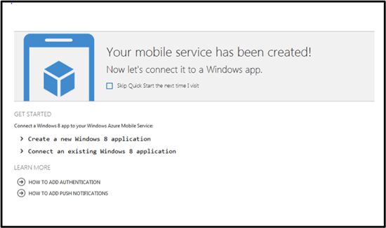

Introducing Windows Azure Mobile Services [by Clint Edmonson from Microsoft, Aug 28, 2012]
…
Features
The preview makes it fast and easy to create cloud services for Windows 8 applications within minutes. Here are the key benefits:
Rapid development: configure a straightforward and secure backend in less than five minutes.
Create modern mobile apps: common Windows Azure plus Windows 8 scenarios that Windows Azure Mobile Services preview will support include:
– Automated Service API generation providing CRUD functionality and dynamic schematization on top of Structured Storage
– Structured Storage with powerful query support so a Windows 8 app can seamlessly connect to a Windows Azure SQL database
– Integrated Authentication so developers can configure user authentication via Windows Live
– Push Notifications to bring your Windows 8 apps to life with up to date and relevant information
Access structured data: connect to a Windows Azure SQL database for simple data management and dynamically created tables. Easy to set and manage permissions.
Pricing
One of the key things that we’ve consistently heard from developers about using Windows Azure with mobile applications is the need for a low cost and simple offer. The simplest way to describe the pricing for Windows Azure Mobile Services at preview is that it is the same as Windows Azure Websites during preview.
What’s FREE?
Run up to 10 Mobile Services for free in a multitenant environment
Free with valid Windows Azure Free Trial
– 1GB SQL Database
– Unlimited ingress
– 165MB/day egress [i.e. data transfers out of a Windows Azure datacenter (also called “bandwidth”)]What do I pay for?
Scaling up to dedicated VMs
Once Windows Azure Free Trial expires – SQL Database and egress

Note that Clint Edmonson has also the following reference architecture diagram for the platform (for the June release of Windows Azure):

See also: Introducing Windows Azure [David Chappel’s OPINARI blog, June 21, 2012]
Windows Azure has been reborn. Along with its original technologies, this cloud platform now provides IaaS (with Windows and Linux), web hosting, support for VPNs, and more. It’s by far the biggest change in Azure since its original 2008 announcement.
I’ve written a Microsoft-sponsored introduction to this new incarnation. It’s on WindowsAzure.com, but if you’d like a direct link, the paper is available here.
Introducing Windows Azure [David Chappell whitepaper v 2.0, May 30, 2012]
… Back in 2008, the very first pre-release version of Windows Azure supported only .NET development. Today, however, you can create Windows Azure applications in pretty much any language. Microsoft currently provides language-specific SDKs for .NET, Java, PHP, Node.js, and Python. There’s also a general Windows Azure SDK that provides basic support for any language, such as C++.
These SDKs help you build, deploy, and manage Windows Azure applications. They’re available either from http://www.windowsazure.com or GitHub, and they can be used with Visual Studio and Eclipse. Windows Azure also offers command line tools that developers can use with any editor or development environment, including tools for deploying applications to Windows Azure from Linux and Macintosh systems.
Along with helping you build Windows Azure applications, these SDKs also provide client libraries that help you create software running outside the cloud that uses Windows Azure services. For example, you might build an application running at a hoster that relies on Windows Azure blobs, or create a tool that deploys Windows Azure applications through the Windows Azure management interface. …
Introducing OData: Data Access for the Web, the Cloud, Mobile Devices, and More [David Chappell whitepaper, May, 2011]
… Open Data Protocol, commonly called just OData … defines an abstract data model and a protocol that let any client access information exposed by any data source. Figure 1 shows some of the most important examples of clients and data sources, illustrating where OData fits in the picture.
As the figure illustrates, OData allows mixing and matching clients and data sources. Some of the most important examples of data sources that support OData today are:
Custom applications: Rather than creating its own mechanism to expose data, an application can instead use OData. Facebook, Netflix, and eBay all expose some of their information via OData today, as do a number of custom enterprise applications. To make this easier to do, OData libraries are available that let .NET Framework and Java applications act as data sources.
Cloud storage: OData is the built-in data access protocol for tables in Microsoft’s Windows Azure, and it’s supported for access to relational data in SQL Azure as well. Using available OData libraries, it’s also possible to expose data from other cloud platforms, such as Amazon Web Services.
Content management software: For example, SharePoint 2010 and Webnodes both have built-in support for exposing information through OData.
Windows Azure Marketplace DataMarket: This cloud-based service for discovering, purchasing, and accessing commercially available datasets lets applications access those datasets through OData.
While it’s possible to access an OData data source from an ordinary browser—the protocol is based on HTTP—client applications usually rely on a client library. As Figure 1 shows, the options supported today include:
Web browsers: JavaScript code running inside any popular Web browser, such as Internet Explorer or Firefox, can access an OData data source. An OData client library is available for Silverlight applications as well, and other rich Internet applications can also act as OData clients.
Mobile phones. OData client libraries are available today for Android, iOS (the operating system used by iPhones and iPads), and Windows Phone 7.
Business intelligence tools: Microsoft Excel provides a data analysis tool called PowerPivot that has built-in support for OData. Other desktop BI tools also support OData today, such as Tableau Software’s Tableau Desktop.
Custom applications: Business logic running on servers can act as an OData client. Support is available today for code created using the .NET Framework, Java, PHP, and other technologies.
The fundamental idea is that any OData client can access any OData data source. Rather than creating unique ways to expose and access data, data sources and their clients can instead rely on the single solution that OData provides.
OData was originally created by Microsoft. Yet while several of the examples in Figure 1 use Microsoft technologies, OData isn’t a Microsoft-only technology. In fact, Microsoft has included OData under its Open Specification Promise, guaranteeing the protocol’s long-term availability for others. While much of today’s OData support is provided by Microsoft, it’s more accurate to view OData as a general purpose data access technology that can be used with many languages and many platforms.
…

and other cloud computing whitepapers from David Chappell:
– Windows Azure Execution Models
– Windows Azure Data Management and Business Analytics
– Windows Azure Networking
– Windows Azure Service Bus
– The Benefits and Risks of Cloud Platforms: A Guide for Business Leaders
– The Windows Azure Programming Model [October, 2010]
– GIS in the Cloud: The ESRI Example
– Windows HPC Server and Windows Azure: High-Performance Computing in the Cloud
– The Microsoft Private Cloud: A Technology Overview
– How SaaS Changes an ISV’s Business: A Guide for ISV Leaders [April 17, 2012]
Videos: How SaaS Changes an ISV’s Business [David Chappel’s OPINARI blog, June 19, 2012]
Some people like to read, others like to watch. If you’re interested in reading about how the move to SaaS changes an ISV’s business, the paper I wrote on the topic is available here. If you’d rather watch, though, there’s also a video series. The programs are:
- How SaaS Changes an ISV’s Business: Assessing the Shift
- How SaaS Changes an ISV’s Business: A Simple Decision Tree
- How SaaS Changes an ISV’s Business: Customers, Pricing, and Revenue
- How SaaS Changes an ISV’s Business: The Sales Process
- How SaaS Changes an ISV’s Business: The Impact of Average Selling Price
- How SaaS Changes an ISV’s Business: Marketing, Software Development, and More
You can watch them in any order, but the order listed above is likely to make the most sense.
Both these videos and the paper they’re based on were sponsored by Microsoft. They’re entirely generic, however, and so there’s no Microsoft-specific content. Instead, they’re intended to be helpful to any existing ISV who’s thinking about creating a SaaS offering.
Getting Started with Windows Azure Mobile Service [windowsazure YouTube channel, Aug 28, 2011]
Announcing Windows Azure Mobile Services [Scott Guthrie’s blog, Aug 28, 2012]
… I’m excited to announce a new capability we are adding to Windows Azure today: Windows Azure Mobile Services
Windows Azure Mobile Services makes it incredibly easy to connect a scalable cloud backend to your client and mobile applications. It allows you to easily store structured data in the cloud that can span both devices and users, integrate it with user authentication, as well as send out updates to clients via push notifications.
Today’s release enables you to add these capabilities to any Windows 8 app in literally minutes, and provides a super productive way for you to quickly build out your app ideas. We’ll also be adding support to enable these same scenarios for Windows Phone, iOS, and Android devices soon.
Read this getting started tutorial to walkthrough how you can build (in less than 5 minutes) a simple Windows 8 “Todo List” app that is cloud enabled using Windows Azure Mobile Services. Or watch this video of me showing how to do it step by step.
…
Storing Data in the Cloud
Storing data in the cloud with Windows Azure Mobile Services is incredibly easy. When you create a Windows Azure Mobile Service, we automatically associate it with a SQL Database inside Windows Azure. The Windows Azure Mobile Service backend then provides built-in support for enabling remote apps to securely store and retrieve data from it (using secure REST end-points utilizing a JSON-based ODATA format) – without you having to write or deploy any custom server code. Built-in management support is provided within the Windows Azure portal for creating new tables, browsing data, setting indexes, and controlling access permissions.
This makes it incredibly easy to connect client applications to the cloud, and enables client developers who don’t have a server-code background to be productive from the very beginning. They can instead focus on building the client app experience, and leverage Windows Azure Mobile Services to provide the cloud backend services they require.
…
User Authentication and Push Notifications
Windows Azure Mobile Services also make it incredibly easy to integrate user authentication/authorization and push notifications within your applications. You can use these capabilities to enable authentication and fine grain access control permissions to the data you store in the cloud, as well as to trigger push notifications to users/devices when the data changes. Windows Azure Mobile Services supports the concept of “server scripts” (small chunks of server-side script that executes in response to actions) that make it really easy to enable these scenarios.
…
Manage and Monitor your Mobile Service
Just like with every other service in Windows Azure, you can monitor usage and metrics of your mobile service backend using the “Dashboard” tab within the Windows Azure Portal.
The dashboard tab provides a built-in monitoring view of the API calls, Bandwidth, and server CPU cycles of your Windows Azure Mobile Service. You can also use the “Logs” tab within the portal to review error messages. This makes it easy to monitor and track how your application is doing.
Scale Up as Your Business Grows
Windows Azure Mobile Services now allows every Windows Azure customer to create and run up to 10 Mobile Services in a free, shared/multi-tenant hosting environment (where your mobile backend will be one of multiple apps running on a shared set of server resources). This provides an easy way to get started on projects at no cost beyond the database you connect your Windows Azure Mobile Service to (note: each Windows Azure free trial account also includes a 1GB SQL Database that you can use with any number of apps or Windows Azure Mobile Services).
…
Summary
I’ve only scratched the surface of what you can do with Windows Azure Mobile Services – there are a lot more features to explore.
With Windows Azure Mobile Services you’ll be able to build mobile app experiences faster than ever, and enable even better user experiences – by connecting your client apps to the cloud.
Visit the Windows Azure Mobile Services development center to learn more, and build your first Windows 8 app connected with Windows Azure today. And read this getting started tutorial to walkthrough how you can build (in less than 5 minutes) a simple Windows 8 “Todo List” app that is cloud enabled using Windows Azure Mobile Services.
Hope this helps,
Scott
…
Tuesday, August 28, 2012 4:14 PM by ScottGu
@Vlad/@Mark,
>>>>>> Do you plan to offer HTTP/REST API as well at some point?We are going to publish documentation for the HTTP REST APIs shortly – which will make it easy for anyone to consume them from any platform. We’ll then provide pre-built REST helper methods for Win8/iOS/Android/others for those who want to work with language libraries as opposed to raw REST ones.
Tuesday, August 28, 2012 4:16 PM by ScottGu
@FDanconia,
>>>>>> When you say “Windows 8 app”, do you mean a Metro app, or a Desktop app, or both?The language libraries we are providing today work with WinRT – so you’d use them within Windows 8 Store Apps. But the underlying features can be accessed by any app using the REST APIs (including desktop ones).
…
Tuesday, August 28, 2012 4:21 PM by ScottGu
@Michael,
>>>>>>> Just curious – why is this offering specific to SQL Azure? I would have expected out-of-the-box support for blobs (for example, json/xml documents) and/or table storage. Seems like cost-wise, it would be much cheaper/easier to scale as well.We’ve heard from a lot of people who want richer querying capabilities and indexing over large amounts of data – which SQL is very good at. The pricing tier of SQL Azure is also pretty good.
We will also support unstructured storage in the future so if you don’t need rich querying you can use that too.
Tuesday, August 28, 2012 4:24 PM by ScottGu
@Jeff,
>>>>>> I am confused. Scalability, user management, structured data – all of the features, with the arguable exception of push notifications, are useful for all types of applications. What about this is “mobile”?We support all of those capabilities with other Azure features today as well (web-sites, storage, databases, cloud services, etc). You can also build your own mobile backends today using those existing features/capabilities to power your mobile clients.
The reason we are introducing Windows Azure Mobile Services is because a lot of developers don’t have the time/skillset/inclination to have to build a custom mobile backend themselves. Instead they’d like to be able to leverage an existing solution to get started and then customize/extend further only as needed when their business grows. Azure Mobile Services makes it really easy for them to do this – while preserving the ability to easily extend it with other azure features in the future.
…
Wednesday, August 29, 2012 11:00 AM by ScottGu
@azureuser,
>>>>>> Excited about the release and have a couple of questions:
>>>>> – Do you plan to expose a management API for the Mobile Services? When?
>>>>> – What other capabilities are are you thinking of adding to the product?Yes – we plan to expose a management API (as well as command-line management support) in the future. We’ll post more details about future features as they become available.
Wednesday, August 29, 2012 11:01 AM by ScottGu
@Michael,
>>>>>>> Does Azure Mobile Services allow you to grow into more complex scenarios? For example WCF RIA Services allow you to create a more coarse grained API over your data model. Will we be able to hook into the pipeline or is it a pure CRUD proxy generator over a database?Mobile Services does allow you to plug-into the server pipeline and do pretty course grained permissions and filtering. I’d recommend looking at the server-scripts capability to learn more about this.
…
Wednesday, August 29, 2012 11:08 AM by ScottGu
@Mahesh,
>>>>>> How is it different than ASP.Net Web API? When to use which?Any guidance coming out?You can think of Windows Azure Mobile Services as providing a pre-built set of Web APIs that provide common functionality that you need to build mobile apps. The benefit of using this pre-built functionality is that you don’t need to write it yourself.
ASP.NET Web API is then what you’d use when you do want to write it yourself – or extend the built-in set of Azure Mobile Services with additional custom functionality.
The good news is that they are composeable and use the same REST/OData semantics. In fact, for the C#/XAML library we ship we use the client-side Web API library to call the Windows Azure Mobile Services REST endpoints.
…


Plans call for Windows Azure Mobile Services to soon add support for Windows Phone, Apple iOS, and Google Android devices. “It allows you to easily store structured data in the cloud that can span both devices and users, integrate it with user authentication, and send out updates to clients via push notifications.” – Scott Guthrie. Additionally as per Microsoft looks to simplify adding Azure cloud support to Windows 8 apps [ZDnet, Aug 28, 2012]:
… the new Azure Mobile Services capability is going to supersede the multiplatform mobile toolkits, a spokesperson confirmed. Here’s the official statement:
“The Windows Azure mobile toolkits [i.e. Windows Azure Toolkit for Windows Phone [Nov 29, 2011], Windows Azure Toolkit for iOS [July 16, 2012] and Windows Azure Toolkit for Android [May 23, 2012]] were the first iteration of support for the Mobile + Cloud scenario. We have incorporated the learnings and feedback from those efforts into Windows Azure Mobile Services. Future improvements will be channeled into Windows Azure Mobile Services rather than the original mobile toolkits.”
Update:
Xamarin partners with Microsoft to support Windows Azure Mobile Services on Android and iOS [Xamarin blog, Sept 20, 2012]
Our friends at Microsoft recently introduced Windows Azure Mobile Services, a cloud platform that provides a scalable backend for mobile applications. It’s an easy way to add login capabilities and remote data storage to your application without building your own backend.
We are really pleased to announce that we have partnered with Microsoft to bring Mobile Services to iOS and Android developers, enabling them to easily use Microsoft’s cloud service from a common C# code base. While we have long enjoyed a productive relationship with Microsoft, we are excited to collaborating with Microsoft at a new level and to help Windows Azure Mobile Services and Microsoft reach additional platforms.
We are making a preview of our cross-platform Azure Mobile Services client framework available today on GitHub under a permissive open source software license. The framework, which is a port of Microsoft’s own Mobile Services client library, will make it easy for developers to use Microsoft’s hosted backend in their Xamarin-powered Android and iOS applications. You can start using it today in your own projects.
Azure Mobile Services offers elastic scalability, allowing you to get the capacity that you need as the popularity of your application grows. The client framework takes advantage of your favorite C# features to simplify data storage and retrieval. For example, you can access your remote data with LINQ queries instead of crafting your own REST API calls. Instead of dealing with a schema and parsing database output, you use attributes to associate remote data fields with class properties.
The following code snippet from a simple todo list application demonstrates how to retrieve database entries that match a specific condition:
publicclassTodoItem
{
publicintId {get;set; }
[DataMember (Name ="text")]
publicstringText {get;set; }
[DataMember (Name ="complete")]
publicboolComplete {get;set; }
}
...
this.table = MobileService.GetTable<TodoItem>();
this.table.Where (ti => !ti.Complete).ToListAsync()
.ContinueWith (t => {this.items = t.Result; }, scheduler);With Xamarin and Azure Mobile Services, you can write your database logic once and use it across platforms. The code above will work seamlessly across iOS, Android, and Windows.
In addition to data storage and retrieval, Azure Mobile Services also supports simple account management. It allows you to authenticate your users against their Windows Live identity, sparing you the trouble of having to build and maintain your own account system.
Mobile Services for Xamarin gives you cross-platform support for the data storage and authentication features. We welcome code contributions from the community and would love to hear about the apps you’re building that leverage Windows Azure Mobile Services.
To learn more about the framework and how you can put it to use in your own applications, check out code samples. For more information about Mobile Services, you can visit the official Windows Azure blog or dev center.
Overview of Xamarin: Build iOS and Android Apps in C# [July 24, 2012]
Explore the features that make Xamarin great for mobile app development
Native APIs, Native UIs, No Compromises
Xamarin provides complete access to each platform’s native SDK and UI controls, projecting the entire native API of each device into C#. So the apps you create are native, not write-once/run-anywhere applications that look alien on every platform. Xamarin gives you access to all of the features that make each platform unique. The result is mobile app nirvana.
Watch this video to see the power of the native APIs.
High Performance
Unlike other cross-platform frameworks, with Xamarin, your app is compiled to a native binary, not interpreted. Native compilation gives users brilliant app performance for even the most demanding scenarios like high frame rate gaming and complex data visualizations. With a small footprint (2.5 MB added to your application code), and negligible impact to app startup time, you can build apps that run faster, wherever they run.
Check out this video and our app showcase to see for yourself.
Share code between platforms
A significant portion of the functionality and development time invested in your mobile app exists in business logic, data access and network communications. With Xamarin, you can share all of code between platforms, while still delivering a device-specific, native user interface. Xamarin lets you run the same C# code on iOS and Android, as well as Windows Phone, which comes with C# built-in.
Watch this video to see an example of the same database, network and business code shared across an iOS and Android app.
Write beautiful code with C#
Write shorter, more succinct, and more maintainable code leveraging advanced language features such as Language Integrated Query (LINQ), delegates, lambdas, events, garbage collection and many other features.
Watch this video to see a side-by-side comparison of C# against Objective-C and see the advantages of the Xamarin over Java on Android.
Powerful IDE
Use Xamarin’s cross-platform IDE, MonoDevelop,
or write your code with Visual Studio.Point-and-click UI design
Xamarin leverages native layout formats for iOS and Android, and enables user interfaces to be built quickly with drag-and-drop simplicity. Xamarin integrates with Xcode’s Interface Builder, allowing you to create iOS UIs with the tools Apple provides. On Android, the Xamarin Designer is the world’s best tool for generating Android user interfaces, allowing you to target multiple screen sizes and orientations among other features.
Watch this video to see how you can generate amazing, native userinterfaces in no time.
Explore native APIs quickly with code completion
Code completion in C# gives you a huge productivity boost by enabling you to explore the giant landscape of native iOS and Android APIs while you type. Quickly find the type or method you are looking for, and discover new options without breaking your train of thought.
Watch this video to see how quick and easy it is to build appfunctionality with autocomplete.
Advanced debugger
Unlike almost any other mobile app framework, Xamarin gives you the full power of a modern debugger, in the simulator and on device. You can debug from MonoDevelop or from Visual Studio. Set breakpoints, watchpoints, single-step through code, hover over variable to see their values and take advantage of many other world-class debugging capabilities.
Watch this video to see debugging in action.
Easy app deployment
With Xamarin, you can package and distribute your apps from directly within the IDE. On iOS, we include integrated support to distribute internal appsover the air with TestFlight.
Watch this video to see these deployment options in action.
The Xamarin Advantage
Platform Extensibility
Add virtually any functionality to your apps. Your apps can incorporate libraries written in C, Objective-C, C++ or Java. Watch this video to see how the entire native ecosystem is available to in your apps.
Stay Current
Xamarin always stays up-to-date with the latest APIs from Apple and Google so you can incorporate the latest features in your apps. We are committed to fast platform updates so that you can stay focused on what you do best — building great apps!
Get Started Today

Introduction to Mobile Development [Xamarin, Aug 29, 2012]
…
Introduction to Xamarin
When considering how to build iOS and Android applications, many people think that the indigenous languages, Objective-C and Java, respectively, are the only choices. However, over the past few years, an entire new ecosystem of platforms for building mobile applications has emerged. These new solutions include Xamarin, and HTML solutions such as PhoneGap and Appcelerator, etc., just to name a couple.
Xamarin is unique in this space by offering a single language (C#), a class library, and a runtime that work across all three mobile platforms of iOS, Android, and Windows Phone (Windows Phone’s indigenous language is already C#), while still compiling native (non-interpreted) applications that are performant enough even for demanding games.
Each of these platforms has a different feature set and each varies in its ability to write native applications–that is, applications that compile down to native code and that interoperate fluently with the underlying Java subsystem. For example, some platforms only allow you to build apps in HTML and JavaScript (such as Appcelerator and PhoneGap), whereas some are very low level and only allow C/C++ code. Some platforms (such as Flash) don’t even utilize the native control toolkit.
Xamarin is unique in that it combines all of the power of the indigenous platforms and adds a number of powerful features of its own, including:
Complete Binding for the Indigenous SDKs – Xamarin contains bindings for nearly the entire underlying platform SDKs in both iOS and Android. Additionally, these bindings are strongly typed, which means that they’re easy to navigate and use, and provide robust compile-time type checking and auto completion during development. This leads to fewer runtime errors and higher quality applications.
Objective-C, Java, C, and C++ Interop – Xamarin provides facilities for directly invoking Objective-C, Java, C, and C++ libraries, giving you the power to use a wide array of 3rd party code that has already been created. This lets you take advantage of existing iOS and Android libraries written in Objective-C, Java, or C/C++. Additionally, Xamarin offers binding projects that allow you to easily bind native Objective-C and Java libraries by using a declarative syntax.
Modern Language Constructs – Xamarin applications are written in C#, a modern language that includes significant improvements over Objective-C and Java such as Dynamic Language Features, Functional Constructs such as Lambdas, LINQ, Parallel Programming features, sophisticated Generics, and more.
Amazing Base Class Library (BCL) – Xamarin applications use the .NET BCL, a massive collection of classes that have comprehensive and streamlined features such as powerful XML, Database, Serialization, IO, String, and Networking support, just to name a few. Additionally, existing C# code can be compiled for use in your applications, which provides access to thousands upon thousands of libraries that will let you do things that aren’t already covered in the BCL.
Modern Integrated Development Environment (IDE) – Xamarin uses MonoDevelop on Mac OSX, and also MonoDevelop or Visual Studio 2010 on Windows. These are both modern IDE’s that include features such as code auto completion, a sophisticated Project and Solution management system, a comprehensive project template library, integrated source control, and many other options.
Mobile Cross Platform Support – Xamarin offers sophisticated cross-platform support for the three major mobile platforms of iOS, Android, and Windows Phone. Applications can be written to share up to 90% of their code, and our Xamarin.Mobile library offers a unified API to access common resources across all three platforms. This can significantly reduce both development costs and time to market for mobile developers that target the three most popular mobile platforms.
Because of Xamarin’s powerful and comprehensive feature set, it fills a void for application developers that want to use a modern language and platform to develop cross-platform mobile applications.
Note:
This Getting Started series focuses on teaching you how to build iOS and Android applications. If you’re interested in building for Windows Phone, Microsoft offers tutorials here. If you’re interested in learning more about cross-platform development with Xamarin (including Windows Phone), you can find our guide here.
Let’s take a look at how this all works.
How Does Xamarin Work?
Xamarin offers two commercial products, Xamarin.iOS and Xamarin.Android, also known as MonoTouch and Mono for Android, respectively. They’re both built on top of Mono, an open-source version of the .NET Framework based on the published .NET ECMA standards. Mono has been around almost as long as the .NET framework itself, and runs on nearly every imaginable platform, including Linux, Unix, FreeBSD, and Mac OSX.
On iOS, Xamarin’s Ahead-of-Time (AOT) compiler compiles Xamarin.iOS applications directly to native ARM assembly code. On Android, Xamarin’s compiler compiles down to Intermediate Language (IL), which is then Just-in-Time (JIT) compiled to native assembly when the application launches.
In both cases, Xamarin applications utilize a runtime that automatically handles things such as memory allocation, garbage collection, underlying platform interoperability, etc.
MonoTouch.dll and Mono.Android.dll
Xamarin applications are built against a subset of the .NET BCL known as the Xamarin Mobile Profile. This profile has been created specifically for mobile applications and packaged in the MonoTouch.dll and Mono.Android.dll (for iOS and Android, respectively). This is much like the way Silverlight (and Moonlight) applications are built against the Silverlight/Moonlight .NET Profile. In fact, the Xamarin Mobile profile is equivalent to the Silverlight 4.0 profile with a bunch of BCL classes added back in.
For a full list of available assemblies and classes, see the MonoTouch Assembly List and the Mono for Android Assembly List.
In addition to the BCL, these .dlls include wrappers for nearly the entire iOS SDK and Android SDK. Availability of these libraries allows you to invoke the underlying SDK APIs directly from C#.
Note:
Xamarin applications are compiled against the Xamarin Mobile profile, just like Silverlight/Moonlight apps are compiled against theirs. This means that you cannot use off-the-shelf .NET assemblies without recompiling the C# source against the Xamarin Mobile profile.
Application Output
When Xamarin applications are compiled, the result is an Application Package, either an .app file in iOS, or an .apk file in Android. These files are indistinguishable from indigenous application packages and are deployable in the exact same way.
…
Building Cross Platform Applications [Xamarin documentation, July 21, 2012]
Best Practices for Developing Mobile Applications with Xamarin
…
Overview
This guide introduces the Xamarin platform and how to architect a cross-platform application to maximize code re-use and deliver a high-quality native experience on all of the main mobile platforms: iOS, Android and Windows Phone.
The approach used in this document is generally applicable to both productivity apps and game apps, however the focus is on productivity and utility (non-game applications). See the [Introduction to MonoGame document] for cross-platform game development guidance.
The phrase “write-once, run everywhere” is often used to extol the virtues of a single codebase that runs unmodified on multiple platforms. While it has the benefit of code re-use, that approach often leads to applications that have a lowest-common-denominator feature-set and a generic-looking user interface that does not fit nicely into any of the target platforms.
Xamarin is not just a “write-once, run everywhere” platform, because one of its strengths is the ability to implement native user interfaces specifically for each platform. However, with thoughtful design it’s still possible to share most of the non-user interface code and get the best of both worlds: write your data storage and business logic code once, and present native UIs on each platform. This document discusses a general architectural approach to achieve this goal.
Here is a summary of the key points for creating Xamarin cross-platform apps:
Use C# – Write your apps in C#. Existing code written in C# can be ported to iOS and Android using Xamarin very easily, and obviously used on Windows Phone.
Utilize the MVC design pattern – Develop your application’s User Interface using the Model/View/Controller pattern. Architect your application using a Model/View/Controller approach or a Model/View/ViewModel approach where there is a clear separation between the “Model” and the rest. Determine which parts of your application will be using native user interface elements of each platform (iOS, Android, Windows Phone and Windows 8/RT) and use this as a guideline to split your application into two components: “Core” and “UserInterface”.
Build native UIs – Each OS-specific application provides a different user-interface layer (implemented in C# with the assistance of native UI design tools):
1. On iOS use the MonoTouch.UIKit APIs to create native-looking applications, optionally utilizing Apple’s Interface Builder.
2. On Android, use Android. Views to create native-looking applications, taking advantage of Xamarin’s UI designer
3. On Windows Phone you will be using the XAML/Silverlight presentation layer, using Visual Studio or Blend’s UI designer
4. On Windows 8, use the Metro APIs to create a native user experience.
The amount of code re-use will depend largely on how much code is kept in the shared core and how much code is user-interface specific. The core code is anything that does not interact directly with the user, but instead provides services for parts of the application that will collect and display this information.
To increase the amount of code re-use, you can adopt cross-platform components that provide common services across all these systems such as:
• SQLite-NET for local SQL storage,
• Xamarin.Mobile for accessing device-specific capabilities including the camera, contacts and geolocation,
• Using framework features for networking, web services, IO and more.
Some of these components are implemented in the Tasky Pro and MWC 2012 case studies.
SEPARATE REUSABLE CODE INTO A CORE LIBRARY
By following the principle of separation of responsibility by layering your application architecture and then moving core functionality that is platform agnostic into a reusable core library, you can maximize code sharing across platforms, as the figure below illustrates:
CASE STUDIES
There are two case studies that accompany this document – Tasky Pro and MWC 2012. Each case study discusses the implementation of the concepts outlined in this document in a real-world example. The code is open source and available on github.

Understanding the Xamarin Mobile Platform
The Xamarin platform consists of a number of elements that allow you to develop applications for iOS and Android:
C# language – Allows you to use a familiar syntax and sophisticated features like Generics, Linq and the Parallel Task Library.
Mono .NET framework – Provides a cross-platform implementation of the extensive features in Microsoft’s .NET framework.
Compiler – Depending on the platform, produces a native app (eg. iOS) or an integrated .NET application and runtime (eg. Android). The compiler also performs many optimizations for mobile deployment such as linkingaway un-used code.
IDE tools – The MonoDevelop IDE and the Xamarin plug-in for Visual Studio allow you to create, build and deploy Xamarin projects.
In addition, because the underlying language is C# with the .NET framework, projects can be structured to share code that can also be deployed to Windows Phone.
Under the Hood
Although Xamarin allows you to write apps in C#, and share the same code across multiple platforms, the actual implementation on each system is very different.
COMPILATION
The C# source makes its way into a native app in very different ways on each platform:
iOS – C# is ahead-of-time (AOT) compiled to ARM assembly language. The .NET framework is included, with unused classes being stripped out during linking to reduce the application size. Apple does not allow runtime code generation on iOS, so some language features are not available (see MonoTouch Limitations).
Android – C# is compiled to IL and packaged with MonoVM + JIT’ing. Unused classes in the framework are stripped out during linking. The application runs side-by-side with Java/Dalvik and interacts with the native types via JNI (see Mono for Android Limitations).
Windows Phone – C# is compiled to IL and executed by the built-in runtime, and does not require Xamarin tools. Designing Windows Phone applications following Xamarin’s guidance makes it simpler to re-use the code on iOS and Android.
The linker documentation for MonoTouch and Mono for Android provides more information about this part of the compilation process.
PLATFORM SDK ACCESS
Xamarin makes the features provided by the platform-specific SDK easily accessible with familiar C# syntax:
iOS – MonoTouch exposes Apple’s CocoaTouch SDK frameworks as namespaces that you can reference from C#. For example the UIKit framework that contains all the user interface controls can be included with a simple
using MonoTouch.UIKit; statement. Android – Mono for Android exposes Google’s Android SDK as namespaces, so you can reference any part of the supported SDK with using statement, such as using Android.Views; to access the user interface controls.
Windows Phone – Windows Phone is not part of the Xamarin platform. When building apps for Windows Phone in C# the SDK is implicitly available to your application, including Silverlight/XAML controls for the user interface.
SEAMLESS INTEGRATION FOR DEVELOPERS
The beauty of Xamarin is that despite the differences under the hood, MonoTouch and Mono for Android (coupled with Microsoft’s Windows Phone SDK) offer a seamless experience for writing C# code that can be re-used across all three platforms.
Business logic, database usage, network access and other common functions can be written once and re-used on each platform, providing a foundation for platform-specific user interfaces that look and perform as a native application.
Integrated Development Environment (IDE) Availability
Xamarin development can be done in either MonoDevelop or Visual Studio. The IDE you choose will be determined by the platforms you wish to target.
Because iOS apps can only be developed on a Mac, and Windows Phone apps can only be developed on Windows, it is impossible to develop for all three platforms on the same operating system. However following the guidance in this document it is possible to reuse code across all these platforms.
The development requirements for each platform are discussed in more detail below.
IOS
Developing iOS applications requires a Mac computer, running Mac OS X.
Apple’s Xcode IDE must be installed to provide the compiler and simulator for testing. To test on a real device and submit applications for distribution you must join Apple’s Developer Program ($99 USD per year). Each time you submit or update an application it must be reviewed and approved by Apple before it is made available for customers to download.
Code is written with Xamarin’s MonoDevelop IDE and screen layouts can be edited with Apple’s Interface Builder. Refer to the MonoTouch Installation Guide for detailed instructions.
ANDROID
Android application development requires the Java and Android SDKs to be installed. These provide the compiler, emulator and other tools required for building, deployment and testing. Java, Google’s Android SDK and Xamarin’s tools can all be installed and run on the following configurations:
Mac OS X with the MonoDevelop IDE
Windows 7 or 8 with the MonoDevelop IDE
Windows 7 or 8 with Visual Studio 2010 or Visual Studio 2012
Xamarin provides a unified installer that will configure your system with the prerequisite Java, Android and Xamarin tools (including a visual designer for screen layouts). Refer to the Mono for Android Installation Guide for detailed instructions.
You can build and test applications on a real device without any license from Google, however to distribute your application through a store (such as Google Play, Amazon or Barnes & Noble) a registration fee may be payable to the operator. Google Play will publish your app instantly, while the other stores have an approval process similar to Apple’s.
WINDOWS PHONE
Windows Phone apps are built with Microsoft’s Visual Studio 2010 or 2012 toolset. They do not use Xamarin directly, however C# code can be shared with across Windows Phone, iOS and Android using Xamarin’s tools. Visit Microsoft’s App Hub to learn about the tools required for Windows Phone development.
Creating the User Interface (UI)
A key benefit of using Xamarin is that the application user interface uses native controls on each platform and is therefore indistinguishable from an application written in Objective-C or Java (for iOS and Android respectively).
When building screens in your app, you can either lay out the controls in code or create complete screens using the design tools available for each platform.
PROGRAMMATICALLY CREATE CONTROLS
Each platform allows user interface controls to be added to a screen using code. This can be very time-consuming as it can be difficult to visualize the finished design when hard-coding pixel coordinates for control positions and sizes.
Programmatically creating controls does have benefits though, particularly on iOS for building views that resize or render differently across the iPhone and iPad screen sizes.
VISUAL DESIGNER
Each platform has a different method for visually laying out screens:
iOS – MonoDevelop integrates with Apple’s Xcode Interface Builder which allows you to create individual screen layouts or storyboards that describe multiple screens. This results in .XIB or .STORYBOARD files that are included in your project.
Android – Xamarin provides an Android drag-and-drop UI designer for both MonoDevelop and Visual Studio. Android screen layouts are saved as .AXML files when using Xamarin tools.
Windows Phone – Microsoft provides a drag-and-drop UI designer in Visual Studio and Blend. The screen layouts are stored as .XAML files.
These screenshots show the visual screen designers available on each platform:
iOS:
Android:
Windows Phone:
In all cases the elements that you create visually can be referenced in your code.
USER INTERFACE CONSIDERATIONS
A key benefit of using Xamarin to built cross platform applications is that they can take advantage of native UI toolkits to present a familiar interface to the user. The UI will also perform as fast as any other native application.
Some UI metaphors work across multiple platforms (for example, all three platforms use a similar scrolling-list control) but in order for your application to ‘feel’ right the UI should take advantage of platform-specific user interface elements when appropriate. Examples of platform-specific UI metaphors include:
iOS – hierarchical navigation with soft back button, tabs on the bottom of the screen.
Android – hardware/system-software back button, action menu, tabs on the top of the screen.
Windows Phone – hardware back button, panorama layout control, live tiles.
It is recommended that you read the design guidelines relevant to the platforms you are targeting:
iOS – Apple’s Human Interface Guidelines
Android – Google’s User Interface Guidelines
Windows Phone – User Experience Design Guidelines for Windows Phone
Library and Code Re-use
The Xamarin platform allows re-use of existing C# code across all platforms as well as the integration of libraries written natively for each platform.
C# SOURCE AND LIBRARIES
Because Xamarin products use C# and the .NET framework, lots of existing source code (both open source and in-house projects) can be re-used in MonoTouch or Mono for Android projects. Often the source can simply be added to a Xamarin solution and it will work immediately. If an unsupported .NET framework feature has been used, some tweaks may be required.
…


Our mission is to produce the best software development tools in the world, and to make it fast, easy and fun to build great mobile apps.
Xamarin was founded in May 2011 and is headquartered in San Francisco, with an engineering office in Cambridge, MA.
Nat Friedman
CEO
An entrepreneur and developer, Nat is passionate about building products that delight customers, with love and attention to detail. Nat has two degrees from MIT and has been writing software for 27 years. In 1999, he co-founded Ximian with Miguel. Nat was a co-founder and chairman of the GNOME foundation. At Novell Nat ran engineering for a $110M product and served as CTO of the Linux business. Nat is an avid traveler who visited 20 countries in 2010, an active angel investor, and a private pilot.
Blog | @natfriedman
Miguel de Icaza
CTO
Miguel has directed the Mono project since its creation in 2001 and oversaw the launches of Mono’s desktop, server and mobile offerings at Novell. Before Mono he started writing free software in 1992 and co-founded the GNOME project in 1997. In 1999 Miguel co-founded Ximian with Nat. He also worked on the Midnight Commander file manager, Gnumeric, and the Linux kernel. He serves as an advisor at Stack Exchange. He has received the Free Software Foundation 1999 Free Software Award, the MIT Technology Review Innovator of the Year Award in 1999, and was named one of Time Magazine’s 100 innovators for the new century in September 2000.
Blog | @migueldeicaza
Joseph Hill
COO
Joseph has been an active participant in the Mono community since 2003, and has also been an active contributor to several open source .NET applications. As a professional developer, he has done significant work in design and implementation of .NET applications for a number of customers including Fortune 50 companies in areas such as messaging solutions, supply chain management, and others. In January 2008, Joseph joined Novell to serve as the Product Manager for Mono, ultimately driving the product development and marketing efforts to launch MonoTouch and Mono for Android.
Blog | @JosephHill
End of update
Connecting an iOS Client to Windows Azure Websites [Chris Risner YouTube channel, Sept 4, 2012]
MobileServices-iOS-Client [WindowsAzure-Samples on GitHub, Sept 6, 2012]
This is an iOS application which demonstrates how to connect to Windows Azure Mobile Services. The client has a dependency on setting up a Mobile Service in the Windows Azure portal. The application allows users to view a list of todo items, mark them as complete, and add new ones. This sample was built using XCode and the iOS Framework.
Windows Azure Mobile Services and iOS [Chris Risner from Microsoft, Aug 30, 2012]
As mentioned yesterday by me, and half the internet, Windows Azure Mobile Services has been launched. Already people have started talking about how fast and easy it is to use Mobile Services as a backend. One thing that I highlighted and that others have pointed out is that official support for iOS, Android, and Windows Phone 8 is coming. This means that if you want to download and install pre-built REST helper methods for your non-Windows 8 operating system, you’ll have to wait. However, since all of the calls to Mobile Services are being done over HTTP and are REST based, it’s pretty easy to see what each call sends over the wire. This means that we can take that information and write our own code that will run on iOS and Android and hit Mobile Services.
Today, I’ll start to show you how to do just that. In this article, we’ll walk through creating a new Mobile Service and then connecting an iOS client to it. We’ll only use some basic data capabilities provided by Mobile Services but in the coming weeks, I’ll show you how to watch the HTTP calls made by a Windows 8 app (so you can figure out what’s going across the wire) and then how to reproduce some of the more advanced things in both iOS and Android. By the end of this walkthrough, we’ll have reproduced in an iOS client, all of the capabilities of the initial Todos Windows 8 Mobile Services demo. You’ll be able to add new todos, list those todos, and mark todos complete. Let’s get started.
If you want to dive into the source code without going through the whole tutorial, you can access the source code on GitHub.
Creating a new Mobile Service
In order to create a Mobile Service, you first need to have a Windows Azure account. You can sign for a free trial here. This free trial is good for three months of access. Once you’ve done that, log into your account, and go to the Account Center. From there, access the preview features area of the site. There you’ll see a button to “try it now”.
…
The Windows 8 Client?
If you have a computer running Windows 8 as well, I would suggest following the instructions for creating “a new Windows 8 application” seen above. We’ve already created the table, but following those steps will enable you to download a Visual Studio solution that is 100% ready to run and you can see how the basic todos app runs. It’s not necessary for proceeding with the iOS client, but it means that you can already have a few todos in your database. Either way, we can proceed to the iOS client now.
Starting the iOS Client
Start up Xcode and create a new project. For this demo, we’ll just create a Single View Application. You can name your project whatever you want (I’ve named mine, “mymobileservice”). Start by going into theMainStoryboard.storyboard. You should see the default storyboard with a single view controller.
…
Conclusion
While official support for anything except Windows 8 is coming, you don’t have to wait to make use of Windows Azure Mobile Services. As seen here, the Mobile Services end points are just looking for data to come across in JSON format and only expect you to send over a single additional header (X-ZUMO-APPLICATION). Today we’ve only looked at a small piece of what you can do with data, as there is much more. I’ll tackle some of those more advanced things in the coming weeks. I’ll also go through how to inspect the HTTP traffic going across the wire from a Windows 8 app so you can see what’s going and how to call into Mobile Services. As a reminder, if you’re looking to test out Mobile Services, sign up for a free Windows Azure account here.
Connecting an Android Client to Windows Azure Websites [Chris Risner YouTube channel, Sept 4, 2012]
Mobile Services – The Android Client [WindowsAzure-Samples on GitHub, Sept 6, 2012]
This is an Android application which demonstrates how to connect to Windows Azure Mobile Services. The client has a dependency on setting up a Mobile Service in the Windows Azure portal. The application allows users to view a list of todo items, mark them as complete, and add new ones. This sample was built using Eclipse and the Android SDK.
Windows Azure Mobile Services and Android [Chris Risner from Microsoft, Aug 30, 2012]
After posting yesterday about connecting Windows Azure Mobile Services and iOS, I had to follow it up with Android! Today, I’m happy to release this walkthrough for connecting Android to Mobile Services. If you read my post from earlier this week on Mobile Services, you’d know that official support for iOS, Android, and Windows Phone 8 is coming. This means that if you want to download and install pre-built REST helper methods for your non-Windows 8 operating system, you’ll have to wait. However, since all of the calls to Mobile Services are being done over HTTP and are REST based, it’s pretty easy to see what each call sends over the wire. This means that we can take that information and write our own code that will run on Android and iOS and hit Mobile Services.
Today, I’ll continue showing you how to do just that. In this article, we’ll walk through creating a new Mobile Service and then connecting an Android client to it. We’ll only use some basic data capabilities provided by Mobile Services but in the coming weeks, I’ll show you how to watch the HTTP calls made by a Windows 8 app (so you can figure out what’s going across the wire) and then how to reproduce some of the more advanced things in both iOS and Android. By the end of this walkthrough, we’ll have reproduced in an Android client, all of the capabilities of the initial Todos Windows 8 Mobile Services demo. You’ll be able to add new todos, list those todos, and mark todos complete. Let’s get started.
If you want to dive into the source code without going through the whole tutorial, you can access the source code on GitHub.
…
More information:
-
- Windows Azure Mobile Services Dev Center[Aug 27, 2012]
- Windows Azure Mobile Services Preview Walkthrough–Part 1: Windows 8 ToDo Demo Application (C#)
- Windows Azure Mobile Services Preview Walkthrough–Part 2: Authenticating Windows 8 App Users (C#)
- Windows Azure Mobile Services Preview Walkthrough–Part 3: Pushing Notifications to Windows 8 Users (C#)
- Understanding the pipeline (and sending complex objects into Mobile Services)
- Mobile Services Reference Documentation
- (Windows) Azure Mobile Services: For Those Who Just Want To Code
- Learn about Windows Azure Mobile Services
- How I wrote and deployed a cloud powered app in just six days
- Channel 9 Video – Windows Azure Mobile Services
Application Craft: a multiplatform rapid development system and SaaS for HTML5 et al
Application Craft – our one minute overview [Oct 29, 2011]
Check out our fantastic one minute video. It shows you just some of the great development features available.
Related information: Microsoft and jQuery Mobile, PhoneGap [Oct 13, 2011]
More information:
– New website [Nov 4, 2011]
– Technology
– Features
– How our system works [Nov 9, 2011]
– Example SmartSites (=websites for smartphones, their core value proposition) in the Content ideas: Location Specific Web Sites, Retail, Publishing and Other
– Use cases in App Dev – Build Web, Mobile and Tablet Apps: Mobile, Workflow, Forms, Reporting, Mashups and Features for that
[this is called by them AppOps – their developer value proposition – meaning: “a substantial set of developer oriented functionality that allows you to build pretty well any sort of business or data-centric App (so not great for games) ”]
– Application Craft – Learning Center [from Oct 22, 2011 on, only half done yet]
(including an API Cheat Sheet, the other resources are very concise videos and links to the reference manual )
– Application Craft – User Guide
– Professional Services [Oct 20, 2011] offerings:
Fork Application Craft on GitHub
As of today (November 3rd, 2011) we are preparing our code for public availability on GitHub. Current estimations are that it will be available in the last week of November. As soon as it is available, we will be letting everyone know and you will find a large link here.
…
I founded Application Craft in September 2009. We started writing code a month or two later and we released our first really proper version in June 2011.
I do the product design and have an extraordinary team of guys and one gal in Russia [in Yoshkar-Ola the capital city of the Mari El Republic]who are a full part of the company. They do all the really hard work and have most of the brains.
Investors [April 8, 2011]
Application Craft is a UK company, founded by Freddy May and backed by 3 Angel Investors.
Urs Wietlisbach – Angel
Urs is the co-founder and Vice Chairman of Partners Group, one of the world’s largest independent private markets asset management companies, with over US$ 23 billion in assets under management [and over 500 employees and 15 offices].

Application Craft IDE [Fredy May, Application Craft, Oct 13, 2011]
[Release: 1.12.1, October 24, 2011 with jQuery Mobile RC1 and Alpha release of Workflow.Detail; Release: 1.10.7, October 3, 2011]
We are just launching our new IDE for building Apps and Content that can be deployed to Mobile, Tablet and Desktop. It is all browser based and uses just HTML5/Javascript/CSS.
It is now released and available on our cloud platform (for not a lot of money) as well as on Amazon AWS from November (for free).
We are looking for advanced content designers as well as javascript developers of all levels to give us their feedback and help guide the product. We are still offering free support at this stage so there really is $0 cost.
It has full support for Responsive Design as well as Client and Server Side Javascripting.
Anyway, take a look and please feel free to contact me directly fmay@applicationcraft.com or on skype ‘freddymay’.

Responsive Design and Javascript Coding in a 100% browser based IDE. [Fredy May, Application Craft, Oct 30, 2011]
Responsive Design and Javascript Coding in a 100% browser based IDE. The first of its kind.
There is lots of chatter and twitter about Responsive Design for Web content right now. What about Apps (both Web Apps and Native ones)? This is my blog post on this topic
One of the key things that developers should be focusing on is how to build an App once that works on various screen sizes and, more importantly, on different devices such as Smartphones and Tablets.
This blog post looks at an extremely cool, 100% browser based IDE that enables mobile and desktop apps to be built while meeting all of these requirements for Responsive Design.
It highlights an App that works on everything from a large screen to an iPhone and looks great on all of them. This IDE (from Application Craft) also allows mobile content Apps to be built that also follow the Responsive Design principles.
URL: http://www.applicationcraft.com/blog/495-responsive-design-adaptive-layouts-application-craft

PhoneGap + Application Craft = Pain-Free Mobile App Development [a PhoneGap case study, Nov 7, 2011]
Remark: while among jQuery related tools it is one of 13, it is the only other development system case-study by PhoneGap next to the earlier mobileFX!
Just as the PhoneGap mantra is fast and easy cross-platform mobile app deployment, Application Craftcreators are committed to making the mobile app and content development process pain-free. No wonder these two technologies get on so well!
Application Craft is a cloud-based, desktop and mobile app development environment for building enterprise apps and mobile and tablet content. On top of its advanced browser-based IDE, Application Craft offers a sophisticated back end that supports database integration, data storage and more. Examples of apps built with Application Craft include the Tate Modern Museum mobile app and the JamieOliver.comapp.
So, why is Application Craft and PhoneGap a match made in heaven?
Application Craft generates 100% JavaScript apps. When combined with PhoneGap and PhoneGap Build, apps built using Application Craft can access native device features and can be automatically deployed to app stores.
PhoneGap Build–a cloud-based services that compiles PhoneGap apps for various platforms–provides a “huge bonus” because it seamlessly manages the complexities of native compilers, says Freddy May, Founder and CEO of Application Craft. “The PhoneGap Build API is icing on the cake because it meant we were able to achieve the tightest possible integration with Application Craft.”
May adds that integrating the PhoneGap API into Application Craft was easy. Despite PhoneGap Build being in beta, Application Craft developers completed the integration without a single email or call to PhoneGap. The result is an app deployment feature that Application Craft is proud of–a build of five platform binaries takes about a minute. “This is more than acceptable especially when you consider it’s an asynchronous process and we allow our users to work on other things as the apps compile. Once a user can specify a single platform build via the build API, it should be even faster,” he says.
By adding cross-platform app compilation to Application Craft, PhoneGap Build saves developers many tedious testing hours, which translates into a major competitive advantage for the Application Craft development environment and, ultimately, makes for happier app developers.
Watch this video to get a closer look at how Application Craft and PhoneGap work together:
AC Phonegap Short.mov [Sept 6, 2011]
Application Craft Phonegap Build Ripple Emulator ShortIn the last couple of weeks, Application Craft has launched a major update with a comprehensive implementation of jQueryMobile and added a new feaure allowing UI designers to build responsive design type page using the IDE. You can read more about this news on their blog.
World’s best and true cross platform to develop mobile application [dineshkamath1982, Nov 14, 2011]
Application Craft (AC) is the best true cross platform for developing mobile apps. AC allows you to develop apps and generate native files for major platforms (symbian, apple – ios, android, webos, blackberry).
They have excellent support (response within minutes) and they also direct you to the necessary documentation for your requirement. They have very good example videos.
The cloud based IDE for developing the apps is excellent. They provide you also preview and live mode to see how would your application behave on your mobile (even before trying out on your mobile).
I decided to go to AC after going through http://en.wikipedia.org/wiki/Mobile_a…. Its mentioned as it is the true cross platform (this is mentioned only for AC). But now i really know why is it.
I am neither an employee or marketing guy of AC. I am just a normal user trying out AC for my personal interest. Please try it out and see if what i quoted make sense 🙂
Application Craft ROCKKKKKKKKKKKKKKKKKKK!!!!!!!!!!!!!!!!!!!!!!!!!!!!!!!!!!!!
Roadmap [Nov 9, 2011]
…
To be Released (target release date 21st Nov)
ServerSide Javascript Support
This will enable an AC User to build scripts that run and execute server side. This will allow secure execution of rules etc. It will also tie in with the Data Storage Access and associated permissions so that only server side scripts can read from and write to connections and queries.
Other Plans not yet prioritised
…
Improved WYSIWYG editor features
The Editor currently does an imperfect job of pasting in HTML from the clipboard. It also does not allow perfect support for AC’s own Styles. This is being rectified along with other user-friendliness aspects of the editor.
CRUD for Regular Databases
CRUD (database Create Read Update and Delete) operations only work on other Apps currently. We have just completed support for CRUD operations on regular databases such as MySQL, Postgres, Oracle etc.
Offline Instance Storage for Mobile Apps
Currently, a Native App cannot store instances to an offline mobile device. We are adding extensive capabilities to allow offline data collection that can be uploaded later.
…
JQuerymobile Themeroller [Freddy May, Nov 7, 2011]
Just been looking at the new JQuerymobile Themeroller and it is a beauty. My plan is to annoy the hell out of Tolstoy (that is by new nickname for Max Kraev [Head of Engineering] by the way) and get this shoehorned in by the end of the year.
http://jquerymobile.com/themeroller/
I think it will make a beautiful addition to the product and give great control over the way that Mobile interfaces are created.
I think that we may then look at the regular Themeroller in a later stage as I think that our theme implementation is in need of improvement.
Anyone who wants to contribute thoughts and ideas on this before we get started, please do so here.
My thoughts are that it will fit into the Themes section of the console and pressing ‘edit’ will bring up the Themeroller Editor. Obviously, it will tie in nicely with the system and not require any manual messing around with the resultant CSS.
Why we love the ACE Cloud 9 Editor (and how we’ve integrated it) [Nov 8, 2011]
There are some parts of the Application Craft system where we need to give credit to other people or products where it is due. One of these is the ACE Cloud 9 Editor from ajax.org.
Code Editing is often an integral part of building an App and so having a really superb code editor is essential. We have successfully incorporated the ACE Editor into our IDE and we are extremely pleased with the result.
Click here to see a video in our Learning Center. Look at the first video (from 1:15) or the second one.
Where we use it
The most important part of our system is the Application Craft IDE. This does 2 main things
- build UI screens with the WYSIWYG, drag-and-drop UI Layout Editor
- edit javascript code (currently client-side code and, very soon, also server-side)
…
Mobile Widgets (from the AC User Guide)
We have gone to a lot of effort to make developing for Mobile devices a really positive experience. There are three main components that we are working with which we have integrated very tightly into the product.
JQueryMobile
Application Craft has embedded JQueryMobileinto the Application Craft widget framework. We comment on this only because we would like to thank the JQuery team for their very high quality work. If you find that there are some things on the jquerymobile.com site that you would like to see included in Application Craft then please let us know.
Phonegap [currently pointing to PhoneGap 1.1.0 not the latest 1.2.0 released by Nitobi on Nov 7, 2011]
Phonegapis the magic that transforms the Web Apps that come out of Application Craft into Native Apps. This lets your Apps be deployed through App Stores and it lets them access device features and hardware such as GPS, Camera, Audio, Contacts and so on.
Ripple
Rippleis a superb emulator plugin for Google Chrome that lets you test out device features without needing to deploy to an actual device.
Thanks to all of the above for majorly improving both our own and our users’ lives (well the development part of their lives at least).
Big Update – Application Craft & jQueryMobile [Fredy May, Application Craft blog, Sept 23, 2011] [Release: 1.10.6, September 20, 2011 with PhoneGap and jQuery Mobile Beta 3 and heavily extended Mobile Widgets support]
We have just launched a major update. It contains a comprehensive implementation of jQueryMobile within Application Craft. We think that this combination of JQM and AC has to be the easiest and fastest way to build Web Apps for mobile and tablet devices (and they pretty good on the desktop, too). And thanks to our Phonegap:Build integration, Native Apps are also extremely easy.
In this post, I am covering
- A bit about the jQueryMobile implementation
- The range of jQueryMobile widgets we currently support
- A typical JQM widget inside the Application Craft IDE
- Requests for widgets and jQueryMobile related features we don’t yet support
- The next major announcement – Responsive Design and Adaptive Layouts
jQueryMobile implementation
The latest jQueryMobile (Beta 3) is a leap forward in terms of stability, functionality and speed. There were quite a few architectural changes, too. We have added these into a special ‘mobile’ toolbox section in the AC IDE. We find the stability to be really excellent and any bugs we found we have patched up, but they were few and far between. All jQueryMobile components have a comprehensive range of properties rendered in the IDE’s property bar and there is full javascript event support. Appropriate widgets also support the AC Data Storage Framework.
JQM comes with 5 standard themes. These have been well designed by the JQM team but we will soon be adding the ability for designers to upload their own custom CSS themes. These Themes are actually very simple and easy to add and everything is done in CSS. We’ll announce it on this blog when it’s ready.
The Mobile widgets we currently support
The table below shows the mobile specific widgets we support (we have a load more desktop ones, most of which can also be used in mobile Apps). Each of these widgets is highly configurable via the property bar in the IDE as well as from AC Scripting (Javascript).
- Checkbox
- Checkbox Group
- Select Button Group
- Single Line Text Input
- Multi Line Text Input
- Mobile Toolbar (dockable)
- Buttons (multi-size)
- Search Input Field
- Slider
- Flip Switch
- Navbar (button bar)
- Popup Dropdown (selection wheel)
- Popup Multi Select List
- List (for navigation and content)
- Collapsible Container
- Accordion
A typical JQM widget in AC
You either set properties or use javascript to control all the finer points of a widget’s behavior. Below are a few variations of the Mobile List widget
You can add Items to the list in two ways. You can use the Item dialog for navigation type stuff where you know your items in advance. Or, you can add data to the list programmatically.
1. You have an array of the following object, one element for each list entry
{ “value”:”1″, // Data value that gets stored in AC (if required)
“label”:”United Kingdom”, // appears as list content
“image”: imgUrl, // image url if required
“divider”: “false”, // true if divider should be shown
“count”: “25”, // the number to show in the count bubble
“aside”: “Short Text”, // appears on the right in smaller font
“action”: id // page jump action id
}
2. And this is how you update your list widget with the list item array
app.setData(‘myMobileList’, lstItems);Populating a Mobile List manually
Populating a Mobile List with JavascriptOver in the property bar, we can now start to make all sorts of adjustments relating to cosmetic and functional behavior. Here are the two more interesting proeprty sections for the Mobile List widget
Documentation
We have documented the new Mobile features. Your can find them here.
Requests for widgets and jQueryMobile related features we don’t yet support
If anyone is aware of a mobile feature that we aren’t supporting but should be, then please let us know. We are also interested in any cool widgets that are already mobile compliant or with a little work, could be.
Responsive Design / Adaptive Layouts
This is a really exciting topic and one which one of the next blog posts will go into in detail. Initiatives like “Mobile First” state that modern web designers and app builders should think about putting the mobile device at the top of the list when thinking about platform support.
Responsive Design allows you to build a single app design that looks and works great on Desktop, Tablet and Mobile devices.


Inaugural Blog Post as Application Craft and SmartSites enters Private Beta [Fredy May, Application Craft blog, June 23, 2011] [Beta 1.0, June 22, 2011, first full Private Beta Release, pre-launch announcement: “Full mobile support and lots of ‘Visual Basic in the Cloud’ features.”]
After some long, hard development and a little bit of pivoting from the original concept, Application Craft is now ready for prime time. We are extremely proud of the platform we have built and we think it does a totally unique job of delivering beautiful, rich mobile and desktop sites (SmartSites) all the way up to full-blown applications.
If you are a Web Designer or Marketer, SmartSites lets you build device independent sites incredibly quickly. If you are a Javascript developer(or about to become one) then Application Craft lets you build anything from great front-ends to forms apps, workflow apps or full-blown relational applications.
SmartSites
[The essence of the new value proposition, i.e. the evolution from the original one: “Democratizing the Building of Data-driven Apps … for Citizen Developers as well – i.e. application stakeholders who have historically been peripheral to, or shut out of, the development process” see the below September 27, 2010 announcement]
A SmartSite is really a Mobile Web Site built on the Application Craft platform. There are several things that make SmartSites very different from other sites.
- It is properly platform independent
- The layout options are really exceptional, supporting many mobile specific widgets
- Device orientation changes are fully supported
- You can deploy your SmartSite app as a Web Site OR as a Native App
- Thanks to the full development capabilities of Application Craft, you can turn a simple, static site into a full blown App with some Javascript knowledge.
Example SmartSites
Rather than explain what they are, take a look at the SmartSites section of our website, where you will find some really good examples.
See some examples on the various tabs on the SmartSites pageApplication Development
Javascript is the lingua franca of the web and everything about Application Craft is Javascript. It is written 100% in it(a lot of thanks to JQuery and JQueryMobile by the way), SmartSites and Apps are pure Javascript and you can add business logic to your Sites and Apps using it.
More about Application Craft AppOps
Private Beta
We are starting off with a Private Beta phase which I anticipate will last 3 to 4 weeks before it goes into Public Beta. We are delighted with the stability and the feature set of the product but we want to make sure that our provisioning systems and platform operations are functioning smoothly before we switch on the automated provisioning.
Support & Feedback
Our main goal in the next months is to work very, very closely with our users. We brought the product to where it now is by working with real users with real issues. We started working with these users in the early days after Robert Scoble did a pre-release video interview late last year. We are immensely grateful to their input and we now are ready to do the same with the next wave of users.
If you contact us for help or suggestions, you will hear back from us. We don’t just want your feedback and input, we need it. We are available on Skype, Twitter etc. You can find full support and contact information here (click on the Support button).
Version 1.0 Release
Application Craft has had a lot of very hard testing before Private Beta from ourselves as well as a handful of early adopters who have built substantial Apps and Sites using Application Craft. The first Commercial Offering is not yet certain but it will not be later than Fall 2011.
Pricing
We will be announcing proper pricing plans in July. There will be versions for all types of users. including a Free version for basic, single-user SmartSites usage all the way up to high end versions including special releases, features, unlimited users (SmartSite/App builders not consumers) and support options.
Future Blog Entries & Requests
Initially, I plan to write a series of blogs on the many usages of Application Craft and SmartSites. I will be showing real examples that focus in on a particular use of the product. If you would like to see me blog on a specific topic, please tweet either @appcrafty or me (Freddy May) personally @3bfred.
SmartPhones need SmartSites [Fredy May, Application Craft blog, June 24, 2011]
The main thrust of this article is to discuss a major problem (and a corresponding solution) with almost all web sites when they are visited by a SmartPhone. They appear so small as to be pretty well unreadable and clicking links is a lottery.
We all know that SmartPhone usage is growing rapidly, so many companies should prepare for lots more people to visit their web site using a SmartPhone. The proliferation of Gelocation Apps and Services (Google Search/Places/Maps, SimpleGeo, Factual etc.) cater explicity to the Mobile user and increase SmartPhone traffic even further.
If you take a look at the image on the left, it will probably be a familiar sight. Given the size of the opportunity, it is pretty amazing how poorly this situation has been addressed.
As you can see from the infographic excerpts above (full Infographic from Microsoft Tag available here), there is already a lot of mobile based internet usage and by 2014 it will exceed desktop usage. And already one half of all searches are performed on mobile devices. This all leads to a lot of people visiting web sites using their SmartPhones.
You should view SmartPhone web site visitors as exciting opportunities, because
- they are probably nearby
- they probably have a very specific and immediate interest in your product or place
- they need information, a local service or a product
One big problem
The big problem is that almost every web site looks terrible in a SmartPhone browser. And site navigation is even worse due to tiny links colliding with fat fingers (my good friend Dobs would appreciate this). Get your phone out and visit some random sites.
There are some notable exceptions (Twitter, Facebook) but take a look at these well known names below. Click on these to see them at their original size or go to the website on your phone or scan the QR-Code if you’ve got an App.
FYI: The QR-codes shown here can be read with QR-Reader Apps (iPhone try ‘ConnectMe’, Android try ‘Google Goggles’)
Starbucks
Apple
DHL… with a SmartSite solution
Take a look at the following example, which is a typical local business you might want to get information on. Click on the thumbnail or scan the QR-Code to see the website rendered on a phone, then read on.
Now, take a look at the SmartSite below, which is an Application Craft SmartSite. It is actually live, so you can interact with it. Be sure to check out the Location pages and both tabs on the Contact page.
This SmartSite took about 1 hour to build
- It includes a simple but cool ‘contact’ form
- It required absolutely no programming skills
- It is a really easy job for a Web Designer, Marketer or Product Manager
- If you want to add really advanced App capabilities and you have some Javascript knowledge then our AppOps features are genuinely superb (more on this in another post)
also reachable at
ac.applicationcraft.com/kallkwikSmartPhone Visitors will probably want different (and simpler) content
Clearly, this is a good thing, because they will usually want access to
- only the most relevant information
- information that relates to the fact they are on the move and probably nearby
- complex and rich layout is not required due to the limited form factor
Location Specific Content
There is another set of very relevant uses of SmartSites that are described on our SmartSites page. Location Specific Content is where you build a SmrtSite that is tied to an object, place or business and targets the SmartPhone user who is actually standing at the location. For instance, information boards at Airport, Tourist Office, Hotel or Shopping Centre. Or providing information to in-store shoppers. Printing QR-Codes/tiny URLs onto products as a better way of accessing manuals and assembly guides. The list is pretty well endless. Go to the SmartSites page to take a look at the example uses.
What are the alternatives?
There are alternative, but very expensive and non-trivial, ways of achieving an effective mobile-ready site
- Hand code it using developer tools such as Sencha or JQueryMobile. This requires proper web development skills and will take many times longer than using Application Craft
- Design your main web site to reformat for SmartPhones but this is really not for the faint-hearted
What if I want to add App like capabilities to my SmartSite
Well, this is where you really are in luck. Application Craft was initially conceived as a cloud based App development platform. Alongside SmartSites, we have AppOps, which is a substantial set of developer oriented functionality that allows you to build pretty well any sort of business or data-centric App (so not great for games) that you are likely to need.
I plan to do another blog post on AppOps soon, but feel free to explore AppOps now.


Application Craft: Sam Schillace to Advise Application Craft [Oct 7, 2010]
Google Docs Creator to Advise Cloud-based Rapid App Development Platform Innovator
London, UK October 7, 2010 – Application Craft today announced that Sam Schillace, creator of Google Docs and co-founder of new venture Restartle, is joining Application Craft as an Advisor. Launched at Tech Crunch Disrupt 2010 and currently in Public Beta, Application Craft radically shortens development cycles for even complex data-driven desktop and mobile applications. Importantly, Application Craft’s drag and drop Data Graphs and built-in collaboration tools allow an unparalleled level of involvement by Citizen Developers in the application development process. By eliminating the user/developer gulf, Application Craft reduces strain on development teams, promotes on-time and on-budget projects and blurs the boundary between content and applications.
Schillace led the Google Docs team after Google acquired Upstartle, the company he co-founded to bring the collaborative word processor Writely to market. Before leaving Google in June 2010 to found Restartle, he led the Internet giant’s Gmail and Apps team as Senior Engineering Director.
“I have seen how fast the Application Craft team has built a really superb product over the last year,” said Mr. Schillace. “It is a genuine enabler for a new class of application developer and I think it will result in some major changes to the desktop and mobile application development landscape. I am excited to be involved with Application Craft during these early, formative days.”
“You would be hard pressed to find a software entrepreneur with as much SaaS and PaaS expertise as Sam Schillace,” said Freddy May, Application Craft Founder and CEO. “I have benefited greatly from Sam’s counsel over the past year and I am delighted that Application Craft will continue to do so now that he has joined as a formal company Advisor.”
About Application Craft
Launched at Tech Crunch Disrupt 2010 and currently in Public Beta, Application Craft’s rapid application development platform allows professional and ‘Citizen’ developers to quickly and collaboratively build amazing data-driven desktop and mobile apps. By eliminating the user/developer gulf, Application Craft reduces strain on development teams, promotes on-time and on-budget projects and blurs the boundary between content and applications. To learn more, please visit: http://www.applicationcraft.com
Application Craft Invites Citizen and Pro Developers to Get Crafty Rapid Development [TechCrunch Disrupt, London, UK and San Francisco, CA (PRWEB) September 27, 2010]
Platform Democratizes the Building of Data-driven Apps
Application Craft today opened the public beta for their rapid development platform that allows both professional and ‘Citizen’ developers to quickly and collaboratively build amazing data-driven desktop and mobile apps. Citizen Developers are application stakeholders who have historically been peripheral to, or shut out of, the development process, such as web designers, analysts, knowledge workers and IT staff. Getting Crafty means unprecedented ease of collaboration between hard core coders and Citizen Developers.
“Throughout my IT career, I have witnessed countless development projects fail due to lack of alignment between users and developers and overloaded development teams. Application Craft aims to eliminate the user/developer gulf by fostering active collaboration, which reduces strain on dev teams and promotes on-time and on-budget projects,” said Freddy May, Application Craft Founder and CEO.
You’re Getting Crafty When…
- Your apps can instantly pull data from virtually any source
- You can rapid prototype in minutes and build a production app in hours
- Web designers become Web developers in a day
- Agile is easy!
- Apps run everywhere out of the box
- Usability takes center stage
- Your projects are consistently on time and on budget
Watch this video to see it in action: http://tinyurl.com/GetCrafty
_C_ollaborative app development that welcomes pros and amateurs
_R_ich apps, extreme mash ups
_A_gile
_F_lexible deployment
_T_otal customization
_Y_our projects on time every timeAbout Application Craft
Application Craft is the quickest way to build apps. The company opened the Public Beta for their revolutionary Rapid Application Development Platform for Professional and ‘Citizen’ developers at TechCrunch Disrupt, where the company is also exhibiting on Tuesday, September 28. Application Craft is seeking Public Beta participants. To learn more and apply for the Beta, go to: http://tinyurl.com/GetCraftyAbout TechCrunch Disrupt
TechCrunch Disrupt San Francisco (http://disrupt.techcrunch.com), is being held Sept 27-29 2010, at the San Francisco Design Center Concourse. TechCrunch Disrupt attracts over 1,500 leading technology innovators and investors and over 150 new startups. The format combines top thought-leader discussions with new product and company launches. Morning executive discussions debate the most timely disruptions in media, advertising and technology. Afternoons host the Startup Battlefield where 25 new companies will launch for the first time on stage, selected to present from more than 500 applications received from around the world. Another 100 early-stage startups will exhibit in Startup Alley. TechCrunch will award a $50,000 grand prize along with other award recognitions at the conclusion of the conference.
Corporate developers: exclusive first look at Application Craft, a new tool for corporate web apps [Robert Scoble, Sept 26, 2010]
http://www.applicationcraft.com/ has what they say is the quickest way to build apps. This is generally aimed at corporate developers, and looks like a modern Visual Studio — everything is in the web browser. Here I spend a bit of time with founder Freddy May who gives me a good look at what it does and why it’s an important new entrant into the web programming field.In the 1990s we had Visual Basic, Delphi, and then Visual Studio come along. All great tools for corporate developers who needed to build apps for their workgroups.
But since then developer tools have stagnated. Yeah, we’ve had Ruby on Rails, but that’s really aimed at web developers (Twitter was originally built in it, for instance) and the kinds of database and UI tools that corporate developers needed weren’t there.
Today Application Craft (CrunchBase info on Application Craft) is releasing a new system that looks somewhat like Visual Studio, but is completely web based. Here CEO Freddy May spends a lot of time with me showing how it works and giving me some idea of the power underneath.
Oh, and you can build a LOT without knowing any code. May says it’s not just aimed at developers, but can be used by “citizen developers.” IE, those who don’t know how to code very well. That is exactly the audience that Visual Basic was aimed at back in 1992, and it went on to be the tool for corporate developers. Will Application Craft take over that mantle? We’ll see, but this is a very interesting start. What do you think?
Microsoft and jQuery Mobile, PhoneGap
Updates: PhoneGap, Cordova, and what’s in a name? [March 19, 2012]
– PhoneGap for Windows Phone Dissected [Dec 19, 2011]
– Tombstoning with PhoneGap for Windows Phone 7 (and KnockoutJS) [Oct 24, 2011]
A few weeks back I wrote a blog post about how the recent announcement of PhoneGap support for Windows Phone 7 (WP7) which makes it possible to develop HTML5-based applications. In my previous blog post I showed the development of a simple HTML5 / JavaScript application which PhoneGap wraps up within a Silverlight application ‘shell’ allowing it to be deployed to your phone and potentially submitted to the Marketplace.
However, in order to pass the various Marketplace requirements and gain certification, your application must correctly handle the application lifecycle. With the recent Mango release, the lifecycle has become a little more complicated (although better! in that it adds multi-tasking / fast-app switching). I have also covered the lifecycle in a previous blog post and demonstrated how you can handle the various lifecycle events within an MVVM application.
The most tricky part of the application lifecycle that as a developer you need to handle is the tombstoned state, where your application is terminated (i.e. stopped and removed from memory). It is your responsibility to save enough state in order that when your tombstoned application is restarted, it looks to the user as if your application never stopped running, i.e. you restore your application UI to its original state.
…
My Take on jQuery Mobile [Oct 25, 2011]
When I first saw the demo of jQuery mobile I was super impressed. Every buttons and gesture feels like a native app. Elements such as the header and footer gives it a strong sense of iOS feel. One couldn’t tell the difference if they didn’t see the address bar. However, after coding HTML 5 mobile apps for assignment 2 and final assignment, the flaws of jQuery mobile starts to surface.1. Bad documentation …2. Page transition …3. Persistent footer …4. Platforms …HTML 5 mobile app is the future but not now.
jQuery Mobile 1.0RC2 Released! [Oct 19, 2011]
… We plan on this being the last RC before moving to the final 1.0 release within the next few weeks. This plan may change if we run into any major issues that will require broader testing and another RC. …
Platform support in 1.0 RC2
We’re excited to announce that as of 1.0 RC2, we’ve covered all our target platforms for the project. At this stage, we have broad support for the vast majority of all modern desktop, smartphone, tablet, and e-reader platforms. In addition, feature phones and older browsers are supported because of our progressive enhancement approach. We’re very proud of our commitment to universal accessibility through our broad support for all popular platforms.
Our graded support matrix was created over a year ago based on our goals as a project and since that time, we’ve been refining our grading system based on real-world device testing and the quickly evolving mobile landscape. To provide a quick summary of our browser support in Beta 1, we’ve created a simple A (full), B (full minus Ajax), C (basic) grade system with notes of the actual devices and versions we’ve been testing on in our lab.
The visual fidelity of the experience is highly dependent on CSS rendering capabilities of the device and platform so not all A grade experience will be pixel-perfect but that’s the nature of the web.
…
End of Updates
Satya Nadella, Jason Zander, Scott Guthrie, and Steve Ballmer: BUILD Keynote – Day 2 [Sept 14, 2011]
Scott Guthrie:
…
… when you create a new MVC 4 project, you’ll notice that there’s actually now a mobile application project template that you can use, so that if you want to build a standalone app specifically for mobile devices, it’s really easy to get started and do that.
What we’re also doing though is making it possible so that you can start with a project like I have here, which is built for desktop browsers, and easily mobile-extend it. So, I’m going to actually take advantage of that technique.
So, to that I’m just going to import a NuGet package called jQuery.Mobile.MVC. This is going to import a couple files into my project here, and let’s take a look at those.
So, the first one that it imported is a couple new JavaScript files, which is jQuery.mobile. And so we’ve been huge fans of the jQuery project for several years now, and really excited to announce this week that we’re going to be shipping jQuery Mobile as part of ASP.NET and Visual Studio going forward. (Applause.)
Even better though is some of the server support that we’re adding to ASP.NET to allow you to easily take advantage of that.
And so one of the things that we’ve done here if you look inside our project again is you’ll notice that there’s a new file that’s also been added by that NuGet package called layout.mobile. And what we’re doing is we’re — in the model view controller world, you can have clean separation between your controllers, your models, and your views. With MVC 4 we’re making it possible so that you can easily override any of the views inside your project to have device-specific optimizations within it.
So, for example, this layout.mobilewill basically override when a phone hits the site, and actually has a layout that’s kind of optimized for a smaller screen real estate. And the cool thing is you can do that on any individual view, partial, or layout.
So, if I wanted to, I could, for example, override the index.CSS HTML to have a mobile-specific view, but I don’t need to do that. So, I can choose which files I want to. In this case I’m just going to use the standard HTML app here, but I am going to go ahead and annotate it with a few jQuery Mobile annotations. So, I’m going to basically say I want this thing to be a list view style rendering, I want to enable filtering on it, and I want to inset it slightly so it looks a little better on a really small screen real estate.
And then I’m going to rerun this application. On my desktop browser it’s going to look exactly the same because I’m using the standard desktop layout, and those annotations are just going to be ignored, and they’re perfectly valid HTML5 annotations.
But if we switch gears here and hit it with a phone, and so I’m going to show here an iPhone emulator. We’re going to hit that exact same app, and one of the things you’ll notice now is we’re taking advantage of that new mobile layout, and we’re taking advantage of those data annotations to have a much smoother look and feel across that experience that’s optimized for a small form factor.
I could go ahead and do filtering. This is all client side. So, I can filter to see just the JAs or the SCs. Again you’ll notice full logon registration capabilities built into the template, and again I can click on say the about link and go back and forward within my site. And with only a few lines of code it’s super easy for me now to mobile optimize my site, and have it work across any phone, whether it’s a Windows Phone, an iPhone, Android, or any other type of device. (Applause.)
…
BUILD Day #2 in Review According to MVPs [Sept 15, 2011]
… Windows Phone team is creating CSS skins for jQuery Mobile that look WinPhone native. #bldwin …
ASP.NET MVC 4 Release Notes [Sept 14, 2011]
…
New Features in ASP.NET MVC 4 Developer Preview
This section describes features that have been introduced in the ASP.NET MVC 4 Developer Preview release.
Enhancements to Default Project Templates
The template that is used to create new ASP.NET MVC 4 projects has been updated to create a more modern-looking website:
In addition to cosmetic improvements, there’s improved functionality in the new template. The template employs a technique called adaptive renderingto look good in both desktop browsers and mobile browsers without any customization.
To see adaptive rendering in action, you can use a mobile emulator or just try resizing the desktop browser window to be smaller. When the browser window gets small enough, the layout of the page will change.
Another enhancement to the default project template is the use of JavaScript to provide a richer UI. The Login and Register links that are used in the template are examples of how to use the jQuery UI Dialog to present a rich login screen:
Mobile Project Template
If you’re starting a new project and want to create a site specifically for mobile and tablet browsers, you can use the new Mobile Application project template. This is based on jQuery Mobile, an open-source library for building touch-optimized UI:
This template contains the same application structure as the Internet Application template (and the controller code is virtually identical), but it’s styled using jQuery Mobile to look good and behave well on touch-based mobile devices. To learn more about how to structure and style mobile UI, see the jQuery Mobile project website.
If you already have a desktop-oriented site that you want to add mobile-optimized views to, or if you want to create a single site that serves differently styled views to desktop and mobile browsers, you can use the new Display Modes feature. (See the next section.)
Display Modes
The new Display Modes feature lets an application select views depending on the browser that’s making the request. For example, if a desktop browser requests the Home page, the application might use the Views\Home\Index.cshtml template. If a mobile browser requests the Home page, the application might return the Views\Home\Index.mobile.cshtml template.
Layouts and partials can also be overridden for particular browser types. For example:
- If your Views\Shared folder contains both the _Layout.cshtml and _Layout.mobile.cshtml templates, by default the application will use _Layout.mobile.cshtml during requests from mobile browsers and _Layout.cshtml during other requests.
- If a folder contains both _MyPartial.cshtml and _MyPartial.mobile.cshtml, the instruction @Html.Partial(“_MyPartial”) will render _MyPartial.mobile.cshtml during requests from mobile browsers, and _MyPartial.cshtml during other requests.If you want to create more specific views, layouts, or partial views for other devices, you can register a new DefaultDisplayMode instance to specify which name to search for when a request satisfies particular conditions. For example, you could add the following code to the Application_Startmethod in the Global.asax file to register the string “iPhone” as a display mode that applies when the Apple iPhone browser makes a request:
DisplayModes.Modes.Insert(0, new DefaultDisplayMode("iPhone"){ ContextCondition = (context => context.Request.UserAgent.IndexOf ("iPhone", StringComparison.OrdinalIgnoreCase) >= 0) });After this code runs, when an Apple iPhone browser makes a request, your application will use the Views\Shared\_Layout.iPhone.cshtml layout (if it exists).
jQuery Mobile, the View Switcher, and Browser Overriding
jQuery Mobile is an open source library for building touch-optimized web UI. If you want to use jQuery Mobile with an ASP.NET MVC 4 application, you can download and install a NuGet package that helps you get started. To install it from the Visual Studio Package Manager Console, type the following command:
Install-Package jQuery.Mobile.MVCThis installs jQuery Mobile and some helper files, including the following:
- Views/Shared/_Layout.Mobile.cshtml, which is a jQuery Mobile-based layout.
- A view-switcher component, which consists of the Views/Shared/_ViewSwitcher.cshtml partial view and the ViewSwitcherController.cs controller.After you install the package, run your application using a mobile browser (or equivalent, like the Firefox User Agent Switcher add-on). You’ll see that your pages look quite different, because jQuery Mobile handles layout and styling. To take advantage of this, you can do the following:
- Create mobile-specific view overrides as described under Display Modesearlier (for example, create Views\Home\Index.mobile.cshtml to override Views\Home\Index.cshtml for mobile browsers).
- Read the jQuery Mobile documentationto learn more about how to add touch-optimized UI elements in mobile views.A convention for mobile-optimized web pages is to add a link whose text is something like Desktop view or Full site mode that lets users switch to a desktop version of the page. The jQuery.Mobile.MVC package includes a sample view-switcher component for this purpose. It’s used in the default Views\Shared\_Layout.Mobile.cshtml view, and it looks like this when the page is rendered:
If visitors click the link, they’re switched to the desktop version of the same page.Because your desktop layout will not include a view switcher by default, visitors won’t have a way to get to mobile mode. To enable this, add the following reference to _ViewSwitcher to your desktop layout, just inside the <body>element:
<body> @Html.Partial("_ViewSwitcher") ...The view switcher uses a new feature called Browser Overriding. This feature lets your application treat requests as if they were coming from a different browser (user agent) than the one they’re actually from. The following table lists the methods that Browser Overriding provides.
HttpContext.SetOverriddenBrowser(userAgentString)Overrides the request’s actual user agent value using the specified user agent.
HttpContext.GetOverriddenUserAgent()Returns the request’s user agent override value, or the actual user agent string if no override has been specified.
HttpContext.GetOverriddenBrowser()Returns an HttpBrowserCapabilitiesBase instance that corresponds to the user agent currently set for the request (actual or overridden). You can use this value to get properties such as IsMobileDevice.
HttpContext.ClearOverriddenBrowser()Removes any overridden user agent for the current request.
Browser Overriding is a core feature of ASP.NET MVC 4 and is available even if you don’t install the jQuery.Mobile.MVC package. However, it affects only view, layout, and partial-view selection — it does not affect any other ASP.NET feature that depends on the Request.Browser object.
By default, the user-agent override is stored using a cookie. If you want to store the override elsewhere (for example, in a database), you can replace the default provider (BrowserOverrideStores.Current). Documentation for this provider will be available to accompany a later release of ASP.NET MVC.
…
Azure SDK
ASP.NET MVC 4 Developer Preview supports the September 2011 1.5 release of the Windows Azure SDK.


Progressively enable the mobile web with ASP.NET MVC 4, HTML5, and jQuery Mobile [BUILD2011 session TOOL-803T, video record on Channel 9, by Phil Haack, Sept 15, 2011]
There are over a billion mobile devices with rich Web capabilities, yet many Websites look terrible on such devices, or worse, fail to work at all. As mobile devices become the primary way that most people access the Web, having a site that fails to deliver a rich experience on the Web using HTML5, JavaScript and jQuery Mobile is missing out on a huge opportunity. In this session, learn how ASP.NET MVC 4 leverages these next generation technologies enabling developers to build a single solution that targets multiple platforms and form factors such as mobile, tablet and desktop devices.
51Degrees.mobi and MVC4 [Sept 23, 2011]
The annual Build conference announced and showcased many exciting innovations from Microsoft, but what interests us the most is the latest version of MVC.
Many of the changes to MVC4 are trying to make it more mobile friendly. As can be seen from Phil Haack’s presentation at Build, MVC now has jQuery Mobile in the box and allows multiple views for each controller depending on the device the server detected; and as Phil said at his talk, “Device detection is not trivial…[51Degrees]… adds a ton of device info to the browser files”.
So exactly how would you integrate 51Degrees with MVC4? The Nuget repository along with the manner in which Views can be configured makes the whole process a breeze. This guide describes how to install 51Degrees from Nuget and then how to setup a view for a mobile device.
ASP.NET MVC 4 Mobile Features [Tutorial with the same content as the Phil Haack’s session above, Sept 14, 2011]
… For this tutorial, you’ll add mobile features to the simple conference-listing application that’s provided in the starter project. …
…
Skills You’ll Learn
Here’s what you’ll learn:
- How the ASP.NET MVC 4 templates use the HTML5
viewportattribute and adaptive renderingto improve display on mobile devices.- How to create mobile-specific views.
- How to create a view switcher that lets users toggle between a mobile view and a desktop view of the application.
…
CSS Media Queries
CSS media queries are an extension to CSS for media types. They allow you to create rules that override the default CSS rules for specific browsers (user agents). A common rule for CSS that targets mobile browsers is defining the maximum screen size. …
…
The Viewport Meta Tag
Most mobile browsers define a virtual browser window width (the viewport) that’s much larger than the actual width of the mobile device. This allows mobile browsers to fit the entire web page inside the virtual display. Users can then zoom in on interesting content. However, if you set the viewport width to the actual device width, no zooming is required, because the content fits in the mobile browser.
The viewport
<meta>tag in the ASP.NET MVC 4 layout file sets the viewport to the device width. …Examining the Effect of CSS Media Queries and the Viewport Meta Tag
…
The viewport
<meta>tag and the CSS media query are not specific to ASP.NET MVC 4, and you can take advantage of these features in any web application. But they are now built into the files that are generated when you create a new ASP.NET MVC 4 project.For more information about the viewport
<meta>tag, see A tale of two viewports — part two.In the next section you’ll see how to provide mobile-browser specific views.
Overriding Views, Layouts, and Partial Views
A significant new feature in ASP.NET MVC 4 is a simple mechanism that lets you override any view (including layouts and partial views) for mobile browsers in general, for an individual mobile browser, or for any specific browser. To provide a mobile-specific view, you can copy a view file and add .Mobile to the file name. For example, to create a mobile Index view, copy Views\Home\Index.cshtml to Views\Home\Index.Mobile.cshtml.
In this section, you’ll create a mobile-specific layout file.
…
Browser-Specific Views
In addition to mobile-specific and desktop-specific views, you can create views for an individual browser. For example, you can create views that are specifically for the iPhone browser. In this section, you’ll create a layout for the iPhone browser and an iPhone version of the AllTags view.
…
In this section we’ve seen how to create mobile layouts and views and how to create layouts and views for specific devices such as the iPhone. In the next section you’ll see how to leverage jQuery Mobile for more compelling mobile views.
Using jQuery Mobile
The jQuery Mobile library provides a user interface framework that works on all the major mobile browsers. jQuery Mobile applies progressive enhancement to mobile browsers that support CSS and JavaScript. Progressive enhancement allows all browsers to display the basic content of a web page, while allowing more powerful browsers and devices to have a richer display. The JavaScript and CSS files that are included with jQuery Mobile style many elements to fit mobile browsers without making any markup changes.
In this section you’ll install the jQuery.Mobile.MVC NuGet package, which installs jQuery Mobile and a view-switcher widget.
…
Improving the Speakers List
…
Creating a Mobile Speakers View
…
Improving the Tags List
…
Improving the Dates List
…
Improving the SessionsTable View
…
Improving the SessionByCode View
…
Wrapup and Review
This tutorial has introduced the new mobile features of ASP.NET MVC 4 Developer Preview. The mobile features include:
- The ability to override layout, views, and partial views, both globally and for an individual view.
- Control over layout and partial override enforcement using the
RequireConsistentDisplayModeproperty.- A view-switcher widget for mobile views than can also be displayed in desktop views.
- Support for supporting specific browsers, such as the iPhone browser.
See Also
- jQuery Mobilesite.
- jQuery Mobile Overview
- W3C Recommendation Mobile Web Application Best Practices [Dec 14, 2010]
- W3C Candidate Recommendation for media queries [July 27, 2010]
Other information:
Anatomy of a Page [jQuery Mobile site]
Building Cross-Platform Apps Using jQuery Mobile [MSDN ScriptJunkie article by Nick Riggs, April 20, 2011]
ASP.NET MVC 4 Article Series by Nandip Makwana:
- Getting Started With ASP.NET MVC 4(Sep 15th)
- First look at ASP.NET MVC 4 Templates(Sep 16th)
- ASP.NET MVC 4 Mobile Project Template(Sep 18th)
- Display Mode in ASP.NET MVC 4 (Sep 21st)
- Under the Hood of Display Mode in MVC 4 (Sep 27th)
PhoneGap
Announcing PhoneGap for Windows Phone Mango [Jesse MacFadyen, Senior SE, Nitobi, Sept 8, 2011]
Over the last month and a bit, Nitobi has been working closely with Microsoft to bring PhoneGap to WP7 devices. I am happy to say that it’s now here, and ready for beta exposure.
Our starting point was the excellent work of Matt Lacey, who created the initial project and did the initial exploration of device functionality. The upcoming Windows Phone Mango update to devices brings a rich set of HTML5 features and IE9 to the device.
Thanks to Microsoft sponsorship, Sergei Grebnov has been making contributions to the code and has implemented the MediaCapture and Camera APIs. This is Sergei’s first foray into PhoneGap, but he has proven to be a valuable asset to the project and was up to speed quickly.
Nitobi has dedicated two developers to the project, myself and Herm Wong. We’ve been busy dusting off our Sliverlight+C# skills and implementing the other APIs. ( the infamous Shazron has also jumped in just this week )
What You’ll Need to Get Started
…
Where Are We ? What APIs Are Done?
Here’s an overview of where we’re at:
- Accelerometer
- Camera
- Compass (unit testing is waiting on us having a device that supports compass)
- Contacts
- Events (partial, still underway)
- GeoLocation
- MediaCapture
- Connection
- Notification
These have all been implemented per the spec, and function as expected with some quirks being added to the documentation as you read this.
The ‘deviceready’ event is fired on startup, and like other device platforms, is the signal that you can begin making PhoneGap API calls.
The GeoLocation API did not require any work, as IE9 implements the spec as defined by W3C.
Still to come :
- File
- Storage
How Does it Work? A peek under the hood.
…
Gotchas + Known Issues
…
Reporting issues, tracking progress and keeping up to date.
…
Will PhoneGap for WP7 support plugins?
This was a key focus, as keeping the architecture plug-able is a primary concern, and in my view, where the real power lies.
PhoneGap-WP7 maintains the plugability of other platforms via a command pattern, to allow developers to add functionality with minimal fuss, simply define your C# class in the WP7GapClassLib.PhoneGap.Commands namespace and derive your class from BaseCommand.
PhoneGap exec works in exactly the same way as other platforms :
PhoneGap.exec(callbackSuccessFunction,callbackErrorFunction, PLUGINNAME, PLUGINMETHODNAME, paramObj);
What is Left to Do? How can You Contribute?
Sergei has begun working on the File API, so you can expect full file access to create, modify, delete files as well as upload/download to/from a server.
I am busily trying to wrap up some of the life-cycle events (Events API) so your application can be notified when the app is pushed to the background. I will be looking into exposing mouse events to JavaScript shortly after that.
…
roadmap-planning [Brian LeRoux, Senior Architect, Nitobi, Sept 30, 2011]
Sept 30 – 1.1.0
- plugins (discussion on Planning: Plugin Packaging)
- security: child browser investigation / oauth support
- Android (Simon)
- performance: first benchmark(s) / resource profiling hooks / capacity tests (maybe identify flagship devices!)
- cmd line scripts for: build, debug, emulate, release, create, log, test
- bundle phonegap/wp7 in the download ( FileAPI, MouseEvents, Storage, Template + BuildScripts )
More information:
- PhoneGap mobile HTML5 framework adding support for Windows Phone Mango [Jean-Christophe Cimetiere, Sr. Technical Evangelist – Interoperability, Microsoft, Sept 8, 2011], the Microsoft announcement
- Developing Windows Phone 7 HTML5 apps with PhoneGap [Colin Eberhardt, Senior Technical Architect, ScottLogic, Sept 29, 2011], extensive report on the usage
- “Acupressure: Treat Yourself” for Windows Phone 7 is released in Windows Marketplace! [Oct 2, 2011], as the first paid PhoneGap-based application in the Windows Phone Marketplace (it appeared first as an iPhone/iPad, Android, and Blackberry version on April 9, and the Android version became #1 among medical paid application on August 5)
The accelerated Adobe strategy for HTML5 et al
Adobe Announces Agreement to Acquire Nitobi, Creator of PhoneGap [Adobe press release, Oct 3, 2011]
Open Source HTML5 Mobile App Platform Accelerates Adobe’s HTML5 and Web Standards Strategy
At its MAX 2011 technology conference, Adobe Systems Incorporated (Nasdaq: ADBE) today announced it has entered into a definitive agreement to acquire privately held Nitobi Software, the creator of PhoneGap and PhoneGap Build. PhoneGap is a popular open source platform for easily building fast, cross-platform mobile applications with HTML5 and JavaScript. With PhoneGap, Adobe® will offer developers the choice of two powerful solutions for cross-platform development of native mobile apps, one using HTML5 and JavaScript with PhoneGap and the other using Adobe Flash® with Adobe AIR®. PhoneGap’s open source framework has been downloaded more than 600,000 times to date and thousands of applications built using PhoneGap are available in mobile app stores that span devices based on Android, iOS, BlackBerry and other operating systems.
“PhoneGap has proven to be an industry-defining app solution for HTML5 developers,” said Danny Winokur, vice president and general manager, Platform, Adobe. “PhoneGap is a fantastic solution for developing a broad range of mobile apps using the latest Web standards, and is already integrated with Dreamweaver® CS5.5. It’s a perfect complement to Adobe’s broad family of developer solutions, including Adobe AIR, and will allow us to continue to provide content publishers and developers with the best, cutting-edge solutions for creating innovative applications across platforms and devices.”
…
Adobe today also released its third public preview of Adobe Edge, the new HTML5 motion and interaction design tool that is bringing Flash-like animation to websites and mobile appsusing the latest capabilities of HTML, JavaScript and CSS. The new release contains innovative interactivity features and other additions suggested by the development community, and enables content creators to easily deliver a new level of visual richness to HTML5-only websites and mobile apps.
Adobe has also extended existing tools like Adobe Dreamweaver and Flash Professional to bring the next generation of Web standards to designers and developers who rely on those tools. Adobe today released the new CSS3 Mobile Pack for Adobe Fireworks®, which will enable designers to easily extract CSS3 from their design elements in Fireworks and quickly add them to their HTML based websites and mobile applications.
Adobe continues to work closely with the HTML5 community to make important contributions to the W3C and key open source projects like WebKit and JQuery. Adobe has co-authored with Microsoft and submitted to the W3C a proposal for CSS Regions, which enables sophisticated magazine-like layouts using Web standards. Adobe has also contributed a preliminary implementation of CSS Regions to the open source WebKit layout engine, which is already available in the latest builds of Chromium and the WebKit browser. Microsoft has made an implementation available in the latest preview release of Internet Explorer 10. In addition, Adobe today introduced a new proposal to the W3C, co-edited with other W3C members, called CSS Shaders that brings cinematic visual effects to HTML. Finally, Adobe announced that jQuery Mobile 1.0, a popular touch-optimized open source JavaScript framework to which Adobe is a leading contributor, was just made available as a Release Candidate (RC1) this week. Concurrent with this release will be a new version of ThemeRoller, which Adobe has rebuilt from the ground up to enable users to design custom jQuery user interface themes for tight integration in mobile Web projects
Adobe Envisions Brave New World of Web Layouts With ‘CSS Regions’ [Webmonkey article, May 10, 2011]
Internet Explorer 10 Developer Guide: CSS [Sept 13, 2011]
…
CSS Regions
CSS Regions is a page layout feature for Metro style apps in Windows Developer Preview and for Internet Explorer 10. With it, developers and designers can take a single HTML content stream of text and images and segment that stream into multiple empty containers defined in a standard HTML template. HTML templates are documents that are mostly empty of original content, but are instead composed primarily of empty containers that are sized and positioned to give incoming content a specific layout.
This allows for a continuous content stream to be restructured into a multi-page layout more suited, for instance, for tablet consumption.
Within a single page, CSS Regions allows web developers to develop complex content layouts equivalent to what might be seen in a magazine or newspaper, where multiple regions of the same flow of content (text, related pictures, video, and so on) are shaped around unrelated content elements, such as alternate stories or advertisements.
Furthermore, CSS Regions enables content placed in a target container to take on the styling of that container, even if it is independent of the content source formatting.
CSS Regions are defined by the W3C in the CSS Regions specification, which is currently an Editor’s Draft.
For a hands-on demo of CSS Regions, see Hands On: CSS3 Regions on the IE Test Drive.
…
When can I use CSS Regions? [excerpted, Oct 12, 2011]
Resources:

Adobe Proposes New Standard for 3D Effects on the Web [Webmonkey article, Oct 12, 2011]
Adobe has proposed a new set of CSS-based tools that the company hopes will one day become a standard on the web. Following on the heels of Adobe’s effort to improve web layout tools with CSS Regions, Adobe is now proposing CSS Shaders, which would bring high-quality cinematic effects to the web without the need for plugins like Flash.
“Shader” is a term pulled from the 3D graphics world; it refers to small programs that create 3D effects, like the rippling motion in a waving flag. The CSS Shaders proposal would add similar tools to the CSS specification, allowing web developers to easily apply cinema-style filter effects to any HTML content. Think grayscale to color transitions, animated shadows, photo-realistic warping and other mainstays of the 3D animation world.
CSS Shaders will look familiar to anyone who’s used the various filters in Adobe Flash since they are essentially the same thing applied to HTML. At the moment there’s no working demo, but you can see CSS Shaders at work in the video below
Some of what CSS Shaders do in the demo is already possible using WebGL. However, WebGL’s magic only works on the HTML5 canvas element and can only apply the shader effects that WebGL supports. CSS Shaders, on the other hand, would allow anyone to write custom shaders, load those shaders via the page’s stylesheet and then apply them to any HTML element.
Adobe has been working with Apple and Opera to create the new CSS Shaders draft proposal at the W3C. The CSS version of shaders borrows some ideas from the earlier draft spec for SVG filter effects (now Filter Effects 1.0), but would apply the filters to HTML rather an SVG.
As for the real world, John Nack, Principal Product Manager at Adobe, reports that the code used for the demo is “under consideration for inclusion in WebKit.” For now though Adobe is using its own build of Chromium to create the demo videos.
If you’d like to learn more about how CSS Shaders work and what sort of filters Adobe has created, head on over to the company’s devnet site where Adobe’s Vincent Hardy offers an overview of CSS Shaders, a look at the proposed syntax and several more (sadly not embeddable) demo movies.
CSS Shaders [Oct 10, 2011]
CSS shaders, cinematic effects for HTML.
Short video demonstrating CSS shaders in action. CSS shaders are a proposal from Adobe, Apple and Opera made to the W3C in October 2011: https://dvcs.w3.org/hg/FXTF/raw-file/tip/custom/index.html.
Article at: http://www.adobe.com/devnet/html5/articles/css-shaders.html
Introducing CSS shaders: Cinematic effects for the web [Oct 3, 2011]
Advances in HTML5 and CSS (for example transitions, animations, transforms, text shadows, box-shadows, gradients, SVG) have improved the graphical and interactive richness of HTML. SVG filter effects are now moving to Filter Effects 1.0to become available in CSS and HTML, in addition to SVG, and will bring effects such as grayscale, sepia tone, or hue-rotate to all web content. More sophisticated effects, such as the chiseled effect shown in Figure 1, will also be possible.
Figure 1. Filter Effects applied to SVG content, from the svg-wow.org website.
The Adobe CSS shaders proposal has been brought to the W3C FX task force. CSS shaders define a filter effects extensibility mechanism and provide rich, easily animated visual effects to all HTML5 content. They work particularly well with CSS animations and CSS transitions.
…

Adobe Enables 3D Games With Flash Player 11, AIR 3 [Sept 21, 2011]
… said Danny Winokur, vice president and general manager of Platform, Adobe. “Flash offers the best way for content owners to deliver their most demanding experiences, including games, premium video and sophisticated data-driven apps, to all of their users, while HTML 5 tools such as Adobe Edge and Dreamweaver® are ideal for building interactive Web pages, rich ads, branded microsites and general-purpose mobile applications.” …
Adobe Gains Mobile Capabilities, Partnerships With Nitobi/PhoneGap Deal [Gartner, Oct 10, 2011]
Adobe will gain credibility in mobile application development with this acquisition, but it needs to preserve partnerships and demonstrate the viability of the subscription-based business model for enterprises.
On 3 October 2011, Adobe Systems announced plans to acquire Nitobi Software, the creator of PhoneGap, an open-source platform for building cross-platform mobile applications with HTML5 and JavaScript, and PhoneGap Build, a service for compiling mobile applications for multiple platforms.
Analysis
By purchasing Nitobi, Adobe gets PhoneGap Build and becomes the primary sponsor of the PhoneGap open-source project. Adobe will be able to address the needs of mobile application developers and enterprises with mobile application requirements.
Nitobi introduced PhoneGap in 2008, positioning itself as a vendor of mobile consumer application development platform with several independent software vendors (ISVs) and complementary mobile framework vendors and enterprises. PhoneGap has achieved tremendous traction by providing native code wrappers for most of the relevant operating systems and enabling developers to write an application once and deploy it to a number of devices with variable native functions.
Though Adobe will gain these capabilities, we believe it faces four hurdles:
- PhoneGap has found a unique market position, focused on providing a middleware layer that implements both standards-based and native phone APIs. Over time, the incremental value-add of PhoneGap’s access to native functions may be eroded by updates to HTML5 and other standards. However, Gartner expects that smartphone OS manufacturer innovation will mean that there will be a long-term, ever-changing gap between what is available in standards and what is being built into the latest mobile device operating systems.
- PhoneGap has traction with other development vendors such as Worklight and Sencha. Adobe will need to continue to invest in Phone Gap’s open-source offering to remain attractive to these partners.
- The Creative Cloud subscription model is unproven and targeted outside traditional enterprise development. Gartner observes that many enterprises are averse to such business models (similar to Usablenet).
- Adobe has had little success over time among enterprise mobile developers, and few of them currently use the PhoneGap framework. Gartner has seen a minor amount of evidence that this will change.
Meanwhile, in the rich Internet application (RIA) space, offerings from Adobe (Flex), Microsoft (Silverlight), IBM (Expeditor) and Oracle (ADF Faces) are losing to lighter-weight, vendor-neutral technologies like jQuery (an open-source package which is now supported by Adobe, Microsoft and Oracle).
On the upside, Adobe notes that Nitobi is in the process of contributing the core PhoneGap code to the Apache Software Foundation, and it will continue to update and maintain the framework to add support for new device capabilities as they appear in the market. The primary value for Adobe customers will stem from integrations between PhoneGap and value-added services provided within the Adobe Creative Cloud offering. Formal sponsorship of PhoneGap by Adobe, a financially sound organization with broad reach, also ensures longevity for the framework.
Recommendations
- PhoneGap customers: Continue to use PhoneGap, but assess your mobile architecture and selections of vendors/platforms on at least an annual basis, particularly if you are using Worklight, Sencha, JQueryMobile, Dojox or other frameworks in conjunction with PhoneGap.
- Enterprises pondering native app deployment: Consider PhoneGap a strong choice if you have existing Web investments you would like to resurface in a native app store.
Designers respond to Adobe’s acquisition of Nitobi, TypeKit [DigitalArts, Oct 7, 2011]
Adobe kicked off its conference on Monday with a keynote speech by chief technology officer Kevin Lynch, in which he announced the company’s acquisitions of Typekit — which provides high-quality fonts for use on websites — and also Nitobi Software, the creator of PhoneGap and PhoneGap Build. PhoneGap is a popular open source platform for building cross-platform mobile applications with HTML5 and JavaScript.
The TypeKit announcement, which came early on in the first keynote session, to a huge cheer from the creatives in the audience, means that Typekit fonts will soon be offered as a standalone service and over time as part of Adobe Creative Cloud. It will give designers and developers access to Typekit’s massive font library, with a license to integrate real fonts into websites and ensure fonts are displayed consistently across all modern browsers.
“When Kevin Lynch said the opening announcement was about fonts, I thought ‘this is what we came to MAX for, fonts – are you serious?’, but when they said it was TypeKit I was amazed,” said RJ Owen, experience planner at Colorado-based design agency Effective UI. “As a developer that was super-exciting. I love TypeKit. Jason Santa Maria and those other guys there have been my web-heroes, so knowing that Adobe is interesting in acquiring them is really cool.”
Louisa Churchyard, a freelance web designer from Seattle, was also excited at the TypeKit announcement.
“It’s amazing- it’s really key for designers,” she said. “Not only can you use the font functionality to use any beautiful font on the Web, but the idea that Adobe will build TypeKit into their products is really great. It will save a lot of time.”
Typekit provides font technology for sites such as The New York TimesHowever it was the Nitobi announcement that was foremost on the minds of most MAX delegates and conference speakers.
“I was really excited about the PhoneGap announcement,” said RJ. “ I think Adobe is doing a really great job from a technology standpoint in the way that they’re trying to push forward both Flash and HTML5. I think it’s the right tone for them and it’s the way the industry is going.”
“I think it gives Adobe a better way to play in the mobile apps space, rather than trying to deploy Flash apps to everyone’s platforms,” continued RJ. “Now they’ve got a HTML5 avenue into Apps as well. It shows that they support the things that the community supports. PhoneGap’s already big, so this gives Adobe bigger credibility with HTML developers.”
Steve Lund, of development and consulting company Digital Primateswas also very positive. “It’s interesting,” he said. “We’ve just developed an application for a company who wanted to get it on the Web, on Android, on iPad, on TV- they wanted that same experience everywhere. More and more companies are needing that. So moving in that direction and staying on top of being able to deploy to all those places is pretty exciting. Simplifying that build process is pretty interesting too. Flex and Flashbuilder already have a pretty good way to deploy to all those devices, but if we move more to HTML 5 side of things I think we’ll be looking into PhoneGap.”
Danny Jackson of interactive design agency rain also finds the Nitobi announcement interesting, but is rather more downbeat about the PhoneGap product itself.
“We’ve just launching a project that been done using PhoneGap, but we weren’t super-impressed with it,” he said. “A lot of the time our clients come to us with a project which they want across platforms, but don’t have the budget to code it natively, so we have to look for cross-platform solutions and that’s why we used PhoneGap initially.”
Danny said a lot of clients are now specifying HTML5 as part of the project requirements these days because they want the app to run on the iPad.
“When I heard the announcement it started me wondering what advancements could be made to PhoneGap [with Adobe]. At the moment, it’s fine to work with, but it was really far off from doing all things natively for mobile. For our project [using PhoneGap] there’s some latency on iOS – it’s not as snappy as native, and for Android it’s even worse. Our thoughts then were that we probably wouldn’t use PhoneGap going forward and instead use AIR for Mobile.”

Adobe: the biggest WebKit contributor you didn’t know about [Oct 11, 2011]
…
Dave McAllister, who has been shepherding Adobe’s open source work for several years now, says “the biggest change since last year is our adoption of and contribution to external projects – the adoption and understanding of community-led open source projects that are adding value to Adobe’s basic platforms.”
…
Some of that, but certainly not all, has come from acquiring companies like Nitobi and Day who were already involved in projects through Apache, but there’s a lot of work being done by core teams at Adobe, both in Apache and beyond, in projects that are mainstream rather than niche. “We’re making massive contributions to Apache,” he points out. “We are the drivers for jQuery Mobile, we are working on jQuery DataGrid, we are now massively involved in WebKit and in CSS Regions and Shaders [with the W3C]; CSS Regions are mainstream for WebKit [now] and Shaders are moving that way. We have two full time employees also now who are committers to WebKit and we did not have that last year. They also are working on specific technologies with WebKit, like CSS Regions and Shaders. Not including the PhoneGap submission, the number of Apache projects with current or past participation from Adobe employees is 31.”
…
“One is a specification and one is an implementation,” as McAllister puts it. “In many ways – but not all – the concept of prototyping and delivering to the mainstream of WebKit has been leading HTML5 development. The things that have been floated into WebKit show up in the W3C. We presented regions to the W3C at the same time that it went into WebKit, and it’s now mainstream in WebKit. We see Mozilla and we see IE adopting the standard from W3C; we see that standard implemented in WebKit.”
Prototyping means you’re more likely to get specifications that developers can actually build sites with. McAllister compares a problematic standard like SVG Filters (which he frankly calls “nightmarish”) with the far more practical CSS Shaders: “What you’re seeing is part of that maturity of standards versus production. There’s a reason you’re now seeing implementation lead specification.” Of course, WebKit is also an important route to mobile (with PhoneGap and AIR covering the app options for developers). The mobile web, he points out “is heavily weighted towards WebKit, in the 70% range of mobile browsers.”
Adobe is also contributing to some W3C test suites“where we have expertise” (like internationalisation) but he also sounds a note of caution. “You have to be really careful that the test itself does not become a certification suite; you don’t want it’s ‘cool, this is all open source, do with it what you want to, redistribute it any way you want to, but I’m sorry you didn’t pass the certification test so you can’t do anything with it’. That is a way to stifle that marketplace.”
Too soon to standardise
There is some work Adobe is doing that’s isn’t being proposed as a standard or being contributed to an open source project because it’s too soon, in particular touch – something that has a vendor prefix in every browser that supports it. “It would be really great to have universal hardware and software standards for touch but it’s too soon; the market’s too new. Standards codify what’s common and in the touch world there’s just too much innovation going on.”
But when new technologies stabilise, McAllister says: “You are going to see us probably being aggressive in standards activities that we need to be aggressive in. You’re seeing that a little of that with CSS. Where our customers really expect to have the best capabilities in a technology, if that is controlled by a standard, then it’s part of our job to represent what those needs are.”
That means we can expect to see Adobe continue the cycle of contributing to open source to advance platforms the company is interested in, proposing standards based on proving their ideas with those prototypes – and building tools so that developers can work with those standards.
Adobe Releases Early Preview [Preview 1] of New HTML5 Web Motion and Interaction Design Tool [Heidi Voltmer, Group Product Marketing Manager, Mark Anders, Fellow, Adobe, July 31, 2011]
Adobe’s Heidi Voltmer shares the news about the first Adobe Edge preview and Mark Anders shows off a demo of Adobe Edge.
Adobe Releases Early Preview of New HTML5 Web Motion and Interaction Design Tool [Adobe press release, Aug 1, 2011]
Company Invites Community Into Development Process to Shape Final Product
Adobe Systems Incorporated (Nasdaq:ADBE) today announced the first public preview release of Adobe® Edge, a new HTML5 web motion and interaction design tool that allows web designers to bring animation, similar to that created in Flash® Professional, to websites using standards likes HTML, JavaScript and CSS. Because of rapid changes around HTML5, the company is adopting an open development methodology for Adobe Edge and is releasing the software on the Adobe Labs site much earlier than normal in the development process – before it even reaches beta – in order to allow user feedback to help shape the final product.
“Now, with Adobe Edge, we’re taking our HTML5 tooling to a whole new level and look forward to getting some really useful feedback from the community over the next few months, as we refine the product.”
While in public preview, Adobe Edge will be a no-charge download that web designers are encouraged to explore and provide feedback on, to help shape future preview releases. To download the software, visit www.labs.adobe.com.
Adobe Edge, first shown at Adobe MAX 2010, is ideal for designers who want an efficient way to leverage Web standards like HTML to create Web content with motion and transitions. Adobe Edge is being designed as a fast and lightweight professional-grade tool that complements Adobe’s existing Web tools, such as Adobe Dreamweaver® CS5.5, Adobe Flash Professional CS5.5 and Adobe Flash Builder® 4.5 software.
“Over the last year Adobe has delivered on several significant HTML5 milestones including contributions to jQuery, submitting code to WebKit, and enhanced HTML5 output in Creative Suite® 5.5,” said Paul Gubbay, vice president of Design and Web Engineering, Adobe. “Now, with Adobe Edge, we’re taking our HTML5 tooling to a whole new leveland look forward to getting some really useful feedback from the community over the next few months, as we refine the product.”
The Adobe Edge preview works natively with HTML. It enables users to add motion to existing HTML documents without hampering design integrity of CSS-based layouts, and it also enables users to easily create visually rich content from scratch, using familiar drawing tools that produce HTML elements styled with CSS3. Users can import standard Web graphics assets such as SVG, PNG, JPG and GIF files and style them using CSS3. The design stage utilizes WebKit to enable design, preview and manipulation of content with incredible fidelity. The innovative timeline feature is both familiar for creative professionals and breaks new ground in animation productivity to enable users to define and customize motion applied to HTML elements with extreme precision. Content created with Edge is designed to work on modern browsers including those on Android, BlackBerry Playbook™, iOS, HP webOS and other smartphone mobile devices as well as Firefox™, Google Chrome™, Safari™ and Internet Explorer 9™.
This Adobe Edge public preview is available today on Adobe Labs as a no-charge download for anyone wanting to explore adding motion and animation to their HTML workflow or HTML animation to their skill set. Creative professionals are encouraged to dive into the public preview and provide their feedback at www.labs.adobe.com. The Adobe Edge preview is expected to be updated regularly as new functionality is added.
This summer Adobe is sponsoring the Expressive Web Tour HTML5 Campsin cities that include San Francisco, Tokyo, New York City and London to continue providing further support to people interested in HTML5.
In addition, Adobe has launched a new online resourceshowcasing some of the newest and most expressive HTML5 and CSS3 features being added to the modern Web. The new site, which was released today in beta, was created using new HTML5 and CSS3 features.
About Adobe’s HTML5 Innovations
Adobe Edge is the latest development in the company’s HTML5 and Web standards strategy which also includes commitment to innovate open source platforms like Webkit, contributing to Web frameworks like jQuery and extending existing tools like Adobe Dreamweaver and Flash to bring the next generation of Web standards to Web designers and developers.
Adobe Edge: A new web motion and interaction design tool [Rich Lee, Inspire Magazine [Adobe], Sept 20, 2011]
What is Adobe Edge? (Well, obviously it’s no longer the name of Adobe’s flagship newsletter.) Edge is a tool for enabling motion and interaction design with HTML5, CSS3, and JavaScript. Currently available as a preview on Adobe Labs, Edge is a great solution for visual, web, and interactive designers who want to make their web content come alive using web standards. As a new addition to our toolbox for the web, Edge complements Dreamweaver, Flash Professional, and Flash Builder.
As the product marketing manager for Edge, my job is to get the word out, encourage use, and communicate with customers. In this article, I discuss our first launch, what’s new with Preview 2, and the importance of your feedback in helping us continually improve future versions of Edge. If you’re eager to see Adobe Edge up close, check out Mark Anders’ video below.
ADC Presents – Edge Closer Look [Mark Anders, Adobe Fellow, Adobe Developer Connection, Aug 10, 2011] [actually a little updated version of the Mark Anders part embedded into the the press release video shown earlier]
Adobe Fellow Mark Anders demonstrates how to animate an ad with drawing tools, text, and graphics. He’ll also show you how to add motion to an existing HTML file, as well as some of Edge Preview 1’s easing functions.
Edge Preview 1
Edge was released as a preview, instead of being called a beta or even an alpha. “Preview” signified that it was a glimpse of what’s to come. The primary focus of Preview 1 was the animation model, which is the foundation we’re building on. We also focused on other starting points such as the stage, timeline, and elements controls. Our goal was to make Edge approachable and easy to use, and give our users a solid starting point.
Within a day, more than 50,000 people downloaded Edge. And Edge was one of the top 10 trending topics on Twitter. But the best result was the feedback we received and the number of animations our customers made. To see what people created within days of the Edge launch was awesome — our entire team was amazed by the level of ingenuity and creativity from the community. Check out some exampleson the Edge discussion board.
The results of Preview 1 showed us there is a lot of demand for a tool like Edge, which gave us even more encouragement to build the best product we can.
Introducing Edge Preview 2
Edge Preview 2 was released on September 8, with a theme of fit and finish improvements. We included features we weren’t able to include for Preview 1, updated to the latest version of jQuery, and fixed bugs (including a nasty one that forced some Windows users with certain graphics cards to run in 16-bit mode). We also implemented many of the requests we received from Preview 1 users.
Here’s a summary of the updates:
- Smart guides:Guides and dimension markers are displayed when an object on the stage is moved or resized. This helps you align with precision and resize objects in relation to others on the stage.
- Specify semantic tags on managed elements: Change the tag type of each shape, image and text you create in Edge to reflect how they appear in the HTML document object model (DOM).
- Copy and paste elements:You can now copy and paste elements in Edge, to easily duplicate shapes, images or text. Duplicate images will refer to the same underlying asset.
- Align and distribute elements:Select multiple elements, and align and distribute them via new options in the Modify menu.
- Drag and drop z-index manipulation: In the elements panel, you can now control the z-order of shapes, text and images created in Edge.
- Playhead time editing:You can now type into the timeline’s counter to move the playhead to a specific location, or by dragging the numeric value up or down with your mouse.
- Windows 7 update: An error on the Windows version that caused Edge to crash on startup has been resolved, no longer requiring users to change the display bit depth from 32-bit to 16-bit.
- jQuery update: Edge’s animation framework now works with the latest version of jQuery, 1.6.2.
Check out the complete list of updates on Adobe Labs.
More previews to come
Even though we’re making fast progress with Edge, there’s still more to come. We are planning to release more versions of Edge, as more features and capabilities are added. One of the biggest improvements will be interactivity. This is a major feature that has been on our radar since day 1, and is the most popular request we’ve received from the community. We are working diligently on it and hope to have it available to you soon.
Other changes you can expect are expanded features and functionality, plus more fit and finish improvements and bug fixes. Our philosophy is to improve each version of Edge by being more transparent and letting customers shape its development.
We’re also releasing more updates of Edge because of the evolving nature of web standards. Edge needs to keep up with standards and best practices as they evolve, so releasing one version of Edge that captures the HTML5, CSS3, and JavaScript capabilities of that specific point in time doesn’t make sense. The same goes for the growing multitude of desktop and device browsers on the market — projects created in Edge need to maintain integrity and render correctly for those browsers.
Edge has come a long way since it was first shown as a prototype at MAX 2010, but it’s far from finished.
Feedback is key
It’s no secret that Adobe Edge won’t be free forever. But before we put a price on it, our team needs to ensure we make a 1.0 product worth buying. So instead of assuming we know what customers want, our top priority is to harness your feedback. Feature requests, questions, bugs, good or bad comments — we want to hear them all. This development period gives us time to implement features, make changes, or even pivot directions. In fact, Preview 2 addresses many of the comments we heard from Preview 1 users. Getting Edge into your hands early helps us get it right for the future.
Edge came with a clean slate, an opportunity that marketers crave. In more than 12 years of working in marketing in Silicon Valley, I’ve been involved with a variety of projects across the hardware, software, and Internet industries. What’s different with Edge is the level of openness and desire for customer involvement in its development process. It has been a very refreshing change of methodology, especially in technology companies where decisions are often made behind closed doors. I hope this change will ultimately translate into a new level of trust and, more importantly, a better product for our customers.
To submit feature requests, report bugs, ask questions, or leave comments, visit the Edge discussion board.
Adobe MAX Keynote Announcements – Day 2 [MAX News, Oct 4, 2011]
Creating the very best user experiences
The Adobe MAX 2011 day two keynote explored the best solutions for how Adobe Flash® technology and HTML work together to deliver highly expressive experiences in the browser and as apps. Among the highlights:
– PhoneGap: Adobe has entered into an agreement to acquire PhoneGap. PhoneGap allows developers to create native applications using familiar web technologies including HTML, CSS, JavaScript, and jQuery to build and deploy applications to all major mobile platforms.
– Adobe Edge Preview 3is now available, adding new interactivity features like looping, hyperlinks, and animation control. It also has a new built-in code snippet library and the ability to add custom JavaScript. Expand the boundaries of motion and interaction design using HTML5, CSS3, and JavaScript.
– HTML contributions: Adobe has been contributing actively to HTML5 with the W3C and through contributions to Webkit to enable new expressiveness in HTML.
- CSS Regions: CSS Regions give designers more control over the flow of text in HTML by letting them wrap text around graphics and custom shapes. CSS Regions are available in the latest versions of Chromium and Internet Explorer 10.
- CSS Shaders: Adobe has proposed CSS Shaders to the W3C as a contribution to HTML, with the goal of enabling rich, animated effects for the HTML5 content elements through CSS. Find out more and see examples on the Adobe Developer Connection.
…
…
Features Introduced in Edge Preview 3 (10/3/11)
Edge will continue to be updated during the preview period with additional features and improved functionality. Preview 3 introduces interactivity capabilities for Edge, the most requested functionality thus far. The first set of interactivity features include looping, hyperlinks, access to the Edge animation framework API, and the ability to handle HTML DOM events– all within Edge.
- Actions — The core of Edge’s interactivity capabilities, Actions are functions that can be added to handle a single event.
- The Actions Editor uses a popup interface that lets you enter JavaScript code for a function.
- A built-in code snippet library is available for commonly used functions like go to, stop, hyperlink, etc.
- Add your own JavaScript code to add new flexibility to your compositions.
- Where actions can be attached:
- Elementsto handle click events
- Stageto access composition-level events such as “loaded”
- Timelineto access playback events such as “complete”
- Triggersto allow time-based actions to be applied in the timeline
- Objects other than triggers allow you to select multiple events you wish to handle, each with its own action.
- Labels — Insert labels on the timeline as reference points in your code, to enable functionality like playing or seeking to that point in the timeline.
See the complete list of features in Edge Preview
…
FAQ
…How does Adobe Edge differ from other Adobe tools for the web?
Edge is a new addition to the existing set of Adobe professional web tools like Dreamweaver, Flash Professional, and Flash Builder. Each Adobe tool has strengths for their respective use cases and support different technologies:
Product Sample use cases Supported technologies Adobe Edge Preview Advertising, simple animations and motion design for new compositions or using existing CSS-based page layouts JavaScript, JSON, HTML/HTML5, CSS, web graphics including SVG, jQuery-based animation framework Adobe Dreamweaver CS5.5 Websites and web applications for desktops, smartphones, and other devices HTML/HTML5, CSS, JavaScript, jQuery, PHP, PhoneGap, site management, FTP, CMS frameworks, SVN (Subversion) Adobe Flash Professional CS5.5 Immersive interactive experiences, mobile applications, gaming, premium video, advertising ActionScript, Flash Player, AIR for desktop and mobile Adobe Flash Builder 4.5 Rich Internet applications (RIAs) and mobile applications Professional ActionScript IDE, Flex, Flash Player, AIR for desktop and mobile
Adobe & jQuery
Updates on Adobe’s use of, and contributions to, jQuery
Adobe Edge Preview 3 available [Oct 4, 2011]
Below, I’ll briefly cover a few of the new additions in Preview 3 and hopefully give you some background and tips that help to get you going.
Preview 3 adds support for interactivity in the form of actions and timeline triggers which execute a custom JavaScript function, defined by you, whenever a specific event occurs on an element, or a time offset within a timeline has elapsed. Actions and triggers provide powerful hooks for manipulating the timeline, elements on the page, or for calling out to your application specific code to accomplish some task. To kick-start the use of actions and triggers, a small library of code snippets has been provided in both the actions and trigger panels in Edge, which allow you to insert the code for common tasks with just a click of a button. The snippets are a great way to get a feel for the types of things you can do with an action or trigger. It’s also a good way to start learning the basics of the Edge Runtime API which the team has started to document here:
http://adobe.com/go/edge_jsapi
Since the Edge Runtime itself uses jQuery 1.6.2, the code for your custom action/trigger functions can make full use of the jQuery core API.
Here are some things to keep in mind when writing your custom event/trigger functions:
…
jQuery Mobile 1.0 Release Candidate 1 available [Oct 3, 2011]
jQuery Mobile 1.0 Release Candidate 1 is now available for download and testing. This release contains numerous bug fixes and some much needed updates to the framework documentation.
The team is also very excited to announce the development of a new Theme Roller Mobile tool, spearheaded by our very own Tyler Benziger, which makes it incredibly easy to create jQuery Mobile themes in just minutes, without having to edit a single line of CSS. Also in the works is a Download Builder tool which allows you to generate custom versions of the jQuery Mobile framework JavaScript and CSS files. Simply choose the components you wish to use, and the Download Builder will take care of building the custom full/minified JavaScript and CSS files necessary to support those components.
Full details can be found here:
http://jquerymobile.com/blog/2011/09/29/jquery-mobile-1-0rc1-released/
You can see a video preview of the new Theme Roller Mobile tool here:
For information on how to download or insert jQuery Mobile into your pages, go here:
http://jquerymobile.com/download/
A demo of jQuery Mobile 1.0 RC1 can also be found here:
http://jquerymobile.com/demos/1.0rc1/
The team is currently focused on fixing bugs and improving performance. If you have any issues or enhancement requests, please file them in the jQuery Mobile issue tracker on GitHub so they can be considered/addressed for the 1.0 final release:
jQuery Mobile Beta 3 available [Sept 9, 2011]
… Finally, we are now driving towards the 1.0 release. Focus will be placed on fixing bugs and improving performance. …
jQuery Mobile Beta 2 available [Aug 4, 2011]
… One important change to note with this release is the updated Mobile Grade Browser Support matrix, which includes several new platforms in the A-Grade support level:
http://jquerymobile.com/gbs/ [“as of 1.0 RC1, we’ve covered all our target platforms for the project” but Windows Phone 7 is just HTC 7 Surround]
…
Adobe Edge Preview 1 and jQuery [Aug 2, 2011]
Adobe recently released Preview 1 of Adobe® Edge, a new web motion and interaction design tool, on labs:
http://labs.adobe.com/technologies/edge/
Edge allows a designer to create animated content for websites, using web standards like HTML5, JavaScript, and CSS3. To get an idea of the types of animations you can create, be sure to check out the “Getting Started” video [Available on the Adobe TV only] and samples:
http://tv.adobe.com/watch/adc-presents/edge-getting-started/
http://labs.adobe.com/technologies/edge/resources/jQuery is one of the key components in Edge’s implementation. It is used both internally, within the application itself, and within the final animation output it produces, to evaluate selectors and manipulate/traverse the DOM.
The animation output produced by Edge does not make use of jQuery’s $.animate() function. Edge uses its own declarative representation and implementation of timelines and tweens. This representation is designed to be highly flexible yet toolable and human-readable.
Edge Preview 1 uses jQuery 1.4.2. Succeeding Previews will use newer versions of jQuery, and the next release is expected to use version 1.6.2.
Please keep in mind that this is a preview, not a beta, or finished product so there is still quite a bit of work to be done on the product itself. Also, the Edge team is aware of the many ways to animate content with open web technologies (JS, CSS3, Canvas, SVG, etc). For this preview, the focus was on basics, specifically, animation of elements within the HTML document DOM. We’ve heard loud and clear from the community about their desire to animate content within canvas and SVG elements. I assure you that the team has already thought about support for content inside these elements, and so there are already implementation requests for these features in the Edge product backlog.
Dreamweaver CS 5.5 Speaks jQuery [April 13, 2011]
With the release of Creative Suite 5.5 we’re beginning to see the benefit of Adobe’s support for jQuery.
It’s especially exciting for us to see the integration of jQuery Mobile into Dreamweaver CS 5.5. As this video shows, Dreamweaver users now have an incredibly easy way to get started with jQuery Mobile and mobile web application development.
The addition of industrial-strength jQuery code hinting is also fantastic to see and should be a welcomed addition to all those folks who work with jQuery code in Dreamweaver.
The Current State of (Touch) Events [March 7, 2011]
One of the main goals of the jQuery Mobile project is to allow developers to extend the reach of their application content to a wide variety of browsers on different devices. If you take a look at some of the web-enabled devices that are currently out on the market, you will see that there are many different means being employed to allow users to navigate and click/activate elements within a web page.
Older or low-end devices, with no touch screen support, usually have hardware buttons, scroll-wheels, nubs/joysticks, or track-balls. Devices that use buttons and scroll-wheels usually scroll the page, highlighting actionable (clickable) items along the way. When the user activates the highlighted element on screen, a click event is usually dispatched to trigger any actions associated with that element. Devices that use nubs/joysticks or track-balls typically display a cursor on screen, and usually dispatch mouse and click events just like the desktop. The main point to note here is that the browsers on these devices are using the standard desktop mouse events to trigger actions on a web page.
Newer or high-end devices, now rely on touch screens as the main means for scrolling and manipulating items within the display. Although there are many options for browsing the web on these devices, a growing number of them are deploying WebKit based browsers as the default.
One of the common misconceptions I hear quite frequently is the assumption that because all these browsers are all based on WebKit that they all share the same features and work identically. The reallity is that WebKit is just a rendering engine with a set of APIs that allow developers to write browsers on top of it to communicate and drive the rendering of the page. It doesn’t know how to load a file, it doesn’t know what hardware/platform it is running on, what graphics library is being used to render objects to the screen, or even how to deal with OS level events. All of these things are what browsers, built on top of WebKit, need to provide, and this is what is going to make things interesting and challenging for the next few years. All of these WebKit based browsers are either written entirely by the device vendor, or supplied with the OS, but modified by vendors to work better with their hardware and/or add/remove browser and Web Kit features.
All of these factors create a mobile environment where there are lots of WebKit based browsers, but the features they support, performance, and user experience all vary quite a bit.
When Safari for mobile hit the scene, via iOS, it introduced a set of new touch events:
- touchstart
- touchmove
- touchend
- touchcancel
These are the DOM-level events that Safari mobile dispatches in real-time as the user places one or more fingers (touches) on the screen and drags them around. The big problem is that most of the pages on the web assume the use of mouse and click events. To keep most web pages functional, mobile Safari dispatches synthesized mouse events afterthe user lifts his finger so the web page receives a series of mouse events in the following order:
- mouseover
- mousemove
- mousedown
- mouseup
- click
At this point you may be asking “why didn’t the Safari folks just use mouse events instead of creating a whole new set of events?” I think the answer has to do with the fact that the iOS devices support multi-touch. On traditional computing platforms there was always a notion of a single mouse with a main (left) button and maybe center and right buttons. Although you could click and hold down these buttons at different times to generate multiple overlapping mousedown and mouseup events, they were still tied to a single source for the move/positioning information. Also, folks have become accustomed to the fact that these buttons do specific actions. For example right mouse buttons are typically associated with bringing up a context menu, etc. With the new multi-touch events, not only can you have more than 3 touches, each touch generates its own set of touchstart, touchmove, and touchend events, and in some cases touchmoves could be coalesced into single events if more than one touch shares the same target. It suffices to say that the newer touch events are fundamentally different in behavior and perhaps the Safari folks did not want to break or modify the well established mouse usage and behavioral model.
There are a few interesting things to note about touch events on iOS:
- Only one event for each mouse event type is dispatched.
- Mouse events are dispatched approximately 300+ milliseconds after the user lifts his finger.
- Mouse events are not dispatched if the touch results in the screen scrolling. Scroll events are also not dispatched until after the user lifts their finger.
- Mouse events are not dispatched if the user initially touches the screen with more than one finger.
- Touch events are not dispatched to textfields and textareas. Only mouse events are dispatched.
Ok, so getting back to the larger picture, vendors with touch-based devices and WebKit-based browsers have decided to adopt Safari’s touch events. The problem is now each vendor has to implement the event code to drive the touch events. It was explained to me by a device vendor that every hardware device and OS has its own unique implementation and API for dispatching events and that this leads to some interesting differences in browser behavior and event implementations. After playing with several iOS, Android and BlackBerry devices, I have seen first handthat this is indeed true. Some examples off the top of my head include:
- BlackBerry dispatches interleaved touch and mouse events real-time while Android and iOS dispatch single mouse events after the user lifts their finger.
- Some devices dispatch scroll events in a somewhat real-time manor, while others only dispatch a single event after the user lifts their finger.
- Android devices require preventDefault on touchstart to prevent screen scrolling, while other devices require a preventDefault on touchmove, but this causes form elements to break because you can no longer click on them.
- iOS dispatches a touchend event when the screen scrolls, but some platforms just stop dispatching touch events while the screen scrolls.
Some of these differences are bugs, or temporary problems due to current implementation, but the fact remains that the devices with these problems may exist and be used for a long time since vendors decide if and when these devices can be updated with fixes. Hopefully things will get better as standards emerge.
Another complicating factor is that some devices have both a touch-screen and a nub/joystick/track-ball. For jQuery Mobile, we need to support both touch and mouse events within all our components. We can’t just rely on mouse events because they don’t provide the real-time feedback/response that is necessary to make things feel snappy when the user is touching the screen. But supporting both is a big headache because it complicates event handling. For example, we need to set up a component to listen for both touch and mouse events, but then we need to disable mouse event handlers if touch events are used so that handlers/actions are only triggered once. We then need to re-enable the mouse handlers when the touch events are all done, but sometimes “done” is hard to figure out due to the fact that sometimes touch events just stop coming because the screen just scrolled.
Over the next few weeks we’ll be blogging about some of the ways we are dealing with these challenges while trying to reduce the event code complexity for jQuery Mobile components and implementing features like faux momentum scrolling. Stay tuned! [Have not been realized!]
…
By Steve Drucker– 3:57 PM on March 31, 2011
Have you looked at Sencha Touch? Much better IMHO.
Adobe and jQuery Sitting In A Tree… [Feb 7, 2011]
If you attended Adobe MAX in November you heard us declare our appreciation for jQueryand the important role it plays in helping web designers and developers create engaging experiences across browsers and devices.
Along with that, we announced our intention to 1) increase support/usage of jQuery within our products and 2) contribute to jQuery development projects.
This blog is where we’ll share information about how those efforts are going and hopefully hear from you about what you’d like to see from the combination of jQuery and Adobe.
This being our first post, there are a couple things we should mention to catch you up on what’s been happening since MAX. We’re currently involved in two projects; jQuery Mobile and the jQuery Data Grid.
jQuery Mobile–a touch-optimized UI framework for smartphones and tablets–is currently on its Alpha 3 release. We’re very excited about this project and have had one of our finest–Kin Blas–working closely with the rest of the jQuery mobile team since November. As a side note, Kin will be speaking about jQuery Mobile at a Bay Area Mobile (BAM) meetupin March. Highly recommended if you’re interested in getting an overview of the framework from one of its main contributors.
jQuery Data Grid–a rich, dynamic grid component–is a new jQuery UI project. We recently became sponsors and look forward to getting more involved from a development standpoint. A key aspect of the Data Grid project is the development of a generic data model and a generic template model. These are the pieces we’re most interested in as we’d like to see a jQuery-based framework that helps web designers/developers more easily work with dynamic, client-side data.
We’re thrilled to be participating in the evolution of jQuery and we look forward to sharing more news in the months ahead.
jQuery Mobile: State of the Framework (PDF presentation, 142 slides) [Todd Parker & Scott Jehl, filament group, Oct 1, 2011]
jQuery Mobile: Touch-Optimized Web Framework for Smartphones & Tablets [product website]
A unified user interface system across all popular mobile device platforms, built on the rock-solid jQuery and jQuery UI foundation. Its lightweight code is built with progressive enhancement, and has a flexible, easily themeable design.
Project Goals and Strategy
Seriously cross-platform & cross-device
jQuery mobile framework takes the “write less, do more” mantra to the next level: Instead of writing unique apps for each mobile device or OS, the jQuery mobile framework will allow you to design a single highly branded and customized web application that will work on all popular smartphone and tablet platforms. Device support
Touch-optimized layouts & UI widgets
Our aim is to provide tools to build dynamic touch interfaces that will adapt gracefully to a range of device form factors. The system will include both layouts (lists, detail panes, overlays) and a rich set of form controls and UI widgets (toggles, sliders, tabs). Demos
Themable designs: Bigger and better
To make building mobile themes easy, we’re dramatically expanding the CSS framework to have the power to design full applications. For more polished visuals without the bloat, we added support for more CSS3 properties like
text-shadow,box-shadow, and gradients.


jQuery Mobile ThemeRoller Preview [Oct 1, 2011]
This screencast is a preview of the new jQuery Mobile ThemeRoller tool, shown during Todd Parker and Scott Jehl’s (of http://filamentgroup.com) keynote session at jQuery Conference 2011. This is being developed by Tyler Benziger at Adobe and makes it incredibly easy to create jQuery Mobile themes in just minutes, without having to edit a single line of CSS.
jQuery Mobile 1.0 RC1 Released! [Sept 29, 2011]
…
ThemeRoller Mobile: Coming soon!
We’ve been working on a completely new ThemeRoller tool, built from the ground-up for jQuery Mobile. Tyler Benzinger from Adobe has been spearheading the development effort (thanks Tyler!) and we’re very close for having a beta version ready for release [in two weeks]. We’re really excited to show it off because there are a lot of super cool features that make it drop-dead-simple to build a stunning theme in minutes.
…
Essential jQuery Plugin Patterns [Smashing Magazine, Oct 11, 2011]
… Some developers may wish to use the jQuery UI widget factory; it’s great for complex, flexible UI components. Some may not. …
…
“Complete” Widget Factory
While the authoring guide is a great introduction to plugin development, it doesn’t offer a great number of conveniences for obscuring away from common plumbing tasks that we have to deal with on a regular basis.
The jQuery UI Widget Factory is a solution to this problem that helps you build complex, stateful plugins based on object-oriented principles. It also eases communication with your plugin’s instance, obfuscating a number of the repetitive tasks that you would have to code when working with basic plugins.
In case you haven’t come across these before, stateful plugins keep track of their current state, also allowing you to change properties of the plugin after it has been initialized.
One of the great things about the Widget Factory is that the majority of the jQuery UI library actually uses it as a base for its components. This means that if you’re looking for further guidance on structure beyond this template, you won’t have to look beyond the jQuery UI repository.
…
jQuery Mobile Widgets With The Widget factory
jQuery mobile is a framework that encourages the design of ubiquitous Web applications that work both on popular mobile devices and platforms and on the desktop. Rather than writing unique applications for each device or OS, you simply write the code once and it should ideally run on many of the A-, B- and C-grade browsers out there at the moment.
The fundamentals behind jQuery mobile can also be applied to plugin and widget development, as seen in some of the core jQuery mobile widgets used in the official library suite. What’s interesting here is that even though there are very small, subtle differences in writing a “mobile”-optimized widget, if you’re familiar with using the jQuery UI Widget Factory, you should be able to start writing these right away.
…
Customizable starter design for jQuery Mobile [Adobe Developer Connection, Oct 11, 2011]
This article shows you how to use this customizable starter designfor your jQuery Mobile projects. Read the overview to learn about two key approaches to developing websites for mobile, preview and download the template and related files and assets, and watch a short video to learn how you can customize this template.
Overview: Understand jQuery Mobile development
When developing your website for use with mobile devices you have two options. You can make your design “responsive” to varying screen sizes by using CSS media queries, a technique referred to as multiscreen design, responsive design, or screen-sensitive design. The idea behind this approach is to adapt your design based on the users’ screen sizes. Your web page uses a single set of HTML markup, and CSS is used to alter the appearance and layout of that HTML in order to adapt your design for varying screen sizes. (For more information on and a free template for this approach see Customizable starter design for multiscreen development.)
The second approach deals with using an alternate set of HTML and CSS for the mobile version of your website, while using JavaScript to alter the user experience. This approach can give your mobile website a “mobile app feel,”which can tie in closer with the usability of the device’s operating system. Figure 1 represents the relationship between the HTML markup and the design view of the content of a jQuery Mobile project in Dreamweaver.
Figure 1. Relationship between the HTML markup and the design view of the content of a jQuery Mobile project in Dreamweaver.
jQuery Mobile has been developed specificaly for this purpose. And Dreamweaver CS5.5, has built-in support to aid you in creating mobile websites built on the jQuery Mobile framework. jQuery Mobile allows you to build pages, or screens, in a single HTML file, and control what information is seen based on user interaction. As the content slides back and forth, the user experience begins to resemble many mobile application interfaces, while allowing you to break your content into manageable pieces for small-screen consumption.
…

Building Mobile Pages with Dreamweaver CS5.5 [Aug 3, 2011]
Build mobile-friendly web pages based on jQuery JavaScript objects quickly and easily with Dreamweaver CS5.5. And do it without coding! David Karlins, author of Adobe Creative Suite 5 Web Premium How-Tos: 100 Essential Techniques [Adobe Press, Aug 17, 2010], takes you through the Dreamweaver techniques that make this eminently possible.
Customizing Mobile Pages with jQuery Mobile in Dreamweaver CS5.5 [Aug 18, 2011]
New starter pages in Dreamweaver CS5.5 serve as templates for building mobile-friendly pages with jQuery Mobile animation and interactivity. Or you can use jQuery Mobile widgets to design mobile-friendly pages from scratch, with your own choice of jQuery Mobile objects. All without coding! David Karlins, author of Adobe Creative Suite 5 Web Premium How-Tos: 100 Essential Techniques, explores this Dreamweaver magic.
…
In this tutorial, we built a mobile-ready page that used jQuery Mobile to define expandable blocks.
Turning Web Pages into Apps with Dreamweaver CS5.5 [Sep 14, 2011]
David Karlins, author of Adobe Creative Suite 5 Web Premium How-Tos: 100 Essential Techniques, concludes his three-part miniseries on how to get mobile with Dreamweaver. This article walks through the relatively easy process of turning a mobile-friendly web page into an app that runs on iOS or Android. Amazingly, Dreamweaver does most of the work, and no coding is needed!
…
In the second article in this series, “Customizing Mobile Pages with jQuery Mobile in Dreamweaver CS5.5,” I showed you how to build mobile-friendly pages by using Dreamweaver CS5.5’s jQuery Mobile widgets to create your own pages, more or less from scratch.
So actually, if you’ve worked your way through eitherof these previous tutorials, or you know how to build jQuery Mobile pages in Dreamweaver CS5.5 without needing those articles, you’re almost ready to generate an app from your page in Dreamweaver CS5. First let’s look at a checklist of what you need to have in place before generating an app in Dreamweaver CS5.5:
- You need to have a web page built exclusively with HTML5 (which can include audio and video), CSS3, and jQuery Mobile. No Flash objects.NOTENotice that I said a web page. Your app will be generated from a single HTML page. As I explained in the two earlier articles in this series, Dreamweaver’s jQuery Mobile widgets generate forms of content display that look and feel like pages, but everything is within a single HTML page.
- Finally, if you’re going to generate apps for Apple’s mobile iOS (the operating system for the iPod touch, iPhone, and iPad), you’ll need to be using Dreamweaver CS5.5 installed on a Mac. I’ll go into the reasons why shortly, but you need to know about this constraint right away. If you’re generating apps for Google’s Android mobile operating system, you can use either a Windows or Mac install of Dreamweaver CS5.5.
Dreamweaver CS5.5 rather seamlessly invokes software developer kits (SDKs) from Apple and Google, along with PhoneGap, to generate apps. Once you’ve designed your single web page with HTML5, CSS3, and jQuery Mobile, you’ll follow a relatively simple three-step procedure to build your app in Dreamweaver CS5.5. The following sections provide the details, but these are the basic steps:
- Configure the application framework(s).This is a one-time step. You install and connect Dreamweaver with the software development kits (SDKs) from Android and iOS. Once these SDKs are installed and configured for Dreamweaver, you don’t need to mess with this step again.
- Define your mobile application settings.In this step, you specify the name and other parameters of your app.
- Build and emulate the app. This process is more or less a matter of clicking a button, waiting awhile, and then viewing your new app in a mobile device emulator on your laptop or desktop.
…
Getting started with jQuery Mobile [Adobe Developer Connection, May 27, 2011]
…
To support your mobile development needs, jQuery Mobile employs a philosophy called progressive enhancement. At its roots, progressive enhancement means this: Start with static semantic HTML markup, which should work in every browser. Then add your behaviors and enhancements (bells and whistles) on top of that. This ensures that the content of your page and basic HTML functionality is still accessible to less capable browsers.
The challenge with mobile browsers is a real issue. On the one hand you have feature-rich browsers (such as Android web browsers, BlackBerry 6, and iOS Mobile Safari) that are all running variations of WebKit—a rendering engine that powers many web browsers such as Google Chrome and the desktop version of Apple’s Safari. (WebKit knows nothing about loading things off of a network. It knows nothing about native OS events. It knows nothing about scrolling. Every OS, browser, or device vendor, needs to build a browser on top of this engine to provide these things.) Then you have the millions of phones running Nokia’s Symbian or Windows Mobile 6 and earlier that have fragmented support web standards. To add to the challenge is that there are different versions of WebKit used in the different mobile OSes. The bottom line is that progressive enhancement is a model that allows your content to display on any of the supported mobile devices.
The first step to getting started using jQuery Mobile is to set up a web page.
… You will need to use three basic areas of content on your web page when building your first jQuery Mobile site. … [… header … content … footer] …Creating pages in your mobile site using links
… [as a “first level” content add a menu that links to different pages] …
Test the page on your Android or iOS device. When you load the web page you will get three things:
- The menu loads as its own page (you can try to scroll up and down but you will not see anything else).
- When you select a link, the page will transition with an animation sequenceas it moves to the new section.
- When you move away from the menu page a back button automatically appears in the top header DIV section.
Each of these DIV elements will load inside of the web browser and look like separate web pages. The movement between screens is fluid.
The recommendation of creating multiple screens of content on one page allows you to reduce the page load times that cause many mobile devices to appear slow. You can link to external web pages, however, with the following caveat: Links in jQuery Mobile are treated as Ajax calls. Links within a jQuery Mobile page take advantage of CSS Transitions to change the screens. When you want to link to a page outside of the application you are in you need to create a forcing action that creates a new document and replaces the current jQuery Mobile files. This is demonstrated with the following example:
<a href="http://www.madinc.co" rel="external">madinc.co</a>You need to include the
rel="external"property and value. This allows you to link to a web page outside of the local page links you have been using up to this point. However, jQuery Mobile goes one extra step. Instead of just treating external links as a link outside of your site, jQuery Mobile will apply the page transition animation. What this gives you is a unique one-up over other popular mobile frameworks. Instead of having all of your website content in one page, you can split up the content over several pages allowing you to build larger solutions.Working with components
Of course, links and pages are just one part of mobile web design. A second challenge many mobile web developers face is the explosion of apps. Unlike web pages, apps for Android, iOS, and other systems are built with complex technologies such as Objective-C, Java, and C#. These technologies allow developers to easily add menu tools, unique list and other controls, and components not found natively in HTML.
jQuery Mobile is currently shipping with a selection of components. The following components are included in the current alpha version [the components are nominally the same in the RC1]:
- Pages
- Dialog boxes
- Toolbars
- Buttons
- Content formatting
- Form elements
- List views
Adding and changing a component is not too hard. If you know a little HTML, then you are good to go.
…
Where to go from here
A lot of work has clearly gone into the current alpha version of jQuery Mobile. If you have been waiting to jump into the mobile web design world then your wait is over. jQuery Mobile gives you a framework that would otherwise make mobile web development very difficult.
For more information about using jQuery Mobile, refer to the following:
Explore how to use jQuery to make designing for mobile more efficient [Adobe TV, April 10, 2011]
Using and customizing jQuery Mobile themes [the same author, Adobe Developer Connection, July 11, 2011]
In my earlier article, Getting started with jQuery Mobile, I provided an introduction to using the jQuery Mobile framework to build great web experiences for smartphones and tablets. Out of the box, the websites you build with jQuery Mobile look great. Buttons are glossy, gradients are smooth, and the overall interface is elegant.
Depending on your design requirements, however, you may want to blend colors to match your company colors or brand, or highlight or mute buttons and tabs. In short, you may want control of the look and feel of your jQuery Mobile website. This tutorial demonstrates how you can extend the visual structure and themes in a jQuery Mobile website.
jQuery Mobile themes and swatches
jQuery Mobile uses cascading style sheets (CSS) to control the visual layout of content on the screen. There are two main partsof the main jQuery Mobile CSS document:
- Structure, which controls the position, padding, and margins for elements such as buttons and tabs on the screen.
- Theme, which controls specific visual elements such as fonts, colors, gradients, shadows, and corners. Modifying a theme allows you to control the visual elements of objects such as buttons.
Note:To reduce the use of images (and server requests), jQuery Mobile relies on CSS3 properties to add rounded corners, shadows, and gradients instead of techniques that traditionally required JPEG or PNG images. Buttons, backgrounds, and tab bars are created using CSS. It is possible to use images to control your layout, but this is the exception and not the rule.
Each theme can include one or more swatches. A swatch sets the color values for bars, content blocks, buttons, and list items in a theme. You can use swatches to easily switch among alternative color schemes for the main theme.
The idea behind swatches is to provide quick access to alternate color schemes for a given website. While pages for any website generally apply a consistent color scheme, there are occasions where specific elements on a page need to be highlighted (for example, a Try It button) or de-emphasized (for example, a Not Interested button). Swatches enable you to define and use an alternate color scheme to cover these cases.
The default CSS document that comes with jQuery Mobile has a theme with a set of five swatches that are named a, b, c, d, and e. By convention swatch ais the highest level of visual priority; it is black in the default theme (see Figure 1).
Figure 1. A screen created using the default theme and swatch.
Use of the five default jQuery swatches (see Figure 2) is tied to the following jQuery conventions:
- a(black): high-level visual priority
- b(blue): secondary level
- c (gray): baseline
- d(gray and white): alternate secondary level
- e (yellow): accent
Figure 2. The five default swatches from a (left) to e (right).
…

 to e (right).")
Creating jQuery Mobile website themes in Fireworks [Adobe Developer Connection, Oct 03, 2011)
Dreamweaver CS5.5 Studio Techniques: Progressive Enhancement with HTML5 and CSS3 [July 18, 2011]
Customizable starter design for multiscreen development [Adobe Developer Connection, Jul 11, 2011)
Getting started with jQuery Mobile [Adobe TV, May 27, 2011]
Getting started with jQuery Mobile and Adobe Dreamweaver CS5.5 [Edge Newsletter, May 17, 2011]
Dreamweaver CS5.5 and mobile [Adobe TV, May 3, 2011]
Mobile ThemeRoller [Todd Parker, June 13, 2011]
Initial ideas for the mobile ThemeRoller requirements. Consider making this a simple JS tool that can read and edit the theme CSS and be extensible by developersso it can slot into their tools.
Simple mockup.

GLOBAL SETTINGS /////////////////////////
Active state = Same as one of swatches below
Box Corner radius [0.6em] Button corner radius [1em]
Icon [black|white] Disc color [hex] Disc opacity [%]
SWATCHES /////////////////////////
- Default to 5 swatches (A, B, C, D, E), can add up to 26 total (A-Z)
- Each swatch has the following fields for these 5 elements: Bar / Body / Button up / Button hover /Button down
- font-family [input]
- font-weight [normal|bold]
- text-color [hex]
- text-shadow [blur][offset][offset][hex]
- border [hex]
- background-color [hex]
- background-image [hex][hex] = 2 stop gradient, can specify img
- Icon [black|white]
12.00
Normal
0
false
false
false
EN-US
X-NONE
X-NONE
MicrosoftInternetExplorer4
/* Style Definitions */
table.MsoNormalTable
{mso-style-name:”Table Normal”;
mso-tstyle-rowband-size:0;
mso-tstyle-colband-size:0;
mso-style-noshow:yes;
mso-style-priority:99;
mso-style-qformat:yes;
mso-style-parent:””;
mso-padding-alt:0in 5.4pt 0in 5.4pt;
mso-para-margin-top:0in;
mso-para-margin-right:0in;
mso-para-margin-bottom:10.0pt;
mso-para-margin-left:0in;
line-height:115%;
mso-pagination:widow-orphan;
font-size:11.0pt;
font-family:”Calibri”,”sans-serif”;
mso-ascii-font-family:Calibri;
mso-ascii-theme-font:minor-latin;
mso-hansi-font-family:Calibri;
mso-hansi-theme-font:minor-latin;}
When can I use CSS Regions?
Compatibility table for support of CSS Regions in desktop and mobile browsers.
Legend
Green
Supported
Red
Not supported
Greenish yellow
Partially supported
Gray
Support unknown
CSS Regions – Working Draft
Method of flowing content into multiple elements.
Resources:
· Adobe prototype build & samples
|
IE |
Firefox |
Chrome |
Safari |
Opera |
iOS Safari |
Opera Mini |
Opera Mobile |
Android Browser |
||
|
10 versions back |
4.0: Not supported |
|||||||||
|
9 versions back |
5.0: Not supported |
|||||||||
|
8 versions back |
6.0: Not supported |
|||||||||
|
7 versions back |
2.0: Not supported |
7.0: Not supported |
9.0: Not supported |
|||||||
|
6 versions back |
3.0: Not supported |
8.0: Not supported |
9.5-9.6: Not supported |
|||||||
|
5 versions back |
3.5: Not supported |
9.0: Not supported |
10.0-10.1: Not supported |
|||||||
|
4 versions back |
5.5: Not supported |
3.6: Not supported |
10.0: Not supported |
3.1: Not supported |
10.5: Not supported |
|||||
|
3 versions back |
6.0: Not supported |
4.0: Not supported |
11.0: Not supported |
3.2: Not supported |
10.6: Not supported |
3.2: Not supported |
||||
|
2 versions back |
7.0: Not supported |
5.0: Not supported |
12.0: Not supported |
4.0: Not supported |
11.0: Not supported |
4.0-4.1: Not supported |
10.0: Not supported |
2.1: Not supported |
||
|
Previous version |
8.0: Not supported |
6.0: Not supported |
13.0: Not supported |
5.0: Not supported |
11.1: Not supported |
4.2-4.3: Not supported |
11.0: Not supported |
2.2: Not supported |
||
|
Current |
9.0: Not supported |
7.0: Not supported |
14.0: Not supported |
5.1: Not supported |
11.5: Not supported |
5.0: Not supported |
5.0-6.0: Not supported |
11.1: Not supported |
2.3: Not supported |
3.0: Not supported |
|
Near future |
9.0: Not supported |
8.0: Support unknown |
15.0: Partial support -webkit- |
5.1: Not supported |
12.0: Support unknown |
|||||
|
Farther future |
10.0: Partial support -ms- |
9.0: Support unknown |
16.0: Partial support -webkit- |
6.0: Partial support -webkit- |
12.1: Support unknown |
|||||
Note: Currently supported in WebKit using -webkit-flow: “flow_name”; and content: -webkit-from-flow(“flow_name”); Supported in IE10 using an iframe with -ms-flow-into: flow_name; and -ms-flow-from: flow_name;
 Experiencing the Cloud